
Cell type annotation
Last updated on 2026-08-05 | Edit this page
Estimated time: 45 minutes
Overview
Questions
- How can we identify groups of cells with similar expression profiles?
- How can we identify genes that drive separation between these groups of cells?
- How to leverage reference datasets and known marker genes for the cell type annotation of new datasets?
Objectives
- Identify groups of cells by clustering cells based on gene expression patterns.
- Identify marker genes through testing for differential expression between clusters.
- Annotate cell types through annotation transfer from reference datasets.
- Annotate cell types through marker gene set enrichment testing.
Setup
Again we’ll start by loading the libraries we’ll be using:
R
library(AUCell)
library(MouseGastrulationData)
library(SingleR)
library(bluster)
library(scater)
library(scran)
library(scrapper)
library(pheatmap)
library(GSEABase)
Data retrieval
We’ll be using the fifth processed sample from the WT chimeric mouse embryo data:
R
sce <- WTChimeraData(samples = 5, type = "processed")

sce
OUTPUT
class: SingleCellExperiment
dim: 29453 2411
metadata(0):
assays(1): counts
rownames(29453): ENSMUSG00000051951 ENSMUSG00000089699 ...
  ENSMUSG00000095742 tomato-td
rowData names(2): ENSEMBL SYMBOL
colnames(2411): cell_9769 cell_9770 ... cell_12178 cell_12179
colData names(11): cell barcode ... doub.density sizeFactor
reducedDimNames(2): pca.corrected.E7.5 pca.corrected.E8.5
mainExpName: NULL
altExpNames(0):
To speed up the computations, we take a random subset of 1,000 cells.
R
set.seed(123)

ind <- sample(ncol(sce), 1000)

sce <- sce[,ind]
Preprocessing
The SCE object needs to contain log-normalized expression counts as well as PCA coordinates in the reduced dimensions, so we compute those here:
R
sce <- sce |>
  normalizeRnaCounts.se() |>
  chooseRnaHvgs.se()

sce <- sce |>
  runPca.se(features = rowData(sce)$hvg)
Clustering
Clustering is an unsupervised learning procedure that is used to empirically define groups of cells with similar expression profiles. Its primary purpose is to summarize complex scRNA-seq data into a digestible format for human interpretation. This allows us to describe population heterogeneity in terms of discrete labels that are easily understood, rather than attempting to comprehend the high-dimensional manifold on which the cells truly reside. After annotation based on marker genes, the clusters can be treated as proxies for more abstract biological concepts such as cell types or states.
Graph-based clustering is a flexible and scalable technique for identifying coherent groups of cells in large scRNA-seq datasets. We first build a graph where each node is a cell that is connected to its nearest neighbors in the high-dimensional space. Edges are weighted based on the similarity between the cells involved, with higher weight given to cells that are more closely related. We then apply algorithms to identify “communities” of cells that are more connected to cells in the same community than they are to cells of different communities. Each community represents a cluster that we can use for downstream interpretation.
Here, we use the clusterGraph.se() function from the scrapper
package to perform graph-based clustering using the Louvain
algorithm for community detection. All calculations are performed
using the top PCs to take advantage of data compression and denoising.
This function adds a “clusters” column to the colData.
R
sce <- clusterGraph.se(sce)

table(sce$clusters)
OUTPUT
  1   2   3   4   5   6   7   8   9  10  11  12  13  14
108 162  33 128  63  61  27 134  64  64  39  46  29  42
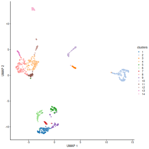
You can see we ended up with 14 clusters of varying sizes.
We can now overlay the cluster labels as color on a UMAP plot:
R
sce <- runUmap.se(sce)

plotReducedDim(sce, "UMAP", color_by = "clusters")
Challenge
Our clusters look semi-reasonable, but what if we wanted to make them
less granular? Look at the help documentation for
?clusterGraph.se and ?buildSnnGraph to find
out what we’d need to change to get fewer, larger clusters.
We see in the help documentation for ?clusterGraph.se an
argument called num.neighbors. Each type of clustering
algorithm will have some sort of hyper-parameter that controls the
granularity of the output clusters. If the clustering process has to
connect larger sets of neighbors, the graph will tend to be cut into
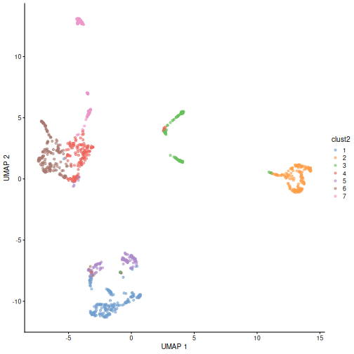
larger groups, resulting in less granular clusters. Create a new set of
clusters with k = 30. Given their visual differences, do
you think one set of clusters is “right” and the other is “wrong”?
R
sce <- clusterGraph.se(sce, num.neighbors = 30,
                       output.name = "clust2")

plotReducedDim(sce, "UMAP", color_by = "clust2")
Marker gene detection
To interpret clustering results as obtained in the previous section, we identify the genes that drive separation between clusters. These marker genes allow us to assign biological meaning to each cluster based on their functional annotation. In the simplest case, we have a priori knowledge of the marker genes associated with particular cell types, allowing us to treat the clustering as a proxy for cell type identity.
The most straightforward approach to marker gene detection involves testing for differential expression between clusters. If a gene is strongly DE between clusters, it is likely to have driven the separation of cells in the clustering algorithm.
Here, we use scoreMarkers() to perform pairwise
comparisons of gene expression, focusing on up-regulated (positive)
markers in one cluster when compared to another cluster.
R
rownames(sce) <- rowData(sce)$SYMBOL

markers <- scoreMarkers.se(sce, groups = sce$clusters)

markers
OUTPUT
List of length 14
names(14): 1 2 3 4 5 6 7 8 9 10 11 12 13 14
The resulting object contains a sorted marker gene list for each cluster, in which the top genes are those that contribute the most to the separation of that cluster from all other clusters.
Here, we inspect the ranked marker gene list for the first cluster.
R
head(markers[[1]], 3)
OUTPUT
DataFrame with 3 rows and 22 columns
           mean  detected cohens.d.min cohens.d.mean cohens.d.median
      <numeric> <numeric>    <numeric>     <numeric>       <numeric>
Ptn     5.18941  1.000000    0.4135944       3.39489         3.68598
Sox2    2.93998  0.972222    0.6191891       3.33378         3.92825
Sfrp1   3.02850  0.953704   -0.0370316       2.02099         2.10181
      cohens.d.max cohens.d.min.rank   auc.min  auc.mean auc.median   auc.max
         <numeric>         <integer> <numeric> <numeric>  <numeric> <numeric>
Ptn        5.92151                 1  0.607339  0.926049   0.989583  1.000000
Sox2       4.53758                 1  0.678819  0.918697   0.980176  0.986111
Sfrp1      3.83032                 2  0.490379  0.850266   0.926881  0.974994
      auc.min.rank delta.mean.min delta.mean.mean delta.mean.median
         <integer>      <numeric>       <numeric>         <numeric>
Ptn              1       0.438100         3.42700           3.76778
Sox2             1       0.664106         2.38613           2.79828
Sfrp1            2      -0.042077         1.87168           2.06497
      delta.mean.max delta.mean.min.rank delta.detected.min delta.detected.mean
           <numeric>           <integer>          <numeric>           <numeric>
Ptn          4.98641                   1        0.000000000            0.372927
Sox2         2.93998                   1        0.083333333            0.708979
Sfrp1        2.96871                   2        0.000578704            0.407483
      delta.detected.median delta.detected.max delta.detected.min.rank
                  <numeric>          <numeric>               <integer>
Ptn                0.256410           0.790123                       2
Sox2               0.868774           0.972222                       1
Sfrp1              0.318783           0.893098                       2
Each column contains summary statistics for each gene in the given
cluster. These are usually the mean/median/min/max of statistics like
Cohen’s d and AUC when comparing this cluster (cluster 1 in
this case) to all other clusters. auc.mean is usually the
most important to check. AUC is the probability that a randomly selected
cell in cluster A has a greater expression of gene X
than a randomly selected cell in cluster B.
We can then inspect the top marker genes for the first cluster using
the plotExpression function from the scater package.
R
c1_markers <- markers[[1]]

ord <- order(-c1_markers$auc.mean)

top.markers <- head(rownames(c1_markers[ord,]))

plotExpression(sce,
               features = top.markers,
               x        = "clusters",
               color_by = "clusters")
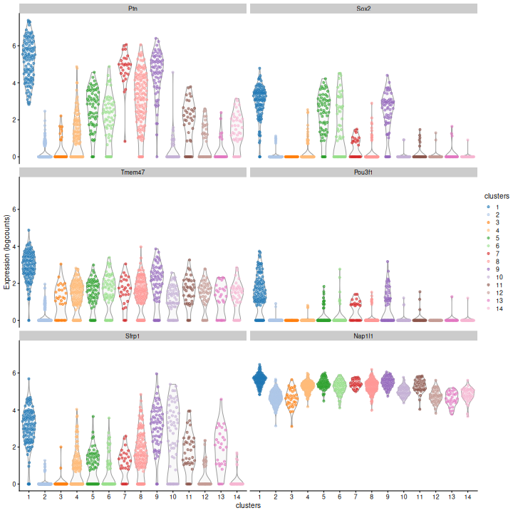
Clearly, not every marker gene distinguishes cluster 1 from every other cluster. However, with a combination of multiple marker genes it’s possible to clearly identify gene patterns that are unique to cluster 1. It’s sort of like the 20 questions game - with answers to the right questions about a cell (e.g. “Do you highly express Ptn? Sox2?”), you can clearly identify what cluster it falls in.
Challenge
Looking at the last plot, what clusters are most difficult to distinguish from cluster 1? Now re-run the UMAP plot from the previous section. Do the difficult-to-distinguish clusters make sense?
You can see that at least among the top markers, cluster 9 (purple) tends to have the least separation from cluster 1.
R
plotReducedDim(sce, "UMAP", color_by = "clusters")
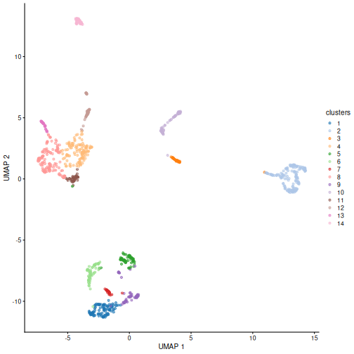
Looking at the UMAP again, we can see that the marker gene overlap of clusters 1 and 6 makes sense. They’re right next to each other on the UMAP. They’re probably closely related cell types, and a less granular clustering would probably lump them together.
Cell type annotation
The most challenging task in scRNA-seq data analysis is arguably the interpretation of the results. Obtaining clusters of cells is fairly straightforward, but it is more difficult to determine what biological state is represented by each of those clusters. Doing so requires us to bridge the gap between the current dataset and prior biological knowledge, and the latter is not always available in a consistent and quantitative manner. Indeed, even the concept of a “cell type” is not clearly defined, with most practitioners possessing a “I’ll know it when I see it” intuition that is not amenable to computational analysis. As such, interpretation of scRNA-seq data is often manual and a common bottleneck in the analysis workflow.
To expedite this step, we can use various computational approaches that exploit prior information to assign meaning to an uncharacterized scRNA-seq dataset. The most obvious sources of prior information are the curated gene sets associated with particular biological processes, e.g., from the Gene Ontology (GO) or the Kyoto Encyclopedia of Genes and Genomes (KEGG) collections. Alternatively, we can directly compare our expression profiles to published reference datasets where each sample or cell has already been annotated with its putative biological state by domain experts. Here, we will demonstrate both approaches on the wild-type chimera dataset.
Assigning cell labels from reference data
A conceptually straightforward annotation approach is to compare the single-cell expression profiles with previously annotated reference datasets. Labels can then be assigned to each cell in our uncharacterized test dataset based on the most similar reference sample(s), for some definition of “similar”. This is a standard classification challenge that can be tackled by standard machine learning techniques such as random forests and support vector machines. Any published and labelled RNA-seq dataset (bulk or single-cell) can be used as a reference, though its reliability depends greatly on the expertise of the original authors who assigned the labels in the first place.
In this section, we will demonstrate the use of the SingleR method for cell type annotation Aran et al., 2019. This method assigns labels to cells based on the reference samples with the highest Spearman rank correlations, using only the marker genes between pairs of labels to focus on the relevant differences between cell types. It also performs a fine-tuning step for each cell where the correlations are recomputed with just the marker genes for the top-scoring labels. This aims to resolve any ambiguity between those labels by removing noise from irrelevant markers for other labels. Further details can be found in the SingleR book from which most of the examples here are derived.
Remember, the quality of reference-based cell type annotation can only be as good as the cell type assignments in the reference. Garbage in, garbage out. In practice, it’s worthwhile to spend time carefully assessing the quality of your reference dataset to make sure the original assignments are valid and are compatible with the query dataset you intend to annotate.
Here we take a single sample from EmbryoAtlasData as our
reference dataset. In practice you would want to take more/all samples,
possibly with batch-effect correction (see the multi-sample
analysis episode).
R
ref <- EmbryoAtlasData(samples = 29)

ref
OUTPUT
class: SingleCellExperiment
dim: 29452 7569
metadata(0):
assays(1): counts
rownames(29452): ENSMUSG00000051951 ENSMUSG00000089699 ...
  ENSMUSG00000096730 ENSMUSG00000095742
rowData names(2): ENSEMBL SYMBOL
colnames(7569): cell_95727 cell_95728 ... cell_103294 cell_103295
colData names(17): cell barcode ... colour sizeFactor
reducedDimNames(2): pca.corrected umap
mainExpName: NULL
altExpNames(0):
In order to reduce the computational load, we subsample the dataset to 2,000 cells.
R
set.seed(123)

ind <- sample(ncol(ref), 2000)

ref <- ref[,ind]
You can see we have an assortment of different cell types in the reference (with varying frequency):
R
tab <- sort(table(ref$celltype), decreasing = TRUE)

data.frame(tab)
OUTPUT
                             Var1 Freq
1    Forebrain/Midbrain/Hindbrain  282
2                      Erythroid3  140
3               Paraxial mesoderm  133
4                    ExE mesoderm   97
5                             NMP   96
6                Surface ectoderm   92
7             Pharyngeal mesoderm   89
8                    ExE endoderm   83
9                      Mesenchyme   83
10                      Allantois   82
11                    Spinal cord   82
12                 Cardiomyocytes   74
13                            Gut   62
14               Somitic mesoderm   59
15                   Neural crest   57
16 Haematoendothelial progenitors   56
17          Intermediate mesoderm   48
18                    Endothelium   44
19                     Erythroid2   20
20            Blood progenitors 2    6
21                     Erythroid1    5
22            Blood progenitors 1    4
23                  Def. endoderm    4
24                Caudal Mesoderm    3
25                            PGC    3
We need the normalized log counts, so we add those on:
R
ref <- normalizeRnaCounts.se(ref)
Some cleaning - remove cells of the reference dataset for which the cell type annotation is missing:
R
nna <- !is.na(ref$celltype)

ref <- ref[,nna]
Also remove very rare cell types (fewer than 10 examples) to avoid allocating cells to a poorly characterized type.
R
abu.ct <- names(tab)[tab >= 10]

ind <- ref$celltype %in% abu.ct

ref <- ref[,ind]
Restrict to genes shared between query and reference dataset.
R
rownames(ref) <- rowData(ref)$SYMBOL

shared_genes <- intersect(rownames(sce), rownames(ref))

sce <- sce[shared_genes,]

ref <- ref[shared_genes,]
Convert sparse assay matrices to regular dense matrices for input to SingleR:
R
sce.mat <- as.matrix(assay(sce, "logcounts"))

ref.mat <- as.matrix(assay(ref, "logcounts"))
Finally, run SingleR with the query and reference datasets:
R
res <- SingleR(test = sce.mat,
               ref = ref.mat,
               labels = ref$celltype)
res
OUTPUT
DataFrame with 1000 rows and 4 columns
                                   scores                 labels delta.next
                                 <matrix>            <character>  <numeric>
cell_11995 0.344089:0.352252:0.322687:... Forebrain/Midbrain/H..  0.0714460
cell_10294 0.284061:0.269633:0.305867:...             Erythroid3  0.0927442
cell_9963  0.344064:0.308871:0.496652:...            Endothelium  0.2402474
cell_11610 0.287595:0.274519:0.302783:...             Erythroid3  0.0446964
cell_10910 0.418575:0.355947:0.360681:...           ExE mesoderm  0.0551009
...                                   ...                    ...        ...
cell_11597 0.326458:0.301278:0.302239:...                    NMP  0.1670511
cell_9807  0.472615:0.388327:0.400081:...             Mesenchyme  0.0715311
cell_10095 0.356238:0.294831:0.497544:...            Endothelium  0.0823898
cell_11706 0.271516:0.243037:0.282809:...             Erythroid2  0.0730011
cell_11860 0.356413:0.348997:0.339735:...       Surface ectoderm  0.0059137
                    pruned.labels
                      <character>
cell_11995 Forebrain/Midbrain/H..
cell_10294             Erythroid3
cell_9963             Endothelium
cell_11610             Erythroid3
cell_10910           ExE mesoderm
...                           ...
cell_11597                    NMP
cell_9807              Mesenchyme
cell_10095            Endothelium
cell_11706                     NA
cell_11860       Surface ectoderm
We inspect the results using a heatmap of the per-cell and label scores. Ideally, each cell should exhibit a high score in one label relative to all of the others, indicating that the assignment to that label was unambiguous.
R
plotScoreHeatmap(res)
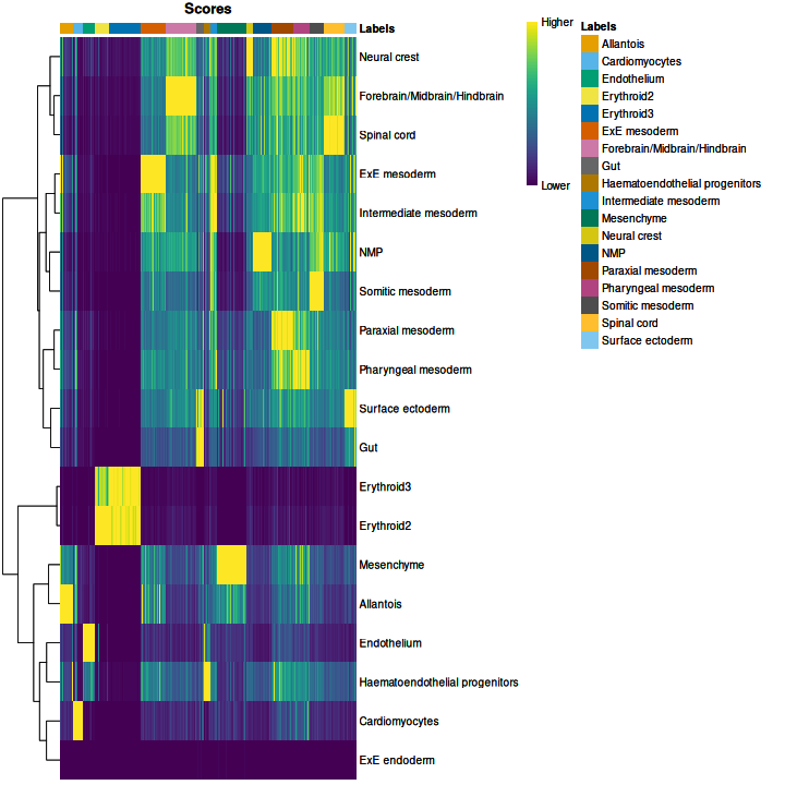
We obtained fairly unambiguous predictions for mesenchyme and endothelial cells, whereas we see expectedly more ambiguity between the two erythroid cell populations.
We can also compare the cell type assignments with the unsupervised clustering results to determine the identity of each cluster. Here, several cell type classes are nested within the same cluster, indicating that these clusters are composed of several transcriptomically similar cell populations. On the other hand, there are also instances where we have several clusters for the same cell type, indicating that the clustering represents finer subdivisions within these cell types.
R
tab <- table(anno = res$pruned.labels,
             cluster = sce$clusters)

pheatmap(log1p(tab),
         color = hcl.colors(100))
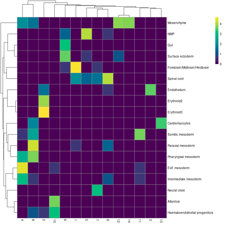
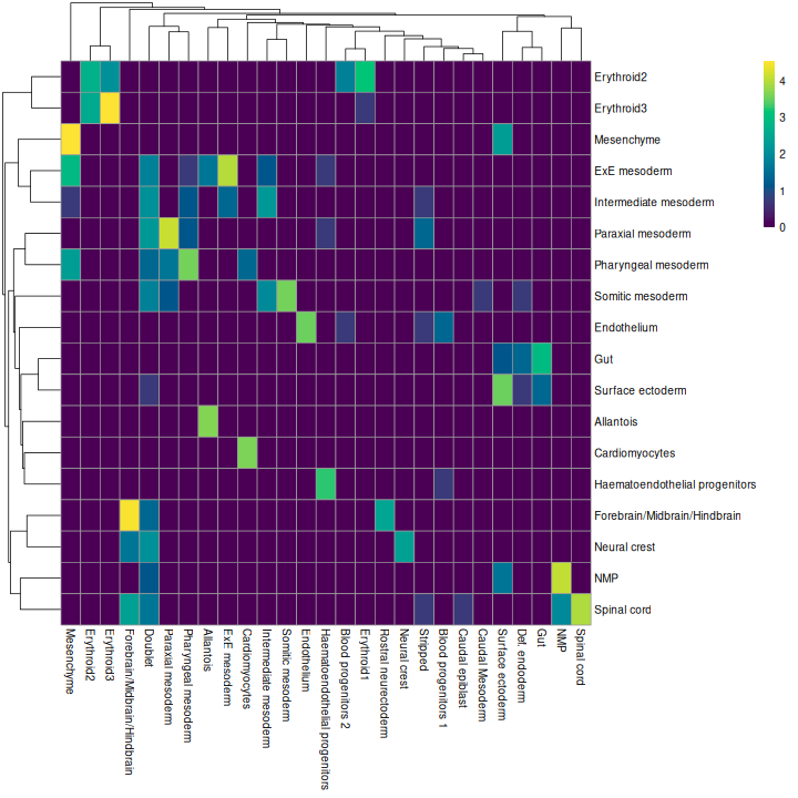
As it so happens, we are in the fortunate position where our test dataset also contains independently defined labels. We see strong consistency between the two sets of labels, indicating that our automatic annotation is comparable to that generated manually by domain experts.
R
tab <- table(res$pruned.labels, sce$celltype.mapped)

pheatmap(log1p(tab),
         color = hcl.colors(100))
Challenge
Assign the SingleR annotations as a column in the colData for the
query object sce.
R
sce$SingleR_label = res$pruned.labels
Assigning cell labels from marker gene sets
A related strategy is to explicitly identify sets of marker genes that are highly expressed in each individual cell. This does not require matching of individual cells to the expression values of the reference dataset, which is faster and more convenient when only the identities of the markers are available.
It’s common to use expert-curated lists of marker genes derived from the literature and/or experimental experience. However for the sake of demonstration, in this case we’ll use cell type markers derived empirically from the mouse embryo atlas dataset.
R
mrkrs <- scoreMarkers.se(ref, groups = ref$celltype)
This gives a list of marker statistics for each cell type. Let’s look at the Erythroid3 markers:
R
mrkrs[["Erythroid3"]][,c("mean", "auc.mean")]
OUTPUT
DataFrame with 29411 rows and 2 columns
              mean  auc.mean
         <numeric> <numeric>
Hbb-bh1   10.37685  0.995020
Hba-a1     8.83379  0.998492
Hba-x      9.72428  0.997738
Hba-a2     7.67391  0.997996
Blvrb      4.55019  0.985159
...            ...       ...
Tceal9    1.355498 0.0312212
Tuba1a    0.521599 0.0587563
Tmsb10    2.274679 0.0526069
Marcksl1  1.196010 0.0377824
Serpinh1  0.240562 0.0327936
The full table gives a large list of statistics for each gene describing how well distinguishes Erythroid3 cells from other cell types. The two selected here, mean expression and mean AUC, are important statistics to look at. They help you check that the gene is highly expressed in the cell type and can consistently discriminate the selected type from the others, respectively.
Our test dataset will be as before the wild-type chimera dataset.
R
sce
OUTPUT
class: SingleCellExperiment
dim: 29411 1000
metadata(1): PCA
assays(2): counts logcounts
rownames(29411): Xkr4 Gm1992 ... Vmn2r122 CAAA01147332.1
rowData names(7): ENSEMBL SYMBOL ... residuals hvg
colnames(1000): cell_11995 cell_10294 ... cell_11706 cell_11860
colData names(14): cell barcode ... clust2 SingleR_label
reducedDimNames(4): pca.corrected.E7.5 pca.corrected.E8.5 PCA UMAP
mainExpName: NULL
altExpNames(0):
We use the AUCell package to identify marker sets that are highly expressed in each cell. This method ranks genes by their expression values within each cell and constructs a response curve of the number of genes from each marker set that are present with increasing rank. It then computes the area under the curve (AUC) for each marker set, quantifying the enrichment of those markers among the most highly expressed genes in that cell. This is roughly similar to performing a Wilcoxon rank sum test between genes in and outside of the set, but involving only the top ranking genes by expression in each cell.
R
get_top_n <- function(mrk_df, ntop = 100) {
  o = order(mrk_df$auc.median, decreasing = TRUE)

  rownames(mrk_df[head(o, ntop),])
}

all.sets <- lapply(names(mrkrs),
                   function(x) {
                     GeneSet(get_top_n(mrkrs[[x]]), setName = x)
                   })

all.sets <- GeneSetCollection(all.sets)

all.sets
OUTPUT
GeneSetCollection
  names: Allantois, Cardiomyocytes, ..., Surface ectoderm (19 total)
  unique identifiers: Phlda2, Spin2c, ..., Sostdc1 (976 total)
  types in collection:
    geneIdType: NullIdentifier (1 total)
    collectionType: NullCollection (1 total)
R
rankings <- AUCell_buildRankings(as.matrix(counts(sce)),
                                 plotStats = FALSE, verbose = FALSE)

cell.aucs <- AUCell_calcAUC(all.sets, rankings)

results <- t(assay(cell.aucs))

head(results, 3)
OUTPUT
            gene sets
cells        Allantois Cardiomyocytes Endothelium Erythroid2 Erythroid3
  cell_11995    0.0984         0.1062       0.129      0.211      0.145
  cell_10294    0.0970         0.0892       0.113      0.584      0.563
  cell_9963     0.2533         0.1502       0.506      0.191      0.158
            gene sets
cells        ExE endoderm ExE mesoderm Forebrain/Midbrain/Hindbrain   Gut
  cell_11995       0.0815        0.184                        0.491 0.175
  cell_10294       0.1218        0.117                        0.343 0.166
  cell_9963        0.1083        0.180                        0.366 0.208
            gene sets
cells        Haematoendothelial progenitors Intermediate mesoderm Mesenchyme
  cell_11995                          0.148                 0.249      0.157
  cell_10294                          0.138                 0.212      0.118
  cell_9963                           0.463                 0.229      0.363
            gene sets
cells        Neural crest   NMP Paraxial mesoderm Pharyngeal mesoderm
  cell_11995        0.441 0.365             0.315               0.345
  cell_10294        0.374 0.272             0.212               0.232
  cell_9963         0.369 0.295             0.373               0.335
            gene sets
cells        Somitic mesoderm Spinal cord Surface ectoderm
  cell_11995            0.311       0.475            0.159
  cell_10294            0.209       0.320            0.110
  cell_9963             0.301       0.337            0.133
We assign cell type identity to each cell in the test dataset by taking the marker set with the top AUC as the label for that cell. Our new labels mostly agree with the original annotation (and, thus, also with the reference-based annotation). Instances where the original annotation is divided into several new label groups typically points to large overlaps in their marker sets. In the absence of prior annotation, a more general diagnostic check is to compare the assigned labels to cluster identities, under the expectation that most cells of a single cluster would have the same label (or, if multiple labels are present, they should at least represent closely related cell states). We only print out the top-left corner of the table here, but you should try looking at the whole thing:
R
new.labels <- colnames(results)[max.col(results)]

tab <- table(new.labels, sce$celltype.mapped)

tab[1:4,1:4]
OUTPUT
new.labels       Allantois Blood progenitors 1 Blood progenitors 2
  Allantois             34                   0                   0
  Cardiomyocytes         0                   0                   0
  Endothelium            0                   0                   0
  Erythroid2             0                   0                   3

new.labels       Cardiomyocytes
  Allantois                   0
  Cardiomyocytes             27
  Endothelium                 0
  Erythroid2                  0
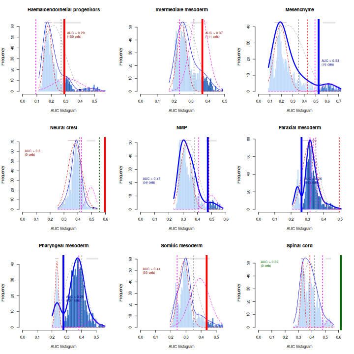
As a diagnostic measure, we examine the distribution of AUCs across cells for each label. In heterogeneous populations, the distribution for each label should be bimodal with one high-scoring peak containing cells of that cell type and a low-scoring peak containing cells of other types. The gap between these two peaks can be used to derive a threshold for whether a label is “active” for a particular cell. (In this case, we simply take the single highest-scoring label per cell as the labels should be mutually exclusive.) In populations where a particular cell type is expected, lack of clear bimodality for the corresponding label may indicate that its gene set is not sufficiently informative.
R
par(mfrow = c(3,3))

AUCell_exploreThresholds(cell.aucs[1:9], plotHist = TRUE, assign = TRUE)
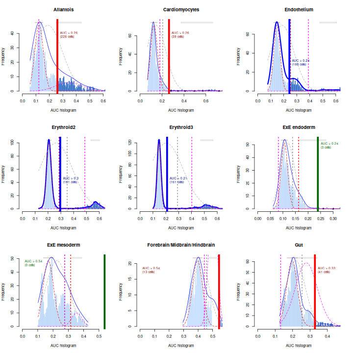
Shown is the distribution of AUCs in the wild-type chimera dataset for each label in the embryo atlas dataset. The blue curve represents the density estimate, the red curve represents a fitted two-component mixture of normals, the pink curve represents a fitted three-component mixture, and the grey curve represents a fitted normal distribution. Vertical lines represent threshold estimates corresponding to each estimate of the distribution.
Challenge
Inspect the diagnostics for the next nine cell types. Do they look okay?
R
par(mfrow = c(3,3))

AUCell_exploreThresholds(cell.aucs[10:18], plotHist = TRUE, assign = TRUE)
Exercises
Exercise 1: Clustering
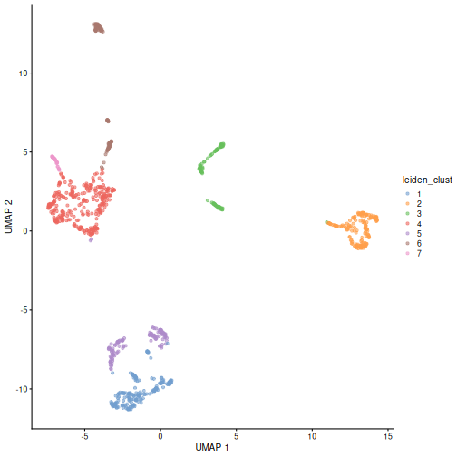
The Leiden
algorithm is similar to the Louvain algorithm, but it is faster and
has been shown to result in better connected communities. Modify the
above call to clusterCells to carry out the community
detection with the Leiden algorithm instead. Visualize the results in a
UMAP plot.
The NNGraphParam constructor has an argument
cluster.args. This allows to specify arguments passed on to
the cluster_leiden function from the igraph
package. Use the cluster.args argument to parameterize the
clustering to use modularity as the objective function and a resolution
parameter of 0.5.
R
arg_list <- list(objective_function = "modularity",
                 resolution_parameter = .5)

sce$leiden_clust <- clusterCells(sce, use.dimred = "PCA",
                               BLUSPARAM = NNGraphParam(cluster.fun = "leiden",
                                                        cluster.args = arg_list))

plotReducedDim(sce, "UMAP", color_by = "leiden_clust")
Exercise 2: Reference marker genes
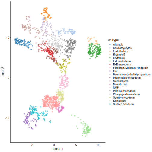
Identify the marker genes in the reference single cell experiment,
using the celltype labels that come with the dataset as the
groups. Compare the top 100 marker genes of two cell types that are
close in UMAP space. Do they share similar marker sets?
R
markers <- scoreMarkers(ref, groups = ref$celltype)
ERROR
Error in `.checkSEX()`:
! SummarizedExperiment inputs are not supported, use 'scoreMarkers.se()' or extract the relevant 'assay()' instead
R
markers
OUTPUT
List of length 14
names(14): 1 2 3 4 5 6 7 8 9 10 11 12 13 14
R
# It comes with UMAP precomputed too
plotReducedDim(ref, dimred = "umap", color_by = "celltype")
R
# Repetitive work -> write a function
order_marker_df <- function(m_df, n = 100) {

  ord <- order(m_df$mean.AUC, decreasing = TRUE)

  rownames(m_df[ord,][1:n,])
}

x <- order_marker_df(markers[["Erythroid2"]])
ERROR
Error in `order()`:
! argument 1 is not a vector
R
y <- order_marker_df(markers[["Erythroid3"]])
ERROR
Error in `order()`:
! argument 1 is not a vector
R
length(intersect(x,y)) / 100
ERROR
Error in `h()`:
! error in evaluating the argument 'x' in selecting a method for function 'intersect': object 'x' not found
Turns out there’s pretty substantial overlap between
Erythroid2 and Erythroid3. It would also be
interesting to plot the expression of the set difference to confirm that
the remainder are the the genes used to distinguish these two types from
each other.
Extension Challenge 1: Group pair comparisons
Why do you think marker genes are found by aggregating pairwise comparisons rather than iteratively comparing each cluster to all other clusters?
One important reason why is because averages over all other clusters can be sensitive to the cell type composition. If a rare cell type shows up in one sample, the most discriminative marker genes found in this way could be very different from those found in another sample where the rare cell type is absent.
Generally, it’s good to keep in mind that the concept of “everything else” is not a stable basis for comparison. Read that sentence again, because its a subtle but broadly applicable point. Think about it and you can probably identify analogous issues in fields outside of single-cell analysis. It frequently comes up when comparisons between multiple categories are involved.
Extension Challenge 2: Parallelizing SingleR
SingleR can be computationally expensive. How do you set it to run in parallel?
Use BiocParallel and the BPPARAM argument!
This example will set it to use four cores on your laptop, but you can
also configure BiocParallel to use cluster jobs.
R
library(BiocParallel)

my_bpparam <- MulticoreParam(workers = 4)

res2 <- SingleR(test = sce.mat,
                ref = ref.mat,
                labels = ref$celltype,
                BPPARAM = my_bpparam)
BiocParallel is the most common way to enable parallel
computation in Bioconductor packages, so you can expect to see it
elsewhere outside of SingleR.
Extension Challenge 3: Critical inspection of diagnostics
The first set of AUCell diagnostics don’t look so good for some of the examples here. Which ones? Why?
The example that jumps out most strongly to the eye is ExE endoderm, which doesn’t show clear separate modes. Simultaneously, Endothelium seems to have three or four modes.
Remember, this is an exploratory diagnostic, not the final word! At this point it’d be good to engage in some critical inspection of the results. Maybe we don’t have enough / the best marker genes. In this particular case, the fact that we subsetted the reference set to 1000 cells probably didn’t help.
Further Reading
- OSCA book, Chapters 5-7
- Assigning cell types with SingleR (the book).
- The AUCell package vignette.
- The two main approaches for cell type annotation are 1) manual annotation of clusters based on marker gene expression, and 2) computational annotation based on annotation transfer from reference datasets or marker gene set enrichment testing.
- For manual annotation, cells are first clustered with unsupervised methods such as graph-based clustering followed by community detection algorithms such as Louvain or Leiden.
- The
clusterCellsfunction from the scran package provides different algorithms that are commonly used for the clustering of scRNA-seq data. - Once clusters have been obtained, cell type labels are then manually assigned to cell clusters by matching cluster-specific upregulated marker genes with prior knowledge of cell-type markers.
- The
scoreMarkersfunction from the scran package package can be used to find candidate marker genes for clusters of cells by ranking differential expression between pairs of clusters. - Computational annotation using published reference datasets or curated gene sets provides a fast, automated, and reproducible alternative to the manual annotation of cell clusters based on marker gene expression.
- The SingleR package is a popular choice for reference-based annotation and assigns labels to cells based on the reference samples with the highest Spearman rank correlations.
- The AUCell package provides an enrichment test to identify curated marker sets that are highly expressed in each cell.
Session Info
R
sessionInfo()
OUTPUT
R version 4.6.1 (2026-06-24)
Platform: x86_64-pc-linux-gnu
Running under: Linux Mint 22.3

Matrix products: default
BLAS:   /usr/lib/x86_64-linux-gnu/blas/libblas.so.3.12.0
LAPACK: /usr/lib/x86_64-linux-gnu/lapack/liblapack.so.3.12.0  LAPACK version 3.12.0

locale:
 [1] LC_CTYPE=en_US.UTF-8       LC_NUMERIC=C
 [3] LC_TIME=en_US.UTF-8        LC_COLLATE=en_US.UTF-8
 [5] LC_MONETARY=en_US.UTF-8    LC_MESSAGES=en_US.UTF-8
 [7] LC_PAPER=en_US.UTF-8       LC_NAME=C
 [9] LC_ADDRESS=C               LC_TELEPHONE=C
[11] LC_MEASUREMENT=en_US.UTF-8 LC_IDENTIFICATION=C

time zone: America/New_York
tzcode source: system (glibc)

attached base packages:
[1] stats4    stats     graphics  grDevices utils     datasets  methods
[8] base

other attached packages:
 [1] GSEABase_1.74.0              graph_1.90.0
 [3] annotate_1.90.0              XML_3.99-0.23
 [5] AnnotationDbi_1.74.0         pheatmap_1.0.13
 [7] scrapper_1.6.3               scran_1.40.0
 [9] scater_1.40.2                ggplot2_4.0.3
[11] scuttle_1.22.0               bluster_1.22.0
[13] SingleR_2.14.1               MouseGastrulationData_1.26.0
[15] SpatialExperiment_1.22.0     SingleCellExperiment_1.34.0
[17] SummarizedExperiment_1.42.0  Biobase_2.72.0
[19] GenomicRanges_1.64.0         Seqinfo_1.2.0
[21] IRanges_2.46.0               S4Vectors_0.50.1
[23] BiocGenerics_0.58.1          generics_0.1.4
[25] MatrixGenerics_1.24.0        matrixStats_1.5.0
[27] AUCell_1.34.0                BiocStyle_2.40.0

loaded via a namespace (and not attached):
  [1] RColorBrewer_1.1-3        jsonlite_2.0.0
  [3] rstudioapi_0.19.0         magrittr_2.0.5
  [5] ggbeeswarm_0.7.3          magick_2.9.1
  [7] farver_2.1.2              rmarkdown_2.31
  [9] vctrs_0.7.3               memoise_2.0.1
 [11] DelayedMatrixStats_1.34.0 htmltools_0.5.9
 [13] S4Arrays_1.12.0           AnnotationHub_4.2.2
 [15] curl_7.1.0                BiocNeighbors_2.6.0
 [17] SparseArray_1.12.2        htmlwidgets_1.6.4
 [19] httr2_1.3.0               plotly_4.12.1
 [21] cachem_1.1.0              igraph_2.3.3
 [23] lifecycle_1.0.5           pkgconfig_2.0.3
 [25] rsvd_1.0.5                Matrix_1.7-6
 [27] R6_2.6.1                  fastmap_1.2.0
 [29] digest_0.6.39             dqrng_0.4.1
 [31] irlba_2.3.7               ExperimentHub_3.2.0
 [33] RSQLite_3.53.3            beachmat_2.28.0
 [35] filelock_1.0.3            labeling_0.4.3
 [37] httr_1.4.8                abind_1.4-8
 [39] compiler_4.6.1            bit64_4.8.2
 [41] withr_3.0.3               S7_0.2.2
 [43] BiocParallel_1.46.0       viridis_0.6.5
 [45] DBI_1.3.0                 R.utils_2.13.0
 [47] MASS_7.3-66               rappdirs_0.3.4
 [49] DelayedArray_0.38.2       rjson_0.2.23
 [51] tools_4.6.1               vipor_0.4.7
 [53] otel_0.2.0                beeswarm_0.4.0
 [55] R.oo_1.27.1               glue_1.8.1
 [57] nlme_3.1-170              grid_4.6.1
 [59] cluster_2.1.8.3           gtable_0.3.6
 [61] R.methodsS3_1.8.2         tidyr_1.3.2
 [63] data.table_1.18.4         BiocSingular_1.28.0
 [65] ScaledMatrix_1.20.0       metapod_1.20.0
 [67] XVector_0.52.0            ggrepel_0.9.8
 [69] BiocVersion_3.23.1        pillar_1.11.1
 [71] limma_3.68.4              BumpyMatrix_1.20.0
 [73] splines_4.6.1             dplyr_1.2.1
 [75] BiocFileCache_3.2.0       lattice_0.22-9
 [77] survival_3.8-9            renv_1.2.3
 [79] bit_4.6.0                 tidyselect_1.2.1
 [81] locfit_1.5-9.12           Biostrings_2.80.1
 [83] knitr_1.51                gridExtra_2.3.1
 [85] edgeR_4.10.1              xfun_0.60
 [87] mixtools_2.0.0.1          statmod_1.5.2
 [89] yaml_2.3.12               evaluate_1.0.5
 [91] codetools_0.2-20          kernlab_0.9-33
 [93] tibble_3.3.1              BiocManager_1.30.27
 [95] cli_3.6.6                 xtable_1.8-8
 [97] segmented_2.2-1           Rcpp_1.1.2
 [99] dbplyr_2.6.0              png_0.1-9
[101] parallel_4.6.1            blob_1.3.0
[103] sparseMatrixStats_1.24.0  viridisLite_0.4.3
[105] scales_1.4.0              purrr_1.2.2
[107] crayon_1.5.3              rlang_1.3.0
[109] formatR_1.14              cowplot_1.2.0
[111] KEGGREST_1.52.2