library(tidyverse)

nhanes_processed <- read_csv("week3Data.csv") Week 3: Plotting
Data
We will be picking up where we left off with the data last week.
First steps with ggplot2
As you saw in this week’s reading, ggplot2 utilizes a specific syntax for creating plots. We can summarize it as:
ggplot(data = <DATA>, mapping = aes(<MAPPINGS>)) + <GEOM_FUNCTION>()Where we define a dataset, choose which variables map to which aspects of the plot, and then choose the geom() or type of plot to draw.
Let’s plug the NHANES dataset into a plot.
ggplot(nhanes_processed)- 1
-
dataandmappingare positional arguments in theggplotfunction, so we don’t have to name them. However, it can be good practice to include the argument names so that it’s immediately obvious what each argument is.

Since we haven’t told ggplot what we want to display, we just get a blank plot. If we add some mappings for the x and y axes:
ggplot(nhanes_processed, aes(x = hba1c, y = plasma.glucose))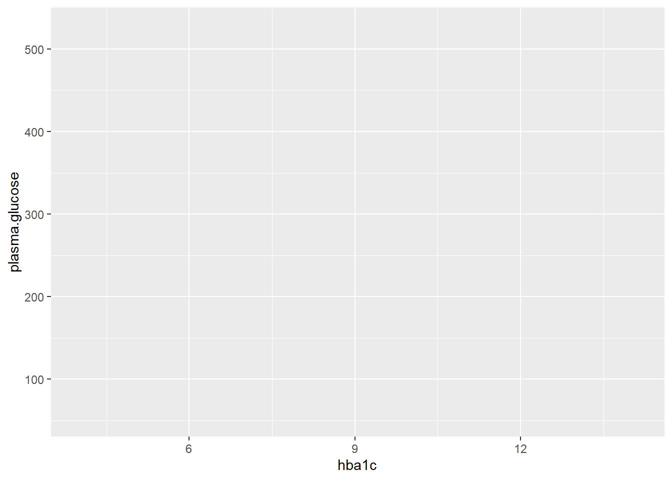
We now get labeled axes and scales based on the variable range. Finally, we can add a geom(). Let’s make a scatterplot, created with geom_point() in ggplot.
ggplot(nhanes_processed, aes(x = hba1c, y = plasma.glucose)) +
  geom_point()
Warning: Removed 1893 rows containing missing values (`geom_point()`).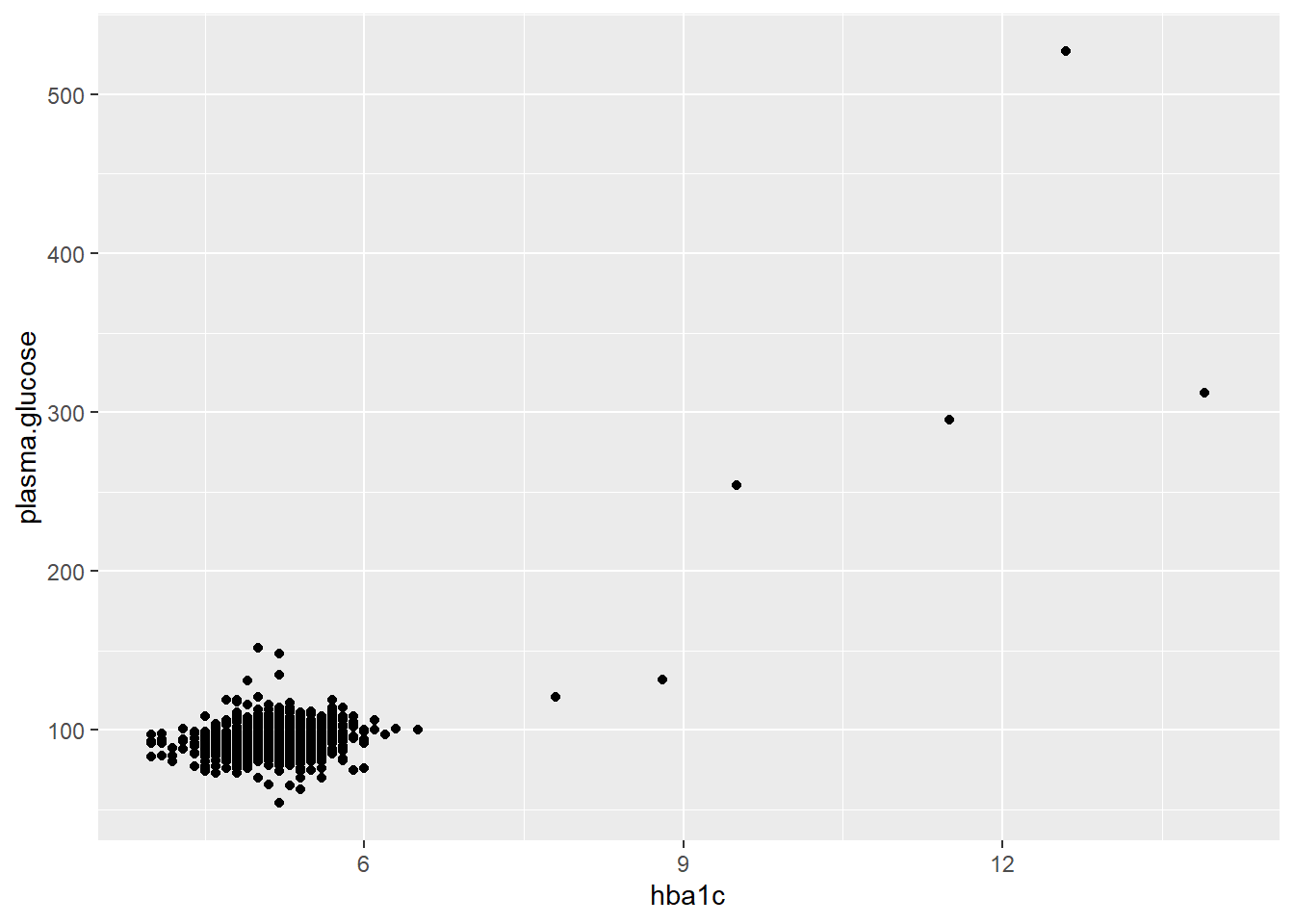
Now, let’s make a boxplot showing how BMI varies by subject ethnicity. Inside of the geom_boxplot function, we’ll also set the varwidth parameter to true so that the box sizes vary with how many samples are in each category.
ggplot(nhanes_processed, aes(x = ethnicity, y = bmi)) +
  geom_boxplot(varwidth = TRUE)
Warning: Removed 25 rows containing non-finite values (`stat_boxplot()`).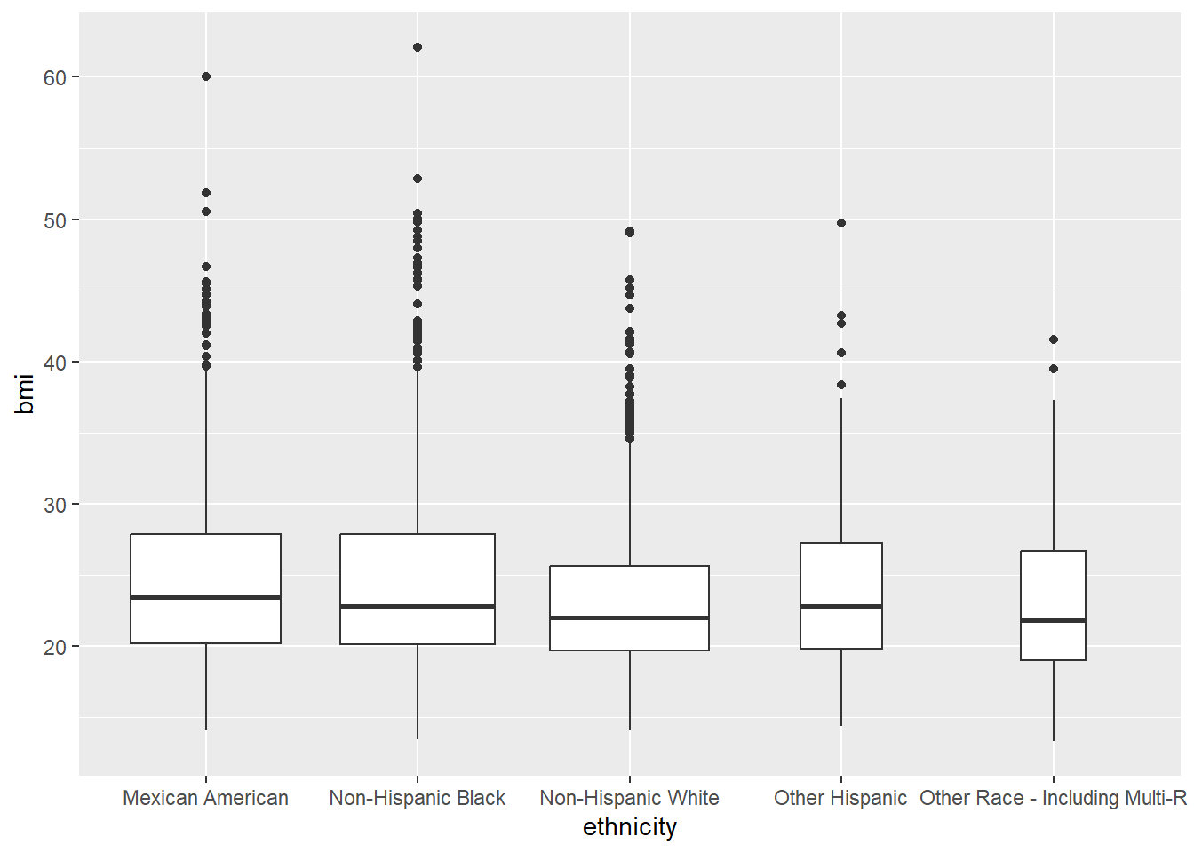
Exercise
Instead of a boxplot, try making a bee swarm plot or a violin plot. Note that the beeswarm plot is in a separate package, ggbeeswarm. You might need to vary the cex argument in the beeswarm plot to increase the spacing between the strips.
# install.packages("ggbeeswarm")
library(ggbeeswarm)
#TODO your plot here

# Beeswarm plot
ggplot(nhanes_processed, aes(x = ethnicity, y = bmi)) +
  geom_beeswarm(cex = 0.5)
Warning: Removed 25 rows containing missing values (`geom_point()`).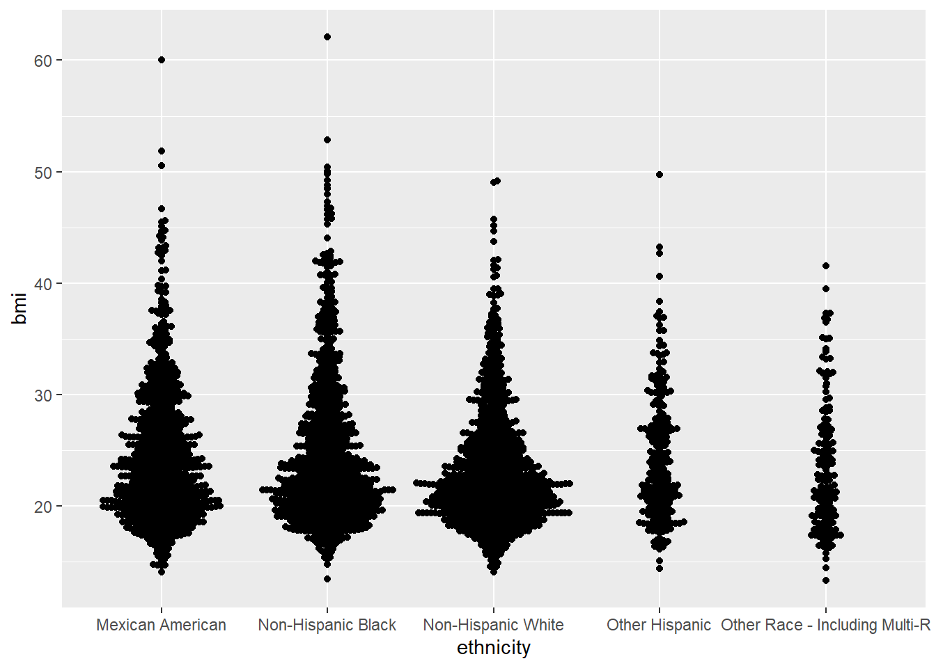
# Violin plot
ggplot(nhanes_processed, aes(x = ethnicity, y = bmi)) +
  geom_violin()
Warning: Removed 25 rows containing non-finite values (`stat_ydensity()`).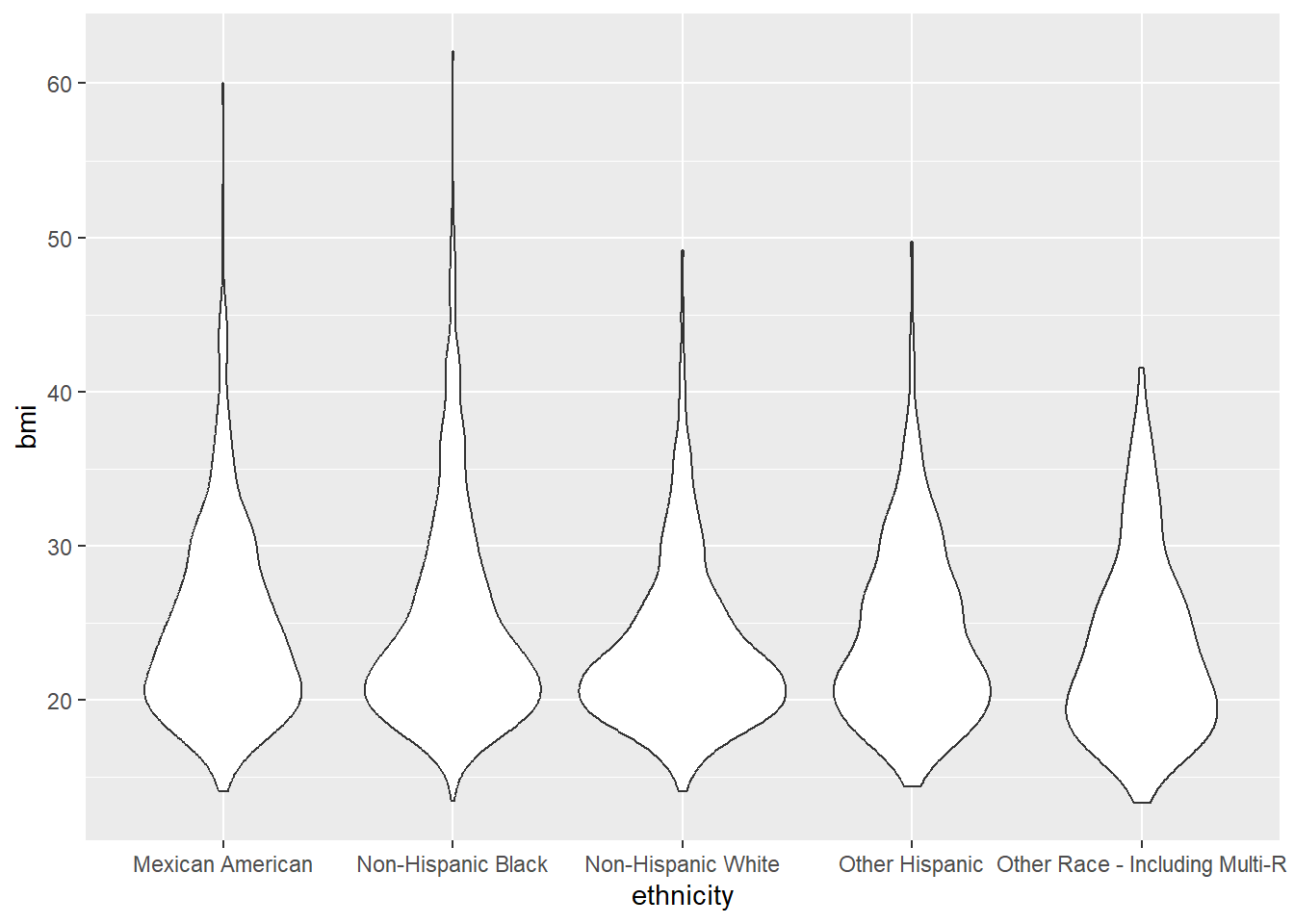
Note that we can also easily make boxplots using R’s builtin plotting boxplot function.
boxplot(bmi ~ ethnicity, data = nhanes_processed)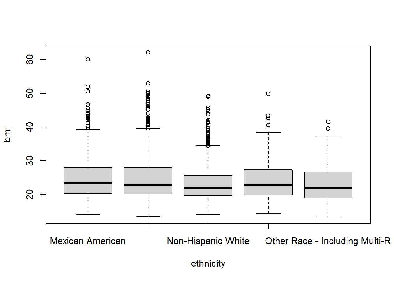
Mapping Variables
Beyond the actual axes we can use mappings to encode variables as various aspects of a plot. Some of the most commonly used other mapping types are shape, fill, color, size, and linetype.
For instance, let’s take our scatterplot from before and color the points by diabetic status.
ggplot(nhanes_processed, aes(x = hba1c, y = plasma.glucose, color = diabetes)) +
  geom_point()
Warning: Removed 1893 rows containing missing values (`geom_point()`).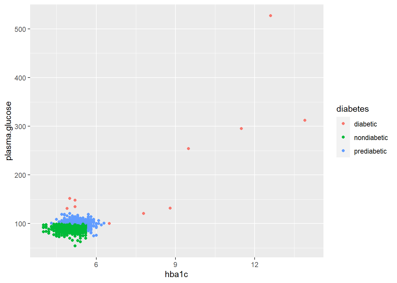
It is difficult to tell how many diabetic participants are in this plot, as it’s possible that the red diabetic points have been covered by the blue and green points. We can alter the transparency of the points by changing alpha. Remember we can also change parts of the plot outside of aes() to have them not depend on any variable.
ggplot(nhanes_processed, aes(x = hba1c, y = plasma.glucose, color = diabetes)) +
  geom_point(alpha = 0.6)
Warning: Removed 1893 rows containing missing values (`geom_point()`).
We can also have a single variable encoded into multiple parts of the plot.
ggplot(nhanes_processed, aes(x = hba1c, y = plasma.glucose, color = diabetes, shape = diabetes)) +
  geom_point(alpha = 0.6)
Warning: Removed 1893 rows containing missing values (`geom_point()`).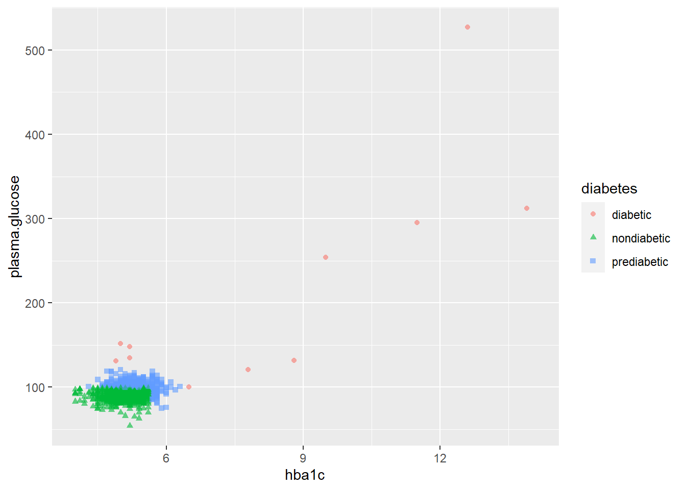
Exercise
- Try coloring your boxplot from before by
age.years. What happens? What about when you useage.cat? Remember to usefillinstead ofcolorfor shapes like boxplots.
# We can't color by age since it's numeric, ggplot gives an error.
ggplot(nhanes_processed, aes(x = ethnicity, y = bmi, fill = age.years)) +
  geom_boxplot()
Warning: Removed 25 rows containing non-finite values (`stat_boxplot()`).Warning: The following aesthetics were dropped during statistical transformation: fill
ℹ This can happen when ggplot fails to infer the correct grouping structure in
the data.
ℹ Did you forget to specify a `group` aesthetic or to convert a numerical
variable into a factor?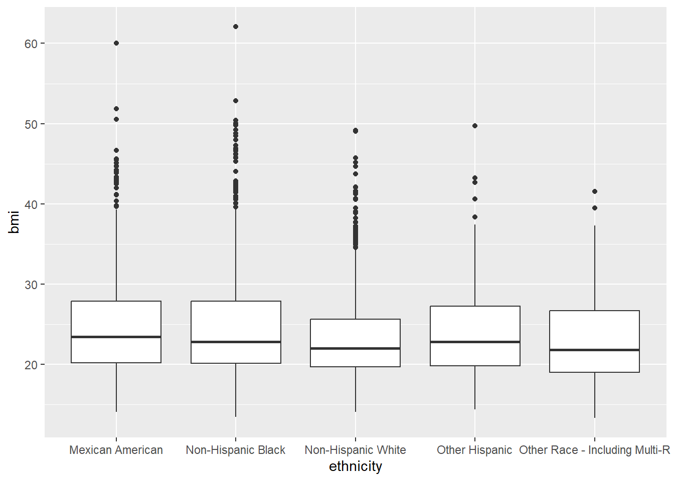
ggplot(nhanes_processed, aes(x = ethnicity, y = bmi, fill = age.cat)) +
  geom_boxplot()
Warning: Removed 25 rows containing non-finite values (`stat_boxplot()`).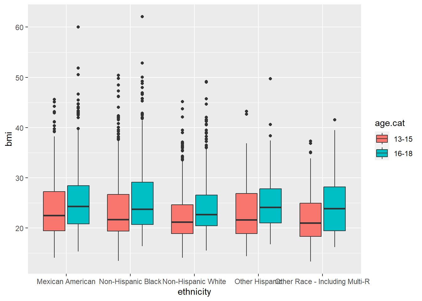
- Now try flipping which variables are encoded in
xandfill. Which version do you think works better?
ggplot(nhanes_processed, aes(x = age.cat, y = bmi, fill = ethnicity)) +
  geom_boxplot()
Warning: Removed 25 rows containing non-finite values (`stat_boxplot()`).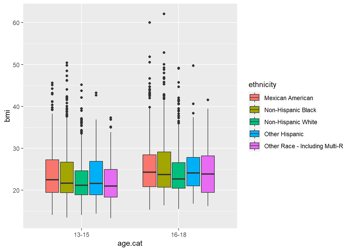
Customizing Plots
Taking a figure all the way to publication-quality can require careful fine tuning. ggplot has a variety of useful themes and other ways to improve a figure’s appearance and readability.
Here’s an example of some of what you can do. Note that changing the fig.width setting for the code block will not effect how the image looks when exported.
#Maybe we want a color scheme from a Wes Anderson movie:
library(wesanderson)

#Note that this font import can take multiple minutes to run
pal <- wes_palette("Zissou1", 2, type = "continuous")

ggplot(nhanes_processed, aes(x = ethnicity, y = bmi, fill = dental.caries)) +
 geom_boxplot() +
 theme_minimal() +
 ggtitle("BMI by ethicity and dental caries") +
 xlab("Ethnicity") +
 ylab("BMI") +
 scale_fill_manual(values = pal, name = "Dental Caries") +
 theme(text = element_text(size=14), axis.text.x = element_text(angle = 45, vjust = 1, hjust = 1))
Warning: Removed 25 rows containing non-finite values (`stat_boxplot()`).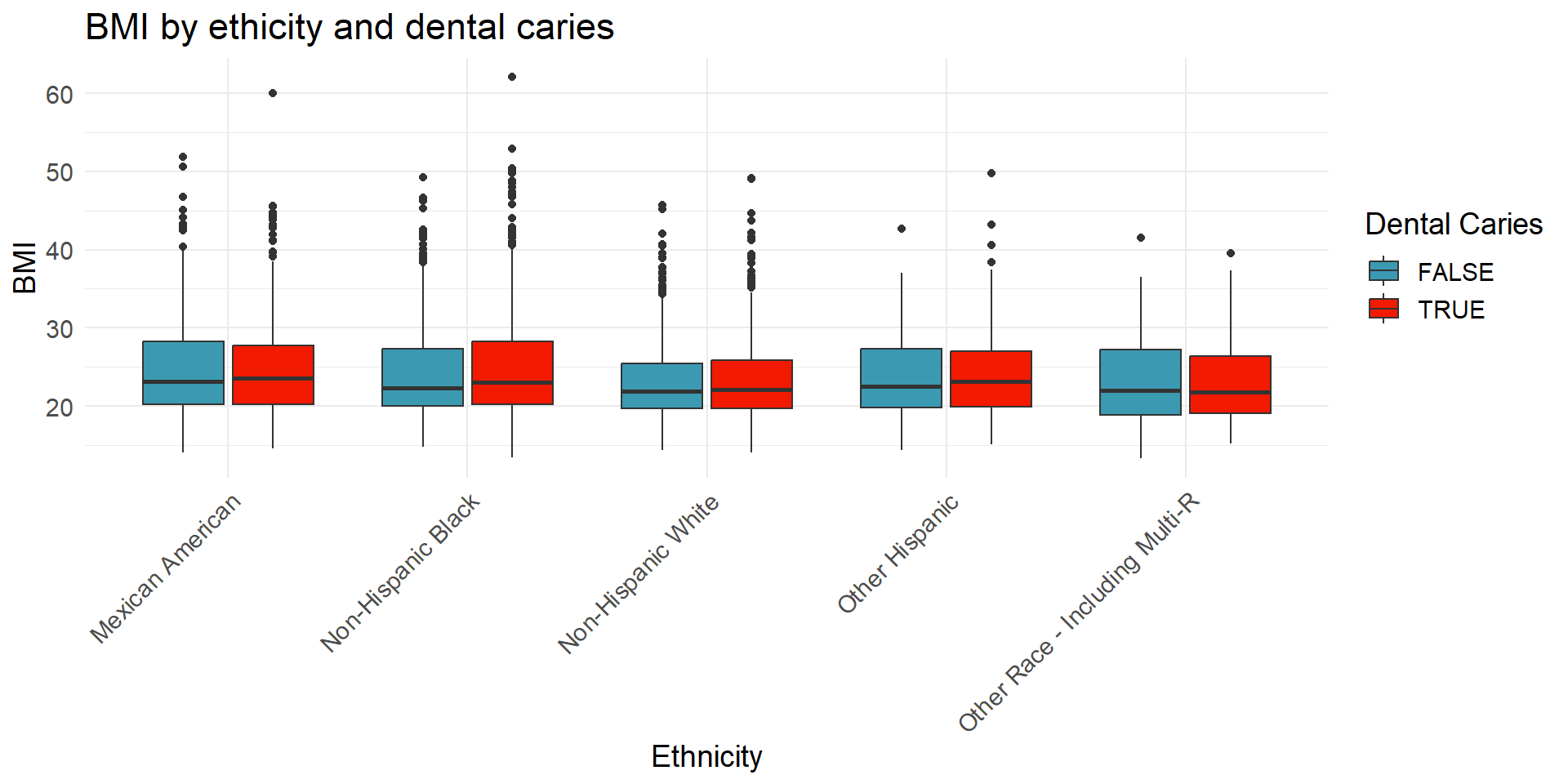
Exporting plots
Exercise
The Journal of the American Dental Association (JADA) manuscript guidlines list the following as their figure formatting requirements:
Formats for Figures If your electronic artwork is created in a Microsoft Office application (Word, PowerPoint, Excel) then please supply “as is” in the native document format. Otherwise, regardless of the application used to create figures, the final artwork should be saved as or converted to 1 of the following formats:
- TIFF, JPEG, or PPT: Color or grayscale photographs (halftones): always use a minimum of 300 dpi.
- TIFF, JPEG, or PPT: Bitmapped line drawings: use a minimum of 1,000 dpi.
- TIFF, JPEG, or PPT: Combinations bitmapped line/halftone (color or grayscale): a minimum of 500 dpi is required.
While Nature’s formatting guidelines are
Nature preferred formats are:
Layered Photoshop (PSD) or TIFF format (high resolution, 300–600 dots per inch (dpi) for photographic images. In Photoshop, it is possible to create images with separate components on different layers. This is particularly useful for placing text labels or arrows over an image, as it allows them to be edited later. If you have done this, please send the Photoshop file (.psd) with the layers intact.
Adobe Illustrator (AI), Postscript, Vector EPS or PDF format for figures containing line drawings and graphs, including figures combining text and line art with photographs or scans.
If these formats are not possible, we can also accept the following formats: JPEG (high-resolution, 300–600 dpi), CorelDraw (up to version 8), Microsoft Word, Excel or PowerPoint.
Export your figure using ggsave to comply with one of these sets of guidelines.
# let's assume this is the plot we want to save, we will save the most recently created plot
ggplot(nhanes_processed, aes(x = ethnicity, y = bmi, fill = age.cat)) +
  geom_boxplot()
Warning: Removed 25 rows containing non-finite values (`stat_boxplot()`).
# Saving as a raster image
ggsave("myplot.jpeg", dpi = 500)
Saving 7 x 5 in imageWarning: Removed 25 rows containing non-finite values (`stat_boxplot()`).# Saving as a vector
ggsave("myplot.pdf")Saving 7 x 5 in imageWarning: Removed 25 rows containing non-finite values (`stat_boxplot()`).