Regression analysis comes in many forms. Here we will learn about linear regression. Regression is a set of tools that allow you to model and interpret the relationships between two or more variables. In regression we treat on variable as the response and a set of variables as possible predictors of the response. Regression models can be used for prediction, for explanation, to test hypotheses about relationships between variables
Causal Relationships
Let’s look at some data from 1989 on infant death rates per 1000 of population. read.table is a more general form of read.csv which can more easily handle non-standard table formats, here the data is separated by tabs as opposed to commas.
library(tidyverse)
── Attaching core tidyverse packages ──────────────────────── tidyverse 2.0.0 ──
✔ dplyr     1.1.3     ✔ readr     2.1.4
✔ forcats   1.0.0     ✔ stringr   1.5.0
✔ ggplot2   3.4.4     ✔ tibble    3.2.1
✔ lubridate 1.9.3     ✔ tidyr     1.3.0
✔ purrr     1.0.2
── Conflicts ────────────────────────────────────────── tidyverse_conflicts() ──
✖ dplyr::filter() masks stats::filter()
✖ dplyr::lag()    masks stats::lag()
ℹ Use the conflicted package (<http://conflicted.r-lib.org/>) to force all conflicts to become errors
We have 20 measurements on - safe=access to safe water - breast= percentage of mothers breast feeding at 6 months - death = infant death rate
Correlation vs. Causation
When performing any time of analysis where we look at the relationship between two variables, we need to be careful to not mix up correlation and causation.
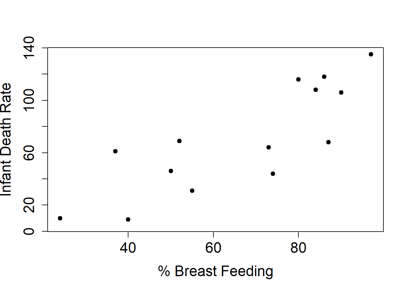
plot(infdeath$breast, infdeath$death, xlab="% Breast Feeding", ylab="Infant Death Rate", pty="s", pch=19, cex.axis=1.5,cex.lab=1.5)
Looking at this data naively, it suggests that longer time breast feeding leads to greater infant mortality.
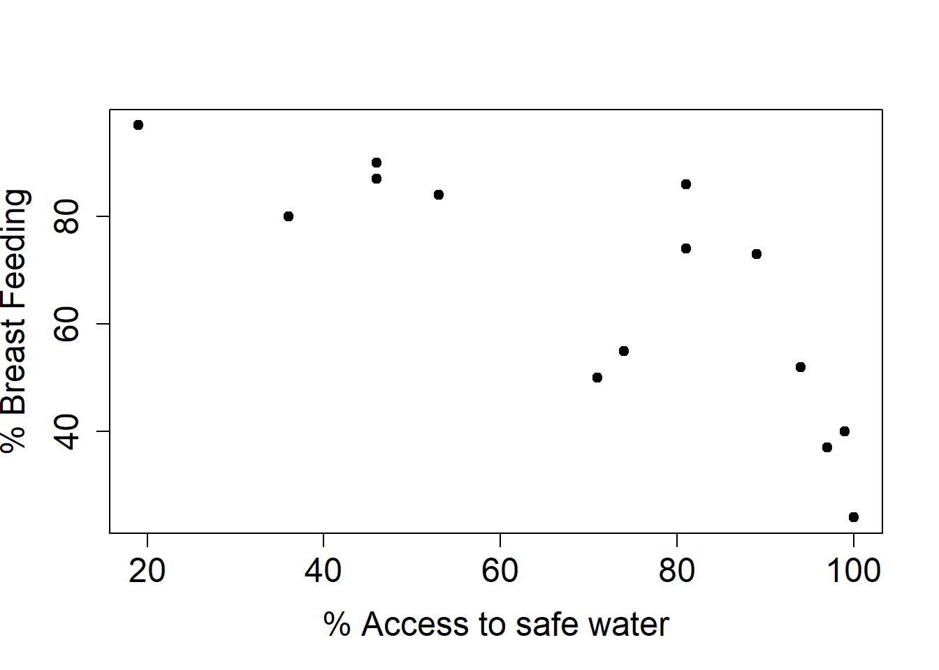
plot(infdeath$safe, infdeath$breast, ylab="% Breast Feeding", xlab="% Access to safe water", pty="s", pch=19, cex.axis=1.5,cex.lab=1.5)
However, there is a latent variable which is actually influencing our result. Countries with access to safe water breast feed for less time.
Causation
Often, as in the example above, there is a third variable (access to clean water) that affects both the response and the predictor. To truly get at causation we typically need a randomized controlled experiment However, we cannot always do experiments, e.g. most epidemiology.
Linear Regression
In linear regression we want to relate the response, \(y\) to the predictor \(x\) using a straight line model
$y = \beta_0 + \beta_1 \cdot x + \epsilon$
You may be more familiar with the notation \(y = mx + b\), which is the identical equation using different variable names.
In this model:
\(\beta_0\) is the intercept - the value that \(y\) takes when \(x=0\)
\(\beta_1\) is the slope of the line, relating \(x\) to \(y\) and can be interpreted as the average change in \(y\) for a one unit change in \(x\)
\(\epsilon\) represents the inherent variability in the system, it is assumed to be zero on average
Some of the statistical theory is easier if you assume that \(\epsilon\)’s come as independent observations with the same distribution (i.i.d), but this is not essential.
Plot the data
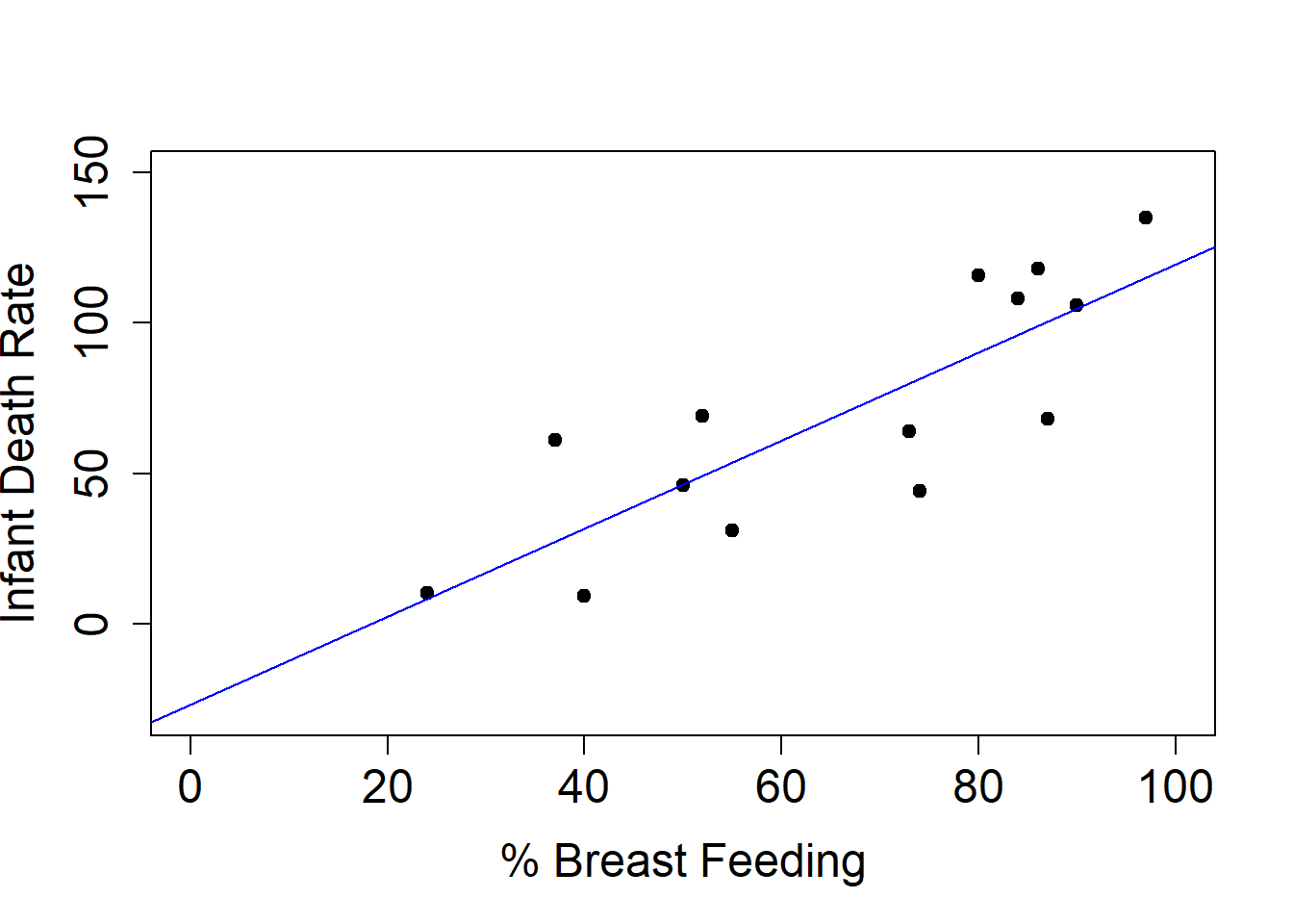
We can use the lm function in R to create a linear model. We then also use R’s formula notation to tell it what we want the model to describe. Here, we want to examine the relationship between mortality and breastfeeding, which we can specify by giving R the linear model y~x, or here infdeath$death ~ infdeath$breast. Note that we don’t need to tell R that we want the model to have an intercept, it incorporates one automatically.
plot(infdeath$breast, infdeath$death, xlab="% Breast Feeding", ylab="Infant Death Rate", pty="s", pch=19, cex.axis=1.5,cex.lab=1.5, xlim=c(0, 100), ylim=c(-30,150))lm1 =lm(infdeath$death~infdeath$breast)abline(lm1, col="blue")
We can directly output the model coefficients and other information, here the learned slope and intercept of the line, by using summary.
summary(lm1)
Call:
lm(formula = infdeath$death ~ infdeath$breast)

Residuals:
    Min      1Q  Median      3Q     Max
-37.568 -21.047   1.368  19.479  33.705

Coefficients:
                Estimate Std. Error t value Pr(>|t|)
(Intercept)      -26.978     20.148  -1.339 0.205392
infdeath$breast    1.467      0.288   5.093 0.000265 ***
---
Signif. codes:  0 '***' 0.001 '**' 0.01 '*' 0.05 '.' 0.1 ' ' 1

Residual standard error: 23.86 on 12 degrees of freedom
  (6 observations deleted due to missingness)
Multiple R-squared:  0.6837,    Adjusted R-squared:  0.6573
F-statistic: 25.94 on 1 and 12 DF,  p-value: 0.000265
We can see that the intercept is about -27 and the slope is about 1.5.
Exercise
Try to interpret these results. What do the slope and intercept mean?
Linear Regression
We denote our estimates by putting a hat on the parameter, e.g. \(\hat{\beta_0}\). This helps make it clear that the coefficients and intercept we found are just estimates based on our data. Ideally, we would want to know the true slope and intercept, but that would be impossible unless we collected data on every infant in the world.
Our estimated line is the given by \(\hat{y} = \hat{\beta}_0 + \hat{\beta}_1 \cdot x\). Now that we have these estimates, given a new \(x\) we can then predict \(y\). However, we have to be careful about whether the new \(x\) is sensible.
Let’s look under the hood of the linear model. How do we choose the best straight line?
Least Squares
Let our predicted values be \(\hat{y}_i = \hat{\beta}_0 + \hat{\beta}_1 \cdot x_i\), and the real values in our data be denoted as \(y_i\).
One strategy to choose our predicted values is to minimize the sum of squared prediction errors:
\[
\sum_{i=1}^n (y_i - \hat{y}_i)^2
\] This method is called least squares and was described by Gauss in 1822.
Another way to look at our model is as
\[
Y = \beta_0 + \beta_1 \cdot X + \epsilon
\] Where we use \(Y\) and \(X\) to represent the fact that data came from some form of sample from a population we want to make inference about, and \(\epsilon\) is the error between each observation and it’s real value based on our model coefficients. Usually we will assume our errors are normally distributed around 0 \(\epsilon \sim N(0, \sigma^2)\), and so are independent (but that is not strictly necessary).
Simulation Experiments
One tool that you can use to understand how different methods work is to create a simulation experiment. In these experiments you create a model, where you know the answer, and you control the variability or stochastic component. Then, you can interpret the way in which the different quantities you are estimating behave. This can help us understand why we might be getting a particular result, or what would happen if our assumptions were not true.
set.seed(123)# Generate some x valuesx =runif(20, min=20, max=70)# Set our regressiony =5+ .2*x # Add in some random erroryobs = y +rnorm(20, sd=1.5)# Create a linear modellm2 =lm(yobs~x)summary(lm2)
Call:
lm(formula = yobs ~ x)

Residuals:
    Min      1Q  Median      3Q     Max
-2.1142 -0.9480 -0.1303  1.0299  2.8389

Coefficients:
            Estimate Std. Error t value Pr(>|t|)
(Intercept)  6.71335    1.04242   6.440 4.63e-06 ***
x            0.16055    0.02088   7.691 4.28e-07 ***
---
Signif. codes:  0 '***' 0.001 '**' 0.01 '*' 0.05 '.' 0.1 ' ' 1

Residual standard error: 1.426 on 18 degrees of freedom
Multiple R-squared:  0.7667,    Adjusted R-squared:  0.7537
F-statistic: 59.15 on 1 and 18 DF,  p-value: 4.275e-07
Repeating simulations
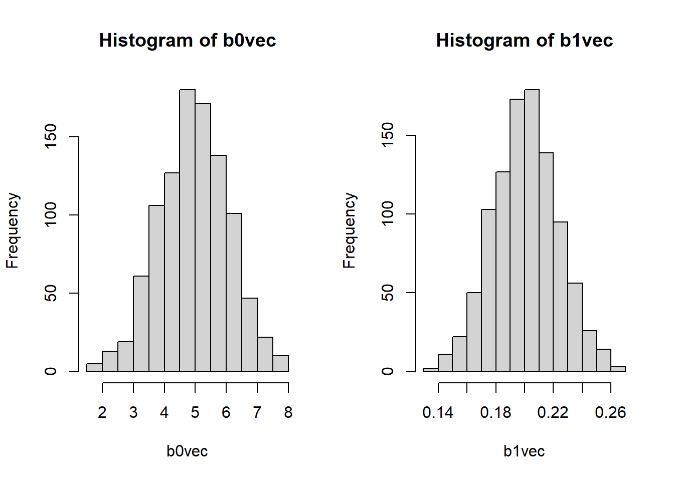
We often want to run many simulations to see how likely certain results are or explore another facet of the model. Here, we run 1000 simulations like the one above. We repeatedly sample from a Normal distribution with sd=1.5 and create a new \(y\). Then, we estimate the parameters for that model, and save them. The code below does this using a for loop. We won’t be covering for loops, but they allow a chunk of code to repeat a certain number of times.
# First, create empty vectors with the number of simulations we want to run. NITER=1000b0vec =rep(NA, NITER)b1vec =rep(NA, NITER)# Create NITER different simulated datasets and linear models using a for loop, storing the results into the vectors we created. for( i in1:NITER) { ei =rnorm(20, sd=1.5) yoi = y + ei lmi =lm(yoi ~ x) b0vec[i] = lmi$coefficients[1] b1vec[i] = lmi$coefficients[2]}
Let’s take a look at the distribution of coefficients produced by our simulations.
We can also see the mean and standard deviation across the simulations.
# Interceptround(mean(b0vec), digits=3)
[1] 4.965
round(sqrt(var(b0vec)), digits=3)
[1] 1.119
# Sloperound(mean(b1vec), digits=3)
[1] 0.201
round(sqrt(var(b1vec)), digits=3)
[1] 0.023
Let’s compare these values to the regression summary from our first simulation. How do the values compare? What can you interpret?
summary(lm2)
Call:
lm(formula = yobs ~ x)

Residuals:
    Min      1Q  Median      3Q     Max
-2.1142 -0.9480 -0.1303  1.0299  2.8389

Coefficients:
            Estimate Std. Error t value Pr(>|t|)
(Intercept)  6.71335    1.04242   6.440 4.63e-06 ***
x            0.16055    0.02088   7.691 4.28e-07 ***
---
Signif. codes:  0 '***' 0.001 '**' 0.01 '*' 0.05 '.' 0.1 ' ' 1

Residual standard error: 1.426 on 18 degrees of freedom
Multiple R-squared:  0.7667,    Adjusted R-squared:  0.7537
F-statistic: 59.15 on 1 and 18 DF,  p-value: 4.275e-07
Inference about the model
When interpretting the summary output, we can note that: - Typically the intercept is not that interesting. - We test the hypothesis \(H_0: \beta_1 = 0\) to determine whether \(x\) provides any explanation of \(y\). - \(R^2\) and multiple \(R^2\) tell us about how much of the variation in \(y\) has been captured by the terms in the model. - The residual standard error is an estimate of \(\sigma\) from the distribution of the \(\epsilon_i\).
However, all of that inference is dependent on the model being correct. If the linear model does not fit the data, then the \(\beta\)’s are not meaningful, the variance cannot be estimated, we cannot correctly assess whether or not the covariate(s) x(’s) help to predict \(y\)
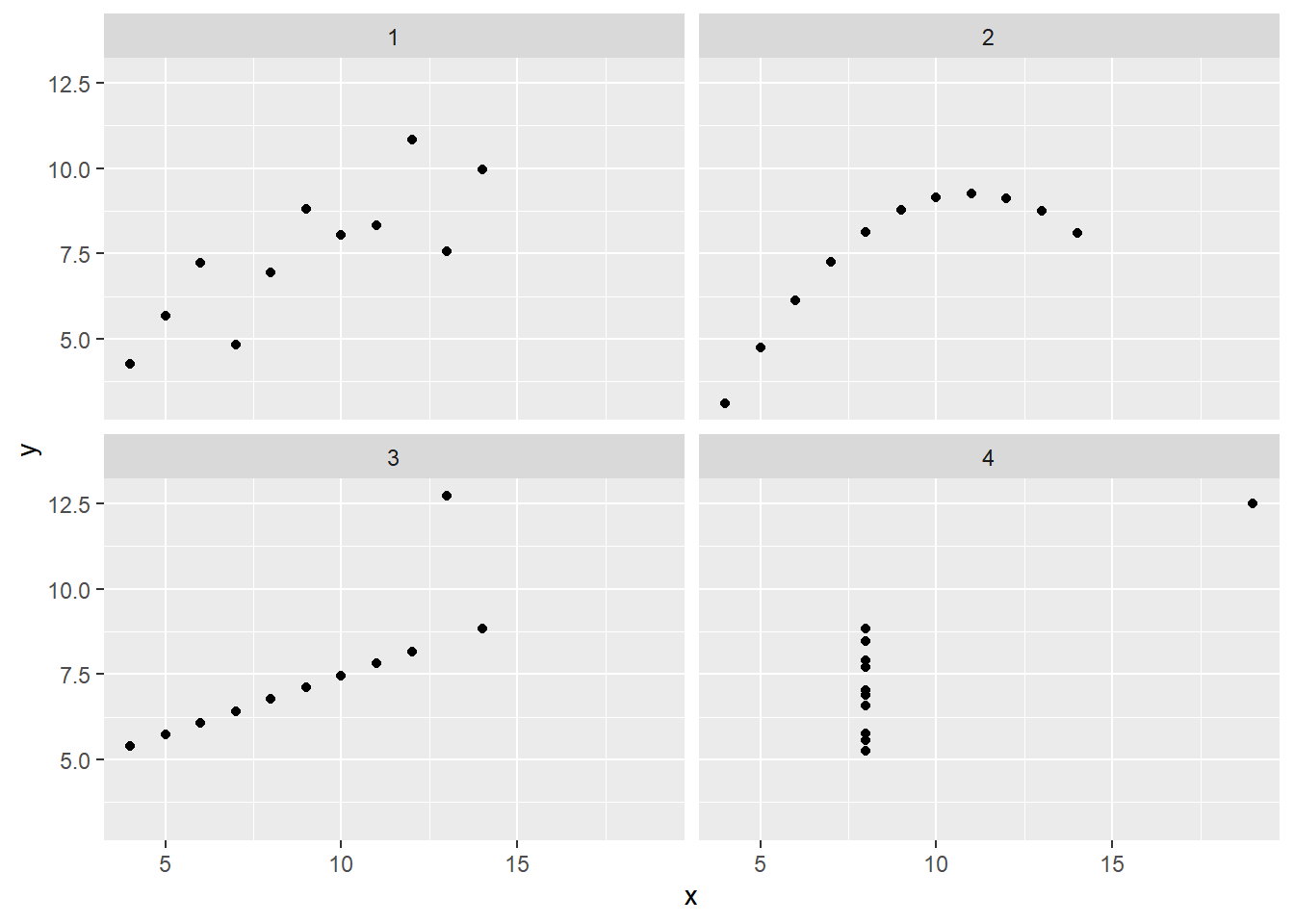
Anscombe’s Quartet
Recall Anscombe’s Quartet which we looked at last week. Recall that all of these models have identical summart statistics, and it turns out they all also have identical linear regression results:
Only the top left plot among these four datasets represents a statistical regression model: - The top right model represents a non-linear relationship, and one that seems to have no error - The bottom left plot is a straight line, with one possible recording error, but no statistical variation - The bottom right plot shows no relationship between \(x\) and \(y\) for most points, but there is one outlier, in both \(x\) and \(y\) that affects the estimated relationship.
The hard part is not writing the command lm(y~x). It is ensuring that the model adequately represents the data and the relationships within it Once you have convinced yourself, and others, that this is true then you can interpret and test hypotheses.
Evaluating Models
The residuals are defined as
\[
e_i = y_i - \hat{y}_i
\]
We can check the residuals for various behaviors to evaluate our model.
1.  Constant spread: the $e_i$'s have about the same spread regardless of the value of $x$
2.  Independence: Do the $e_i$'s show any signs of correlation.
3.  Symmetry and Unimodality: Do the $e_i$'s have an approximately symmetric distribution with a single mode.
4.  Normality: but that is often too strong a requirement.
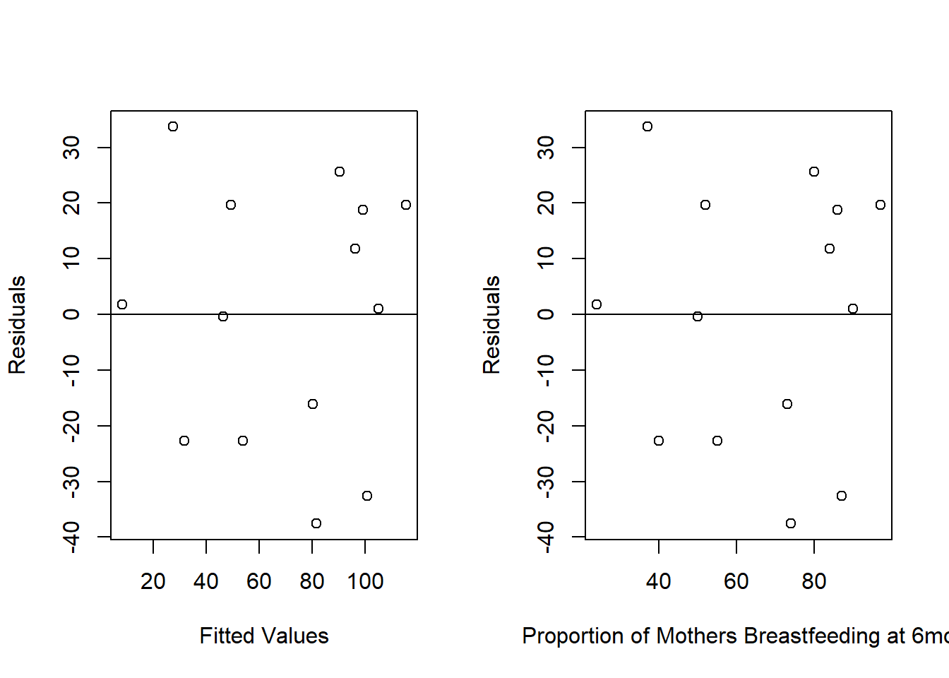
Residual Plots
We can plot the residuals (\(y\)-axis) against any covariates (\(x\)’s) and the predicted values (\(\hat{y}\)’s). We want to look for trends, such as increasing or decreasing variability (fans), and outliers. When data are collected over time, we sometimes look for relationships between successive residuals. We also want to be careful to not over-interpret data if we don’t have that much of it, as we saw last week when looking at insulin.
Let’s return to our child birth example and make a residual plot.
Extensions - non-linear models
So far we’ve only look at linear models. Fitting straight lines is fine, most of the time, as we know that complex relationships can be approximated by a straight line over a restricted set of values.
One option would be to add polynomials in our covariates
\[
y = \beta_0 + \beta_1 \cdot x + \beta_2 \cdot x^2 + \epsilon
\] However, these models have very strong assumptions and the effect of the polynomial terms on the fit can be large.
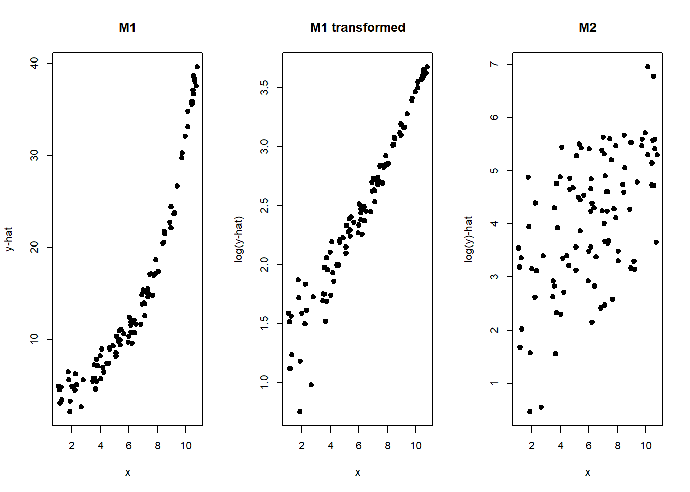
Another option is an exponential model. A straight line model is appropriate if \(y\) changes by a fixed amount for every unit change in \(x\). An exponential curve represents the case where \(y\) changes by a fixed percentage (or proportion) for every unit change in \(x\). We often see exponential models in economics.
The exponential model can be defined as:
\[
y = a \cdot e^{bx} \\
ln(y) = ln(a) + b \cdot x
\] Note that in the second equation, we’ve transformed the values by taking the natural log of both sides. Using this, we can fit an exponential model with linear regression if we transform\(y\). There are many other transformations of \(y\) that could be used and an extensive literature on choosing the best ones (Box-Cox transformation). However, a transformation of \(y\) will in general not just effect the mean relationship but it also affects the variability in your \(y\) values as a function of \(x\).
Thus, the models are not the same. If we take a look again at the exponential function and transformed function, now labeled M1 and M2, note that we would need the error to be multiplicative in M1 for them to be the same.
\[
M1: y = a \cdot e^{bx} + \epsilon \\
M2: ln(y) = ln(a) + b \cdot x + \epsilon \\
\epsilon \sim N(0, \sigma^2)
\]
There are two kinds of predictions that are interesting:
-   *Confidence interval*: predict the mean response for a given value of $x$
-   *Prediction interval*: predict the value of the response $y$ for an individual whose covariate is $x$
Almost all regression methods in R have prediction methods associated with them. Confidence intervals have less variability than prediction intervals.
Example: Confidence Interval vs Prediction Interval
Returning to our example on infant death
lm1 =lm(death~breast, data=infdeath)summary(lm1)
Call:
lm(formula = death ~ breast, data = infdeath)

Residuals:
    Min      1Q  Median      3Q     Max
-37.568 -21.047   1.368  19.479  33.705

Coefficients:
            Estimate Std. Error t value Pr(>|t|)
(Intercept)  -26.978     20.148  -1.339 0.205392
breast         1.467      0.288   5.093 0.000265 ***
---
Signif. codes:  0 '***' 0.001 '**' 0.01 '*' 0.05 '.' 0.1 ' ' 1

Residual standard error: 23.86 on 12 degrees of freedom
  (6 observations deleted due to missingness)
Multiple R-squared:  0.6837,    Adjusted R-squared:  0.6573
F-statistic: 25.94 on 1 and 12 DF,  p-value: 0.000265
We can predict the mean response for country where 62% of the women breast feed at 6 months using the `predict1 function.
Note how the lower and upper bounds are much tighter for the confidence interval than for the prediction interval.
Regressions using factors
As we’ve seen, a factor is a variable that takes on a discrete set of different values. These values can be unordered (e.g. Male/Female or European, Asian, African, etc.) or they can be ordered (age: less than 18, 18-40, more than 40). In regression models, we typically implement factors using dummy variables. Essentially we create a new set of variables using indicator functions, \(1_{Ai} = 1\) if observation \(i\) has the level \(A\).
Fitting factors in regression models
Suppose we have a factor with \(K\) levels We can fit factors in two ways
-   **M1:** includes an intercept in the model and then use $K-1$ indicator variables
-   **M2L=:** no intercept and use $K$ indicator variables.
In M1 the intercept is the mean value of \(y\), and each \(\beta_j\) is the difference in mean for the \(j^{th}\) retained factor level from the overall mean. In M2 each of the \(\beta_j\) is the mean value for \(y\) only within factor level \(j\).
To show an example, suppose our factor is sex, which has two levels, M and F. Our models could be
# Adding -1 tells R that we don't want an interceptlm2 =lm(heights ~ sex -1)summary(lm2)
Call:
lm(formula = heights ~ sex - 1)

Residuals:
    Min      1Q  Median      3Q     Max
-7.7290 -3.4115  0.5925  3.7202  5.9065

Coefficients:
     Estimate Std. Error t value Pr(>|t|)
sexF  68.0986     0.9463   71.97   <2e-16 ***
sexM  68.3868     0.9001   75.98   <2e-16 ***
---
Signif. codes:  0 '***' 0.001 '**' 0.01 '*' 0.05 '.' 0.1 ' ' 1

Residual standard error: 4.125 on 38 degrees of freedom
Multiple R-squared:  0.9965,    Adjusted R-squared:  0.9964
F-statistic:  5476 on 2 and 38 DF,  p-value: < 2.2e-16
Note that there are some issues you have to worry about when fitting a model without an intercept. With model M1 that has an intercept then for each group the test for \(H_0: \beta_j = 0\) tests whether that group mean is different from the mean for the group that was used to determine the intercept. However, in M2 the test for each group, \(H_0: \beta_j = 0\) is then comparing the mean for that group to zero (0). In M2, multiple-\(R^2\) does not have a reasonable interpretation, and we get a very high value.