library(scDiagnostics)

# Load your data (see Getting Data section for download instructions)
healthy_data <- readRDS("data/covid/normal_data_sce.rds")
covid_data <- readRDS("data/covid/covid_data_sce.rds")

# Verify both have logcounts
assayNames(healthy_data)
assayNames(covid_data)

# Verify both have annotations in colData
head(colData(healthy_data))
head(colData(covid_data))scDiagnostics Overview
What is scDiagnostics?
The Problem: Cell type annotation is a critical step in single-cell RNA-seq analysis. Most researchers use reference-based annotation tools (like SingleR or Azimuth) to automatically assign cell type labels to a new query dataset by comparing the query to a well-characterized reference datasets. However, such an annotation transfer typically only provides a cell type prediction and a confidence score for each query cell — further information as to the causes of prediction uncertainty, or whether the reference and query datasets are compatible enough and suitable for such an annotation transfer in the first place, is typically not provided.
The Solution: scDiagnostics provides systematic diagnostic tools to evaluate cell type annotation that is compatible with major annotation tools, and that complement and go beyond inspection of annotation confidence scores. The package helps to:
- Project Query onto the Reference - To identify structural agreements and disagreements between datasets in reduced dimensional space,
- Assess dataset alignment — Are the query and reference datasets similar enough for reliable annotation transfer?
- Detect anomalous cells — Identify cells that deviate from reference structure, suggesting novel cell states / types, batch effects, or annotation issues
- Characterize annotation anomalies — Determine which genes drive differences between query and reference, and whether these expression changes point to biological or technical factors
For an overview of the available functions, see the scDiagnostics reference page or the Bioconductor package landing page.
Before You Start: Input format & requirements
What You Need
scDiagnostics accepts the widely-used SingleCellExperiment (SCE) data format as input, providing integrated data containers for single-cell data in R/Bioconductor. You need:
- A reference SCE object — Expert-annotated dataset eg from reference-atlas collections such as the Human Cell Atlas
- A query SCE object — Single-cell data from a new experiment you want to analyze
- Both with log-normalized counts —
scDiagnosticsassumes data is log-transformed (typicallylogcountsassay of the SCE object) - Both with cell type annotations — Column(s) in
colData()containing cell type labels
Getting Started
TipStep 1: Install scDiagnostics and Required Dependencies
See the Setup & Installation page in the Data & Methods tab for detailed installation instructions.
TipStep 2: Obtain Pre-processed Data
Pre-processed reference and query SCE objects are available for download. See Data retrieval in the Data & Methods tab.
TipStep 3: Predict Cell Type Annotations
If your data doesn’t have cell type labels annotated yet, see Cell Type Annotation in the Data & Methods tab to learn how to run SingleR, Azimuth, CellTypist, or scArches.
TipStep 4: Prepare Data for Analysis
See COVID-19 Processing and MERFISH Processing for examples of data preprocessing workflows (QC filtering, normalization, PCA computation).
Quick Start Tutorial
Below is a simple, step-by-step workflow using COVID-19 PBMC data to demonstrate core scDiagnostics functionality.
Load Data and Verify Requirements
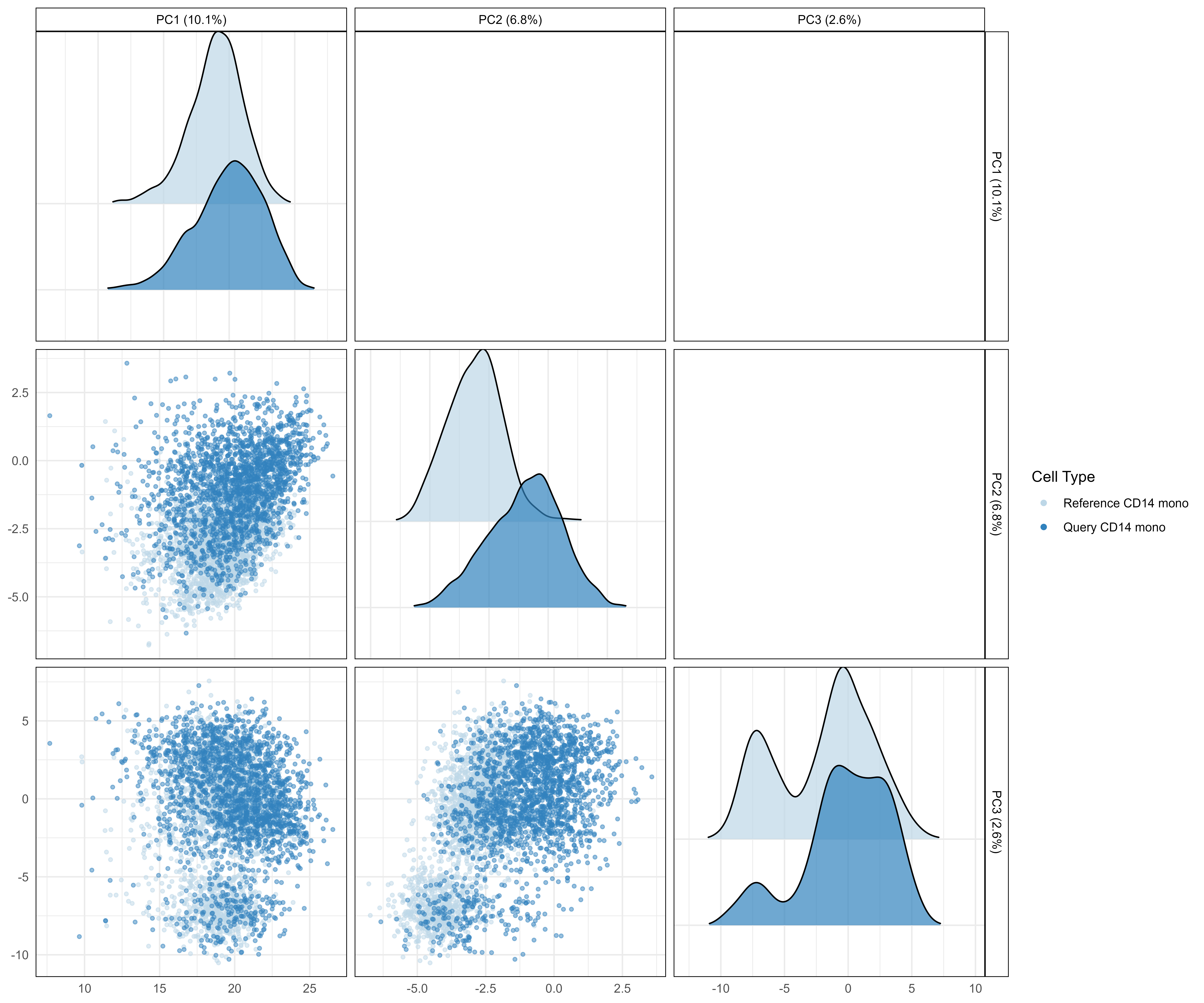
Step 1: Visualize Query vs. Reference in PCA Space
Visualize how the query cells project onto the reference PCA space to get an intuitive sense of dataset alignment and potential dataset incompatibility issues.
# Project query cells onto reference PCA space
pca_plot <- plotCellTypePCA(
    query_data = covid_data,
    reference_data = healthy_data,
    query_cell_type_col = "azimuth_celltype_l1_merged",
    ref_cell_type_col = "author_cell_type_merged",
    cell_types = "CD14 mono",
    pc_subset = 1:3
)

pca_plot
What to look for:
- Diagonal panels: Density distributions of principal components. Reference cells (blue) tightly clustered, query cells (purple) overlapping = good alignment
- Lower scatter panels: Individual cells plotted. Query cells (filled circles) nested within reference (hollow circles) = well-matched datasets
- Separated distributions: Query cells shifted far from reference = potential biological shift or technical incompatibility
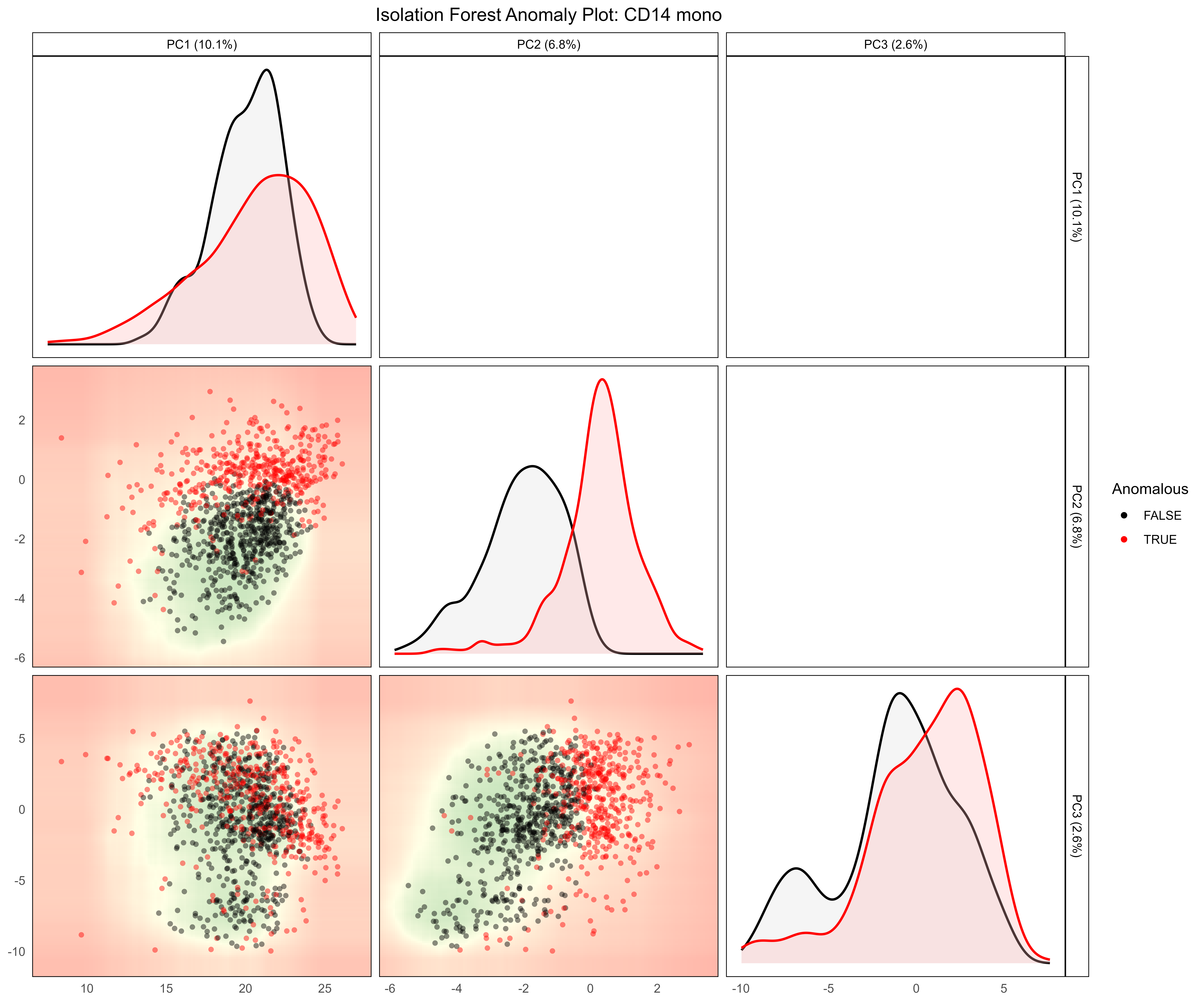
Step 2: Detect Anomalous Cells
Use isolation forests to identify cells deviating from the reference transcriptomic structure.
# Detect anomalies in query data
anomaly_results <- detectAnomaly(
    reference_data = healthy_data,
    query_data = covid_data,
    query_cell_type_col = "azimuth_celltype_l1_merged",
    ref_cell_type_col = "author_cell_type_merged",
    cell_types = "CD14 mono",
    pc_subset = 1:5,
    anomaly_threshold = 0.5,
)

# Visualize anomaly results
plot(anomaly_results,
     cell_type = "CD14 mono",
     pc_subset = 1:3,
     data_type = "query")
Interpretation:
- Red dots = Anomalous cells (deviate from reference structure)
- Green/black dots = Non-anomalous cells (match reference structure)
- Clustered anomalies = Coordinated biological response (e.g., disease activation)
- Scattered anomalies = Potential quality control issues
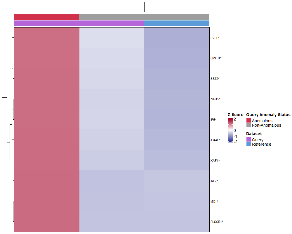
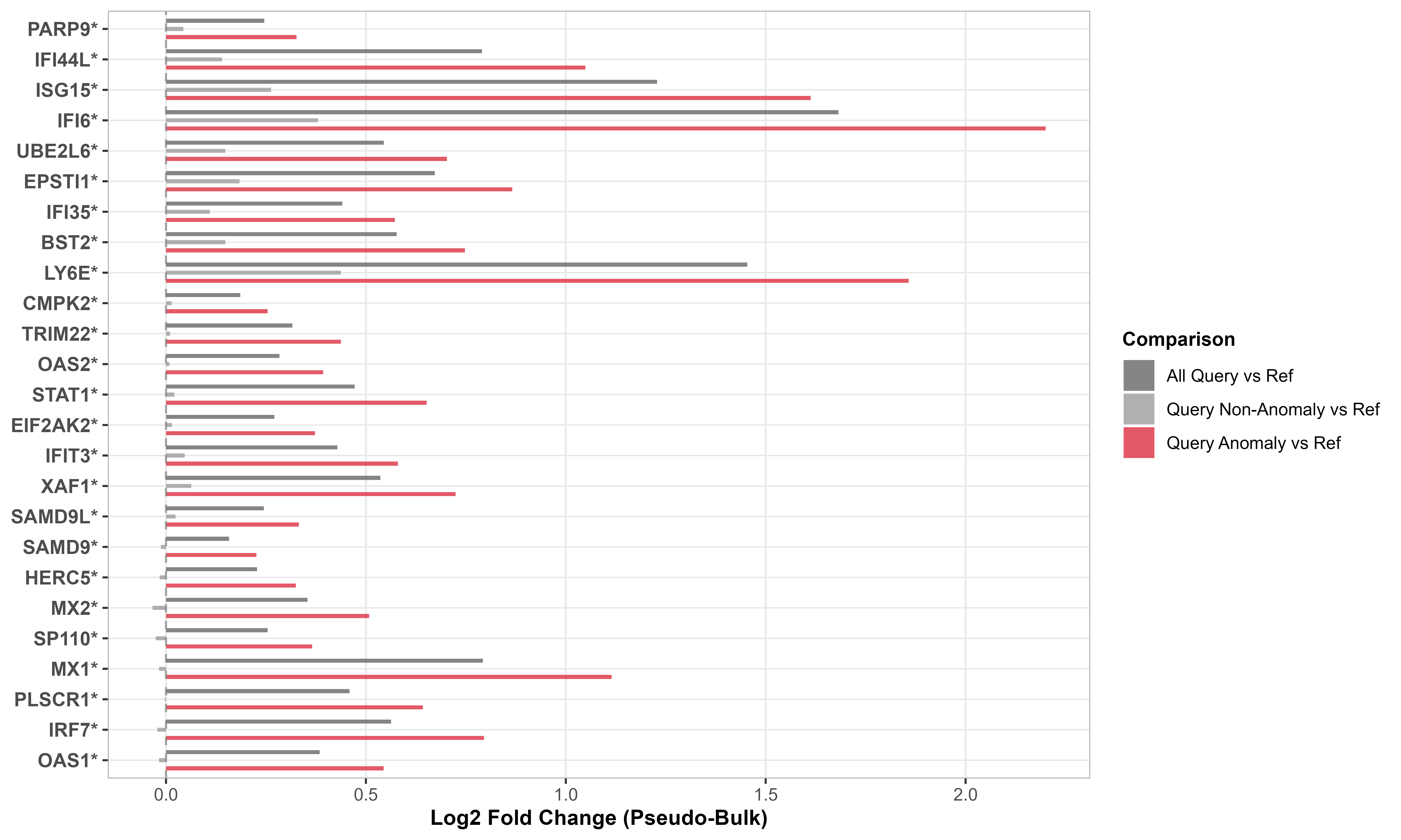
Step 3: Quantify Gene Expression Shifts
Identify which genes drive differences between query and reference using supervised analysis of interferon-stimulated genes.
# IFN-response gene signature from Yoshida et al
ifn_genes <- c(
    "BST2", "CMPK2", "EIF2AK2", "EPSTI1", "HERC5", "IFI35", "IFI44L",
    "IFI6", "IFIT3", "ISG15", "LY6E", "MX1", "MX2", "OAS1", "OAS2",
    "PARP9", "PLSCR1", "SAMD9", "SAMD9L", "SP110", "STAT1", "TRIM22",
    "UBE2L6", "XAF1", "IRF7"
)

# Subset to IFN genes only (supervised analysis)
healthy_data_ifn <- healthy_data[ifn_genes, ]
covid_data_ifn <- covid_data[ifn_genes, ]

# Calculate gene expression shifts
gene_shifts <- calculateGeneShifts(
    query_data = covid_data_ifn,
    reference_data = healthy_data_ifn,
    query_cell_type_col = "azimuth_celltype_l1_merged",
    ref_cell_type_col = "author_cell_type_merged",
    cell_types = "CD14 mono",
    pc_subset = 1:5,
    anomaly_threshold = 0.5,
    detect_anomalies = TRUE,
    anomaly_comparison = TRUE
)

# Visualize as heatmap
plot(gene_shifts,
     cell_type = "CD14 mono",
     plot_type = "heatmap")

# Visualize as barplot
plot(gene_shifts,
     cell_type = "CD14 mono",
     plot_type = "barplot")
What you see:
- Rows = Individual interferon-stimulated genes
- Columns = Stratified cell groups (all query, anomalous only, non-anomalous only)
- Red/warm colors = Upregulated genes in query
- Blue/cool colors = Downregulated genes in query
- Coordinated upregulation (entire pathway activated) = Likely interferon response to disease
- Pattern consistency between heatmap and barplot validates findings
Step 4: Interpret Results
Answer three questions based on diagnostics:
Q1: Are reference and query aligned?
- ✓ YES (overlapping PCA distributions) → Proceed with confidence
- ✗ NO (separated distributions) → Investigate batch effects before downstream analysis
Q2: Are there anomalous cells?
- ✓ Few (< 10%) → Data matches reference well
- ✗ Many (> 30%) → Major transcriptomic shift or reference mismatch
Q3: What drives anomalies?
- ✓ Coordinated pathways (gene modules shift together) → Likely biological signal (disease, activation)
- ✗ Scattered genes → May indicate quality issues or technical artifacts
Core Functions at a Glance
This tutorial demonstrates three foundational functions. scDiagnostics provides 20+ additional functions for in-depth analysis:
Visualization & Exploration
plotCellTypePCA()— PCA projections with density overlaysplotMarkerExpression()— Gene expression distributionsplotCellTypeMDS()— Alternative dimensionality reduction view
Dataset Alignment Assessment
calculateWassersteinDistance()— Statistical distance between distributionscomparePCASubspace()— Compare PC loadings between datasetscalculateAveragePairwiseCorrelation()— Cell-to-cell similarity scores
Anomaly & Outlier Detection
detectAnomaly()— Isolation forest-based anomaly scorescalculateCellDistances()— Individual cell distances to referencecalculateCellSimilarityPCA()— Similarity metrics per cell
Marker Gene Analysis
calculateGeneShifts()— Gene expression changescalculateVarImpOverlap()— Gene importance via random forestcompareMarkers()— Marker gene agreement between methods
Statistical Testing
calculateHotellingPValue()— Hotelling’s T² test on PCscalculateMMDPValue()— Maximum mean discrepancy testcalculateCramerPValue()— Cramer test on multivariate distributions
See the complete reference manual for individual function documentation and package website for additional analysis vignettes.
Full Analyses
We demonstrate scDiagnostics across three complementary analyses:
- Controlled validation with known ground truth
- Tests diagnostic functions on synthetic data
- Establishes baseline performance before real biological applications
- Apply validated diagnostics to severe COVID-19 infection
- Observe disease-driven transcriptomic shifts in real patient data
- Compare anomaly detection across four annotation methods
- Understand annotation quality in dense scRNA-seq context
- Extend diagnostics to spatial transcriptomics (targeted gene panels)
- Test anomaly detection on inflamed tissue with partial reference
- Demonstrate reproducibility across different single-cell technologies
- Show how anomaly detection identifies disease-associated cell states
Exploring Annotation Tool Diagnostics
- Investigate built-in confidence metrics from
SingleR,Azimuth,CellTypist,scArches - Compare tool diagnostics with
scDiagnosticsanomaly detection - Understand when tool confidence scores align (or diverge) with anomalies
- Learn which diagnostic signals are most informative for annotation quality assessment