Compare Principal Components Analysis (PCA) Results
Source:R/comparePCA.R, R/plot.comparePCAObject.R
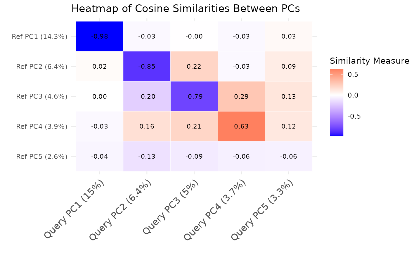
comparePCA.RdThis function compares the principal components (PCs) obtained from separate PCA on reference and query datasets for a single cell type using either cosine similarity or correlation.
The S3 plot method generates a heatmap to visualize the similarities between
principal components from the output of the comparePCA function.
Usage
comparePCA(
  query_data,
  reference_data,
  query_cell_type_col,
  ref_cell_type_col,
  pc_subset = 1:5,
  n_top_vars = 50,
  metric = c("cosine", "correlation"),
  correlation_method = c("spearman", "pearson"),
  n_permutations = 0
)

# S3 method for class 'comparePCAObject'
plot(
  x,
  show_values = TRUE,
  show_significance = TRUE,
  significance_threshold = 0.05,
  color_limits = NULL,
  ...
)
Arguments
- query_data
A
SingleCellExperimentobject containing numeric expression matrix for the query cells.- reference_data
A
SingleCellExperimentobject containing numeric expression matrix for the reference cells.- query_cell_type_col
The column name in the
colDataofquery_datathat identifies the cell types.- ref_cell_type_col
The column name in the
colDataofreference_datathat identifies the cell types.- pc_subset
A numeric vector specifying the subset of principal components (PCs) to compare. Default is the first five PCs.
- n_top_vars
An integer indicating the number of top loading variables to consider for each PC. Default is 50.
- metric
The similarity metric to use. It can be either "cosine" or "correlation". Default is "cosine".
- correlation_method
The correlation method to use if metric is "correlation". It can be "spearman" or "pearson". Default is "spearman".
- n_permutations
Number of permutations for statistical significance testing. If 0, no permutation test is performed. Default is 0.
- x
A
comparePCAObjectoutput from thecomparePCAfunction.- show_values
Logical, whether to display similarity values on the heatmap. Default is TRUE.
- show_significance
Logical, whether to display significance indicators (requires permutation test). Default is TRUE.
- significance_threshold
Numeric, p-value threshold for significance. Default is 0.05.
- color_limits
Numeric vector of length 2 specifying color scale limits. If NULL, uses data range.
- ...
Additional arguments passed to the plotting function.
Value
A list containing:
- similarity_matrix
A matrix comparing the principal components of the reference and query datasets.
- top_variables
A list containing the top loading variables for each PC pair comparison.
- p_values
A matrix of permutation p-values (if n_permutations > 0).
- metric
The similarity metric used.
- n_top_vars
Number of top variables used.
A ggplot object representing the heatmap of similarities.
Details
This function compares the PCA results between the reference and query datasets by computing cosine similarities or correlations between the loadings of top variables for each pair of principal components. It first extracts the PCA rotation matrices from both datasets and identifies the top variables with highest loadings for each PC. Then, it computes the cosine similarities or correlations between the loadings of top variables for each pair of PCs using vectorized operations for improved performance. The resulting matrix contains the similarity values, where rows represent reference PCs and columns represent query PCs.
The S3 plot method creates an enhanced heatmap visualization with options to display statistical significance and similarity values. The heatmap uses a blue-white-red color gradient for similarity values, and optionally overlays significance indicators.
Author
Anthony Christidis, anthony-alexander_christidis@hms.harvard.edu
Examples
# Load libraries
library(scran)
library(scater)

# Load data
data("reference_data")
data("query_data")

# Extract CD4 cells
ref_data_subset <- reference_data[, which(reference_data$expert_annotation == "CD4")]
query_data_subset <- query_data[, which(query_data$expert_annotation == "CD4")]

# Selecting highly variable genes (can be customized by the user)
ref_top_genes <- getTopHVGs(ref_data_subset, n = 500)
#> Warning: 'getTopHVGs' is deprecated.
#> Use 'scrapper::chooseHighlyVariableGenes' instead.
#> See help("Deprecated")
#> Warning: 'fitTrendVar' is deprecated.
#> Use 'scrapper::fitVarianceTrend' instead.
#> See help("Deprecated")
#> Warning: 'combineBlocks' is deprecated.
#> See help("Deprecated")
query_top_genes <- getTopHVGs(query_data_subset, n = 500)
#> Warning: 'getTopHVGs' is deprecated.
#> Use 'scrapper::chooseHighlyVariableGenes' instead.
#> See help("Deprecated")
#> Warning: 'fitTrendVar' is deprecated.
#> Use 'scrapper::fitVarianceTrend' instead.
#> See help("Deprecated")
#> Warning: 'combineBlocks' is deprecated.
#> See help("Deprecated")

# Intersect the gene symbols to obtain common genes
common_genes <- intersect(ref_top_genes, query_top_genes)
ref_data_subset <- ref_data_subset[common_genes,]
query_data_subset <- query_data_subset[common_genes,]

# Run PCA on datasets separately
ref_data_subset <- runPCA(ref_data_subset)
query_data_subset <- runPCA(query_data_subset)

# Call the PCA comparison function
similarity_mat <- comparePCA(query_data = query_data_subset,
                             reference_data = ref_data_subset,
                             query_cell_type_col = "expert_annotation",
                             ref_cell_type_col = "expert_annotation",
                             pc_subset = 1:5,
                             n_top_vars = 50,
                             metric = c("cosine", "correlation")[1],
                             correlation_method = c("spearman", "pearson")[1],
                             n_permutation = 100)
#> Performing 100 permutations for significance testing...

# Create the heatmap
plot(similarity_mat, show_significance = TRUE)