Visualization of Cell Type Annotations
Anthony Christidis
Core for Computational Biomedicine, Harvard Medical SchoolAndrew Ghazi
Core for Computational Biomedicine, Harvard Medical SchoolSmriti Chawla
Core for Computational Biomedicine, Harvard Medical SchoolNitesh Turaga
Core for Computational Biomedicine, Harvard Medical SchoolLudwig Geistlinger
Core for Computational Biomedicine, Harvard Medical SchoolRobert Gentleman
Core for Computational Biomedicine, Harvard Medical SchoolSource:
vignettes/VisualizationTools.Rmd
VisualizationTools.RmdIntroduction
This vignette demonstrates the use plotCellTypeMDS(),
plotCellTypePCA(), boxplotPCA() and
calculateDiscriminantSpace(), which are designed to help
assess and compare cell types between query and reference datasets using
Multidimensional Scaling (MDS) and Principal Component Analysis (PCA),
and Fisher Discriminant Analysis (FDA) respectively.
This vignette also demonstrates how to visualize gene expression data
from single-cell RNA sequencing (scRNA-seq) experiments using two
functions: plotGeneExpressionDimred() and
plotMarkerExpression(). These functions allow researchers
to explore gene expression patterns across various dimensions and
compare expression distributions between different datasets or cell
types.
Lastly this vignette will demonstrate how to visualize quality control (QC) scores and annotation scores, potentially identifying relationship between QC statistics (e.g., total library size or percentage of mitochondrial genes) and cell type annotation scores.
Preliminaries
In the context of the scDiagnostics package, this
vignette illustrates how to evaluate cell type annotations using two
distinct datasets:
reference_data: This dataset consists of meticulously curated cell type annotations assigned by experts, providing a robust benchmark for assessing the quality of annotations. It serves as a standard reference to evaluate and detect anomalies or inconsistencies within the cell type annotations.query_data: This dataset includes annotations both from expert assessments and those generated by the SingleR package. By comparing these annotations, you can identify discrepancies between manual and automated results, thereby pinpointing potential inconsistencies or areas that may need further scrutiny.qc_data: This dataset includes data from haematopoietic stem and progenitor cells, including QC metrics like library size and mitochondrial content, SingleR-predicted cell types and annotation scores indicating prediction confidence.
Visualization of Query vs. Reference Dataset
Plot Reference and Query Cell Types Using MDS
The plotCellTypeMDS() function creates a scatter plot
using Multidimensional Scaling (MDS) to visualize the similarity between
cell types in query and reference datasets. This function generates a
MDS plot that colors cells according to their types based on a
dissimilarity matrix calculated from a specified gene set.
# Generate the MDS scatter plot with cell type coloring
plotCellTypeMDS(query_data = query_data,
                reference_data = reference_data,
                cell_types = c("CD4", "CD8", "B_and_plasma", "Myeloid"),
                query_cell_type_col = "SingleR_annotation",
                ref_cell_type_col = "expert_annotation")
#> Computing MDS from expression data.
Plot Principal Components for Different Cell Types
The plotCellTypePCA() function projects the query
dataset onto the PCA space of the reference dataset. It then plots
specified principal components for different cell types, allowing
comparison of PCA results between query and reference datasets.
# Generate the MDS scatter plot with cell type coloring
plotCellTypePCA(query_data = query_data,
                reference_data = reference_data,
                cell_types = c("CD4", "CD8", "B_and_plasma", "Myeloid"),
                query_cell_type_col = "SingleR_annotation",
                ref_cell_type_col = "expert_annotation",
                pc_subset = 1:3)
#> Picking joint bandwidth of 0.503
#> Picking joint bandwidth of 0.502
#> Picking joint bandwidth of 0.462
Here, plotCellTypePCA() projects the query data into the
PCA space of the reference data and plots the specified principal
components. The pc_subset argument allows you to select
which principal components to display.
Plot Principal Components as Boxplots
The boxplotPCA() function provides a boxplot
visualization of principal components for different cell types across
query and reference datasets. This function helps in comparing the
distributions of PCA scores for specified cell types and datasets.
# Plot the PCA data as boxplots
boxplotPCA(query_data = query_data,
           reference_data = reference_data,
           cell_types = c("CD4", "CD8", "B_and_plasma", "Myeloid"),
           query_cell_type_col = "SingleR_annotation",
           ref_cell_type_col = "expert_annotation",
           pc_subset = 1:3)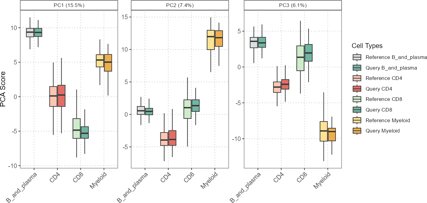
In this example, boxplotPCA() generates boxplots for the
specified principal components, showing the distribution of PCA scores
for different cell types and datasets.
Project Query Data onto Discriminant Space of Reference Data
The calculateDiscriminantSpace() function projects query
single-cell RNA-seq data onto a discriminant space defined by reference
data. This process involves using the reference data to identify key
variables, compute discriminant vectors, and project both the reference
and query data onto this space. The function then assesses the
similarity between the projections of the query data and the reference
data using cosine similarity and Mahalanobis distance.
Function Details
The function performs the following steps for each pairwise combination of cell types:
- Identify Important Variables: Determine the most significant variables that distinguish the two cell types from the reference data.
- Compute Covariance Matrices: Estimate the covariance matrices for each cell type using the Ledoit-Wolf shrinkage method.
- Construct Scatter Matrices: Create within-class and between-class scatter matrices.
- Solve Eigenvalue Problem: Solve the generalized eigenvalue problem to obtain discriminant vectors.
- Project Data: Project both reference and query data onto the discriminant space.
- Assess Similarity: Measure the similarity of the query data projections to the reference projections using cosine similarity and Mahalanobis distance.
Example Application
First, applying the function to the SingleR
annotation.
# Compute important variables for all pairwise cell comparisons
disc_output <- calculateDiscriminantSpace(
  reference_data = reference_data,
  query_data = query_data,
  query_cell_type_col = "SingleR_annotation",
  ref_cell_type_col = "expert_annotation")

# Generate scatter and boxplot
plot(disc_output, plot_type = "scatterplot")
#> Picking joint bandwidth of 0.107
#> Picking joint bandwidth of 0.167
#> Picking joint bandwidth of 0.164
Using Mahalanobis Distance for Anomaly Detection in Single-Cell RNA-Seq Data
We aim to evaluate whether a new batch of query cells fits well
within established reference cell types or if there are cells exhibiting
unusual characteristics. We will use the Mahalanobis distance calculated
by the calculateDiscriminantSpace() function to achieve
this.
# Perform discriminant analysis and projection
discriminant_results <- calculateDiscriminantSpace(
  reference_data = reference_data,
  query_data = query_data,
  ref_cell_type_col = "expert_annotation",
  query_cell_type_col = "SingleR_annotation",
  calculate_metrics = TRUE,  # Compute Mahalanobis distance and cosine similarity
  alpha = 0.01  # Significance level for Mahalanobis distance cutoff
)
You can extract and analyze the Mahalanobis distances of query cells relative to reference cell types. High Mahalanobis distances may indicate potential anomalies or novel cell states.
# Extract Mahalanobis distances
mahalanobis_distances <- discriminant_results$query_mahalanobis_dist

# Identify anomalies based on a threshold
threshold <- discriminant_results$mahalanobis_crit  # Use the computed cutoff value
anomalies <- mahalanobis_distances[mahalanobis_distances > threshold]
You can now create visualizations to illustrate the distribution of Mahalanobis distances and highlight potential anomalies.
# Load ggplot2 for visualization
library(ggplot2)

# Convert distances to a data frame
distances_df <- data.frame(Distance = mahalanobis_distances,
                           Anomaly = ifelse(mahalanobis_distances > threshold, "Anomaly", "Normal"))

# Plot histogram of Mahalanobis distances
ggplot(distances_df, aes(x = Distance, fill = Anomaly)) +
  geom_histogram(binwidth = 0.5, position = "identity", alpha = 0.7) +
  labs(title = "Histogram of Mahalanobis Distances",
       x = "Mahalanobis Distance",
       y = "Frequency") +
  theme_bw()
Low Mahalanobis Distances: These query cells align well with the reference cell types, suggesting they are similar to the established cell types.
High Mahalanobis Distances: Cells with high distances may represent outliers or novel, previously uncharacterized cell types. Further investigation may be needed to understand these anomalies.
Project Data onto Sliced Inverse Regression (SIR) Space of Reference Data
The calculateSIRSpace() function leverages Sliced
Inverse Regression (SIR) to analyze high-dimensional cell type data by
focusing on the directions that best separate different cell types and
their subtypes. The function projects data onto a lower-dimensional SIR
space, aiming to highlight the most informative features for
distinguishing between cell types.
The process starts by handling each cell type as a distinct slice of
the data, allowing for a more detailed analysis. When
multiple_cond_means is set to TRUE, the
function refines this by computing conditional means for each cell type,
using clustering to capture finer distinctions within each type. It then
performs Singular Value Decomposition (SVD) on these refined means to
uncover the principal directions that most effectively differentiate the
cell types.
Ultimately, the function provides projections that reveal how cell types and their subtypes relate to each other in a reduced space, facilitating a deeper understanding of cellular variability and distinctions in complex datasets.
# Calculate the SIR space projections
sir_output <- calculateSIRSpace(
  reference_data = reference_data,
  query_data = query_data,
  query_cell_type_col = "SingleR_annotation",
  ref_cell_type_col = "expert_annotation",
  multiple_cond_means = TRUE
)

# Plot the SIR space projections
plot(sir_output,
     sir_subset = 1:5,
     cell_types = c("CD4", "CD8", "B_and_plasma", "Myeloid"),
     lower_facet = "scatter",
     diagonal_facet = "boxplot",
     upper_facet = "blank")
In this example, we compute the SIR space projections using the
calculateSIRSpace() function, and then we visualize the
projections with a boxplot to analyze the distribution of the data in
the SIR space. This example helps you understand how different cell
types and their subtypes are projected into a common space, facilitating
their comparison and interpretation.
The plot below visualizes the contribution of different markers to the variance along the SIR dimensions, helping identify which markers are most influential in differentiating e.g. between B cells (including plasma cells) from other cell types.
# Plot the top contributing markers
plot(sir_output,
     plot_type = "loadings",
     sir_subset = 1:5,
     n_top = 10)
Visualization of Marker Expressions
Visualizing Gene Expression in Reduced Dimensions
The plotGeneExpressionDimred() function plots the
expression of a specific gene on a dimensional reduction plot. This
function is useful for exploring how gene expression varies across cells
in the context of reduced dimensions, such as those derived from PCA,
t-SNE, or UMAP. Each point on the plot represents a single cell,
color-coded according to the expression level of the specified gene.
Let’s visualize the expression of the gene NKG7 for CD4 on a PCA plot:
# Visualize VPREB3 gene on a PCA plot
plotGeneExpressionDimred(sce_object = query_data,
                         method = "PCA",
                         pc_subset = 1:5,
                         feature = "NKG7",
                         cell_types = "CD4",
                         cell_type_col = "SingleR_annotation")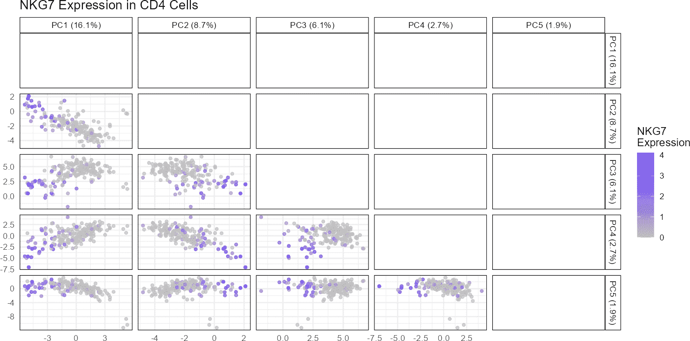
In this example, we visualize the expression of the
NKG7 gene on a PCA plot derived from the
query_data dataset. The method argument
specifies the dimensional reduction technique, which in this case is
“PCA.” The pc_subset argument allows us to focus on
specific principal components (PCs), here selecting the first five. The
feature argument is the name of the gene we want to
visualize.
When executed, this function generates a scatter plot with cells colored by their expression levels of NKG7. The resulting plot can help identify clusters of cells with similar expression patterns or highlight how expression varies across the dataset.
You can also visualize gene expression using other dimensional reduction methods, such as t-SNE or UMAP.
Plotting Gene Expression Distribution
The plotMarkerExpression() function compares the
distribution of a specific gene’s expression across an overall dataset
and within specific cell types. It generates density plots to visualize
these distributions, providing a graphical means of assessing the
similarity between reference and query datasets. The function also
applies a z-rank normalization to make expression values comparable
between datasets.
plotMarkerExpression(
    reference_data = reference_data,
    query_data = query_data,
    ref_cell_type_col = "expert_annotation",
    query_cell_type_col = "SingleR_annotation",
    gene_name = "NKG7",
    cell_type = "CD4",
    normalization = "z_score"
)
#> Picking joint bandwidth of 0.294
#> Picking joint bandwidth of 0.234
In this example, the function compares the expression distribution of
the VPREB3 gene between the reference and query
datasets. The ref_cell_type_col and
query_cell_type_col arguments specify the columns in
colData that identify the cell types in the reference and
query datasets, respectively. The cell_type argument
specifies the cell type of interest, and gene_name is the
gene whose expression distribution we wish to compare.
When executed, this function generates two density plots: one showing the overall gene expression distribution across all cells and another focusing on the specified cell type. These plots help identify whether the gene’s expression levels are similar between the reference and query datasets, providing insight into dataset alignment.
Visualization of QC and Annotation Scores
Scatter Plot: QC Stats vs Cell Type Annotation Scores
The scatter plot visualizes the relationship between QC statistics (e.g., total library size or percentage of mitochondrial genes) and cell type annotation scores. This plot helps in understanding how QC metrics influence or correlate with the predicted cell types.
# Remove cell types with very few cells
qc_data_subset <- qc_data[, !(qc_data$SingleR_annotation
                              %in% c("Chondrocytes", "DC",
                                     "Neurons","Platelets"))]

# Generate scatter plot
p1 <- plotQCvsAnnotation(sce_object = qc_data_subset,
                         cell_type_col = "SingleR_annotation",
                         qc_col = "total",
                         score_col = "annotation_scores")
p1 + ggplot2::xlab("Library Size")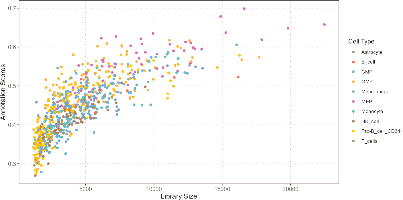
A scatter plot can reveal patterns such as whether cells with higher library sizes or mitochondrial content tend to be associated with specific annotations. For instance, cells with unusually high mitochondrial content might be identified as low-quality or stressed, potentially affecting their annotations.
Histograms: QC Stats and Annotation Scores Visualization
Histograms provide a distribution view of QC metrics and annotation scores. They help in evaluating the range, central tendency, and spread of these variables across cells.
# Generate histograms
histQCvsAnnotation(sce_object = query_data,
                   cell_type_col = "SingleR_annotation",
                   qc_col = "percent_mito",
                   score_col = "annotation_scores")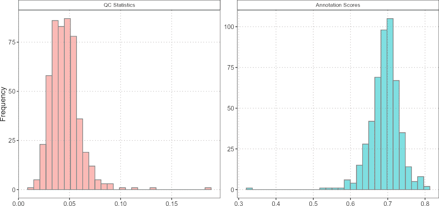
Histograms are useful for assessing the overall distribution of QC metrics and annotation scores. For example, if the majority of cells have high percent_mito, it might indicate that many cells are stressed or dying, which could impact the quality of the data.
Visualization of Gene Sets or Pathway Scores on Dimensional Reduction Plots
Dimensional reduction plots (PCA, t-SNE, UMAP) are used to visualize the relationships between cells in reduced dimensions. Overlaying gene set scores on these plots provides insights into how specific gene activities are distributed across cell clusters.
# Plot gene set scores on PCA
plotGeneSetScores(sce_object = query_data,
                  cell_type_col = "SingleR_annotation",
                  cell_types = "CD8",
                  method = "PCA",
                  score_col = "gene_set_scores",
                  pc_subset = 1:3)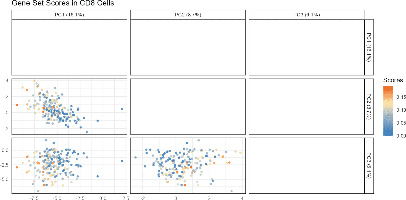
By visualizing gene set scores on PCA or UMAP plots, one can identify clusters of cells with high or low gene set activities. This can help in understanding the biological relevance of different gene sets or pathways in various cell states or types.
R Session Info
R version 4.6.1 (2026-06-24)
Platform: x86_64-pc-linux-gnu
Running under: Ubuntu 24.04.4 LTS

Matrix products: default
BLAS:   /usr/lib/x86_64-linux-gnu/openblas-pthread/libblas.so.3
LAPACK: /usr/lib/x86_64-linux-gnu/openblas-pthread/libopenblasp-r0.3.26.so;  LAPACK version 3.12.0

locale:
 [1] LC_CTYPE=C.UTF-8       LC_NUMERIC=C           LC_TIME=C.UTF-8
 [4] LC_COLLATE=C.UTF-8     LC_MONETARY=C.UTF-8    LC_MESSAGES=C.UTF-8
 [7] LC_PAPER=C.UTF-8       LC_NAME=C              LC_ADDRESS=C
[10] LC_TELEPHONE=C         LC_MEASUREMENT=C.UTF-8 LC_IDENTIFICATION=C

time zone: UTC
tzcode source: system (glibc)

attached base packages:
[1] stats     graphics  grDevices utils     datasets  methods   base

other attached packages:
[1] ggplot2_4.0.3       scDiagnostics_1.7.2 BiocStyle_2.40.0

loaded via a namespace (and not attached):
 [1] SummarizedExperiment_1.42.0 gtable_0.3.6
 [3] xfun_0.59                   bslib_0.11.0
 [5] htmlwidgets_1.6.4           Biobase_2.72.0
 [7] GGally_2.4.0                lattice_0.22-9
 [9] vctrs_0.7.3                 tools_4.6.1
[11] generics_0.1.4              parallel_4.6.1
[13] stats4_4.6.1                tibble_3.3.1
[15] cluster_2.1.8.2             BiocNeighbors_2.6.0
[17] pkgconfig_2.0.3             Matrix_1.7-5
[19] RColorBrewer_1.1-3          S7_0.2.2
[21] desc_1.4.3                  S4Vectors_0.50.1
[23] ggridges_0.5.7              lifecycle_1.0.5
[25] compiler_4.6.1              farver_2.1.2
[27] textshaping_1.0.5           bluster_1.22.0
[29] codetools_0.2-20            Seqinfo_1.2.0
[31] htmltools_0.5.9             sass_0.4.10
[33] yaml_2.3.12                 tidyr_1.3.2
[35] pkgdown_2.2.0               pillar_1.11.1
[37] jquerylib_0.1.4             BiocParallel_1.46.0
[39] SingleCellExperiment_1.34.0 DelayedArray_0.38.2
[41] cachem_1.1.0                abind_1.4-8
[43] ggstats_0.13.0              tidyselect_1.2.1
[45] digest_0.6.39               purrr_1.2.2
[47] dplyr_1.2.1                 bookdown_0.47
[49] labeling_0.4.3              fastmap_1.2.0
[51] grid_4.6.1                  cli_3.6.6
[53] SparseArray_1.12.2          magrittr_2.0.5
[55] S4Arrays_1.12.0             withr_3.0.3
[57] scales_1.4.0                rmarkdown_2.31
[59] XVector_0.52.0              matrixStats_1.5.0
[61] igraph_2.3.3                otel_0.2.0
[63] ranger_0.18.0               ragg_1.5.2
[65] evaluate_1.0.5              knitr_1.51
[67] GenomicRanges_1.64.0        IRanges_2.46.0
[69] rlang_1.3.0                 Rcpp_1.1.2
[71] glue_1.8.1                  BiocManager_1.30.27
[73] BiocGenerics_0.58.1         jsonlite_2.0.0
[75] R6_2.6.1                    MatrixGenerics_1.24.0
[77] systemfonts_1.3.2           fs_2.1.0