Visualizing data with matplotlib and seaborn
Last updated on 2023-04-27 | Edit this page
Overview
Questions
- How can I plot my data?
- How can I save my plot for publishing?
Objectives
- Visualize list-type data using matplotlib.
- Visualize dataframe data with matplotlib and seaborn.
- Customize plot aesthetics.
- Create publication-ready plots for a particular context.
Key Points
-
matplotlibis the most widely used scientific plotting library in Python. - Plot data directly from a Pandas dataframe.
- Select and transform data, then plot it.
- Many styles of plot are available: see the Python Graph Gallery for more options.
- Seaborn extends matplotlib and provides useful defaults and integration with dataframes.
matplotlib is the
most widely used scientific plotting library in Python.
- Commonly use a sub-library called
matplotlib.pyplot. - The Jupyter Notebook will render plots inline by default.
- Simple plots are then (fairly) simple to create.
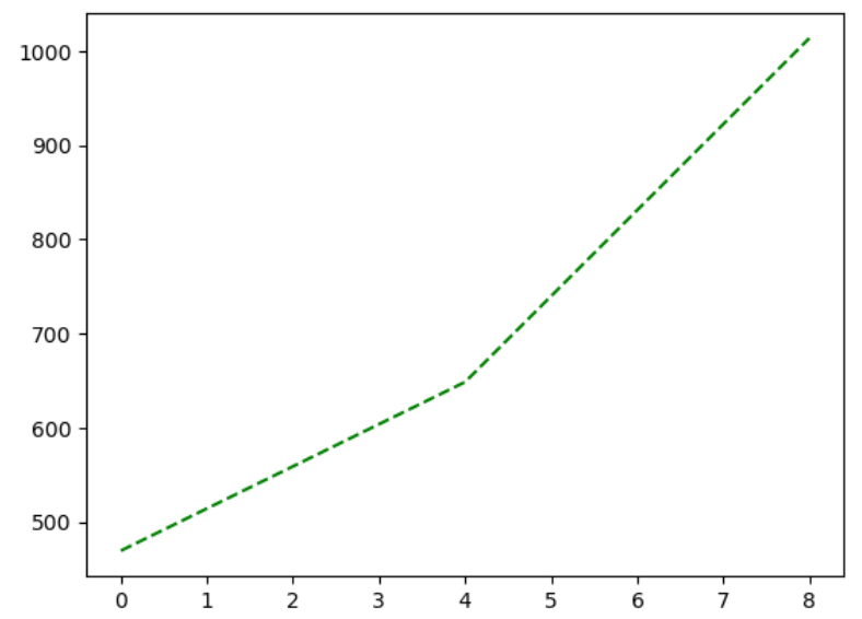
PYTHON
time = [0, 1, 2, 3]
position = [0, 100, 200, 300]

plt.plot(time, position)
plt.xlabel('Time (hr)')
plt.ylabel('Position (km)')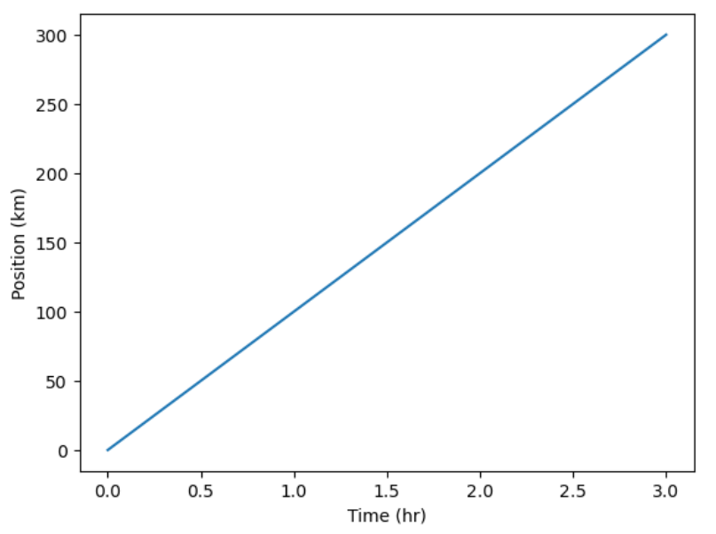
Display All Open Figures
In our Jupyter Notebook example, running the cell should generate the figure directly below the code. The figure is also included in the Notebook document for future viewing. However, other Python environments like an interactive Python session started from a terminal or a Python script executed via the command line require an additional command to display the figure.
Instruct matplotlib to show a figure:
This command can also be used within a Notebook - for instance, to display multiple figures if several are created by a single cell.
Plot data directly from a Pandas dataframe.
- We can also plot Pandas dataframes.
- This implicitly uses
matplotlib.pyplot.
PYTHON
import pandas as pd

url = "https://raw.githubusercontent.com/ccb-hms/workbench-python-workshop/main/episodes/data/rnaseq.csv"
rnaseq_df = pd.read_csv(url, index_col=0)

rnaseq_df.loc[:,'expression'].plot(kind = 'hist')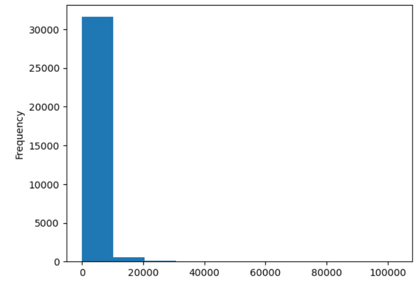
Select and transform data, then plot it.
- By default,
DataFrame.plotplots with the rows as the X axis. - We can transform the data to plot multiple samples.
PYTHON
expression_matrix = rnaseq_df.pivot_table(columns = "time", values = "expression", index="gene")
expression_matrix.plot(kind="box", logy=True)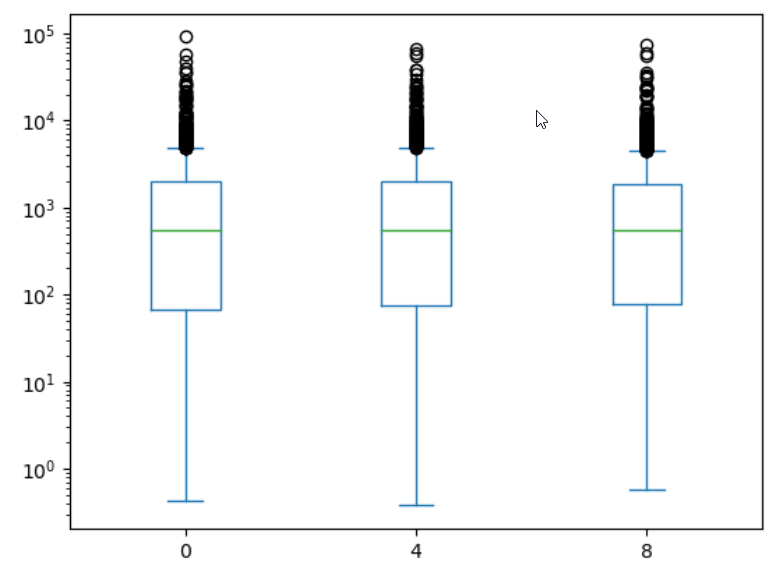
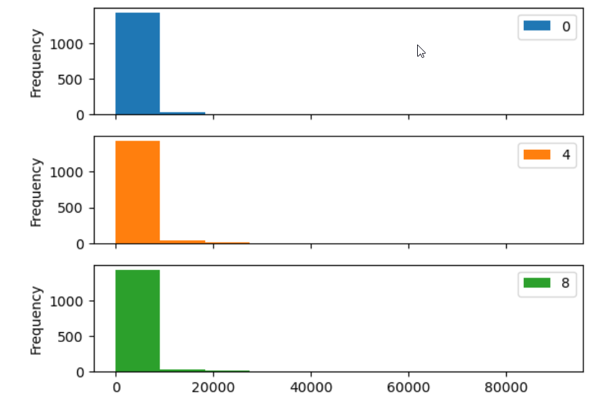
Many plot options are available.
- For example, we can use the
subplotsargument to separate our plot automatically by column.
Data can also be plotted by calling the matplotlib
plot function directly.
- The command is
plt.plot(x, y) - The color and format of markers can also be specified as an
additional optional argument e.g.,
b-is a blue line,g--is a green dashed line.
You can plot many sets of data together.
PYTHON
plt.plot(expression_matrix.loc['Asl'], 'g--', label = 'Asl')
plt.plot(expression_matrix.loc['Apod'], 'r-', label = 'Apod')
plt.plot(expression_matrix.loc['Cyp2d22'], 'b-', label = 'Cyp2d22')
plt.plot(expression_matrix.loc['Klk6'], 'b--', label = 'Klk6')

# Create legend.
plt.legend(loc='upper left')
plt.xlabel('Time (days)')
plt.ylabel('Mean Expression')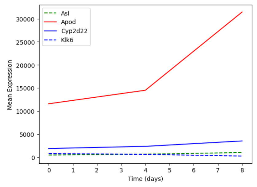
Adding a Legend
Often when plotting multiple datasets on the same figure it is desirable to have a legend describing the data.
This can be done in matplotlib in two stages:
- Provide a label for each dataset in the figure:
PYTHON
plt.plot(expression_matrix.loc['Asl'], 'g--', label = 'Asl')
plt.plot(expression_matrix.loc['Apod'], 'r-', label = 'Apod')- Instruct
matplotlibto create the legend.
By default matplotlib will attempt to place the legend in a suitable
position. If you would rather specify a position this can be done with
the loc= argument, e.g to place the legend in the upper
left corner of the plot, specify loc='upper left'
Seaborn provides more integrated plotting with Pandas and useful defaults
Seaborn is a
plotting library build ontop of matplotlib.pyplot. It
provides higher-level functions for creating high quality data
visualizations, and easily integrates with pandas dataframes.
Let’s see what a boxplot looks like using seaborn.
PYTHON
import seaborn as sns
import numpy as np

#Use seaborn default styling
sns.set_theme()

#Add a log expression column with a pseudocount of 1
rnaseq_df = rnaseq_df.assign(log_exp = np.log2(rnaseq_df["expression"]+1))

sns.boxplot(data = rnaseq_df, x = "time", y = "log_exp")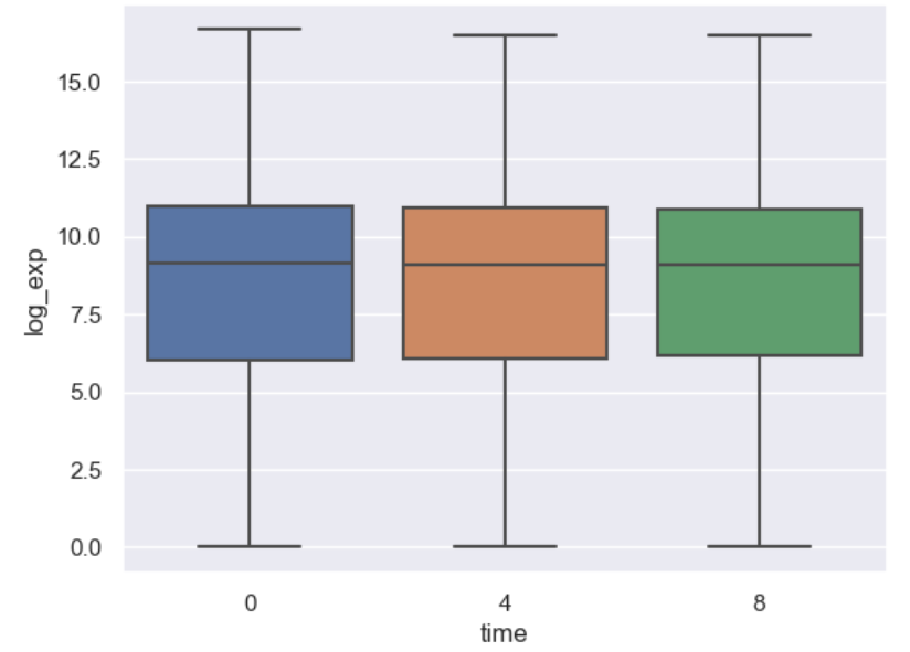
Instead of providing data to x and y directly, with seaborn we
instead give it a dataframe with the data argument, then
tell seaborn which columns of the dataframe we want to be used for each
axis.
Notice that we don’t have to give reshaped data to seaborn, it aggregates our data for us. However, we still have to do more complicated transformations ourselves.
Scenario: log foldchange scatterplot
Imagine we want to compare how different genes behave at different timepoints, and we are expecially interested if genes on any chromosome or of a specific type stnad out. Let’s make a scatterplot of the log-foldchange of our genes step-by-step.
Prepare the data
First, we need to aggregate our data. We could join
expression_matrix with the columns we want from
rnaseq_df, but instead let’s re-pivot our data and bring
gene_biotype and chromosome_name along.
PYTHON
time_matrix = rnaseq_df.pivot_table(columns = "time", values = "log_exp", index=["gene", "chromosome_name", "gene_biotype"])
time_matrix = time_matrix.reset_index(level=["chromosome_name", "gene_biotype"])
print(time_matrix)
OUTPUT
time     chromosome_name    gene_biotype          0          4          8
gene
AI504432               3          lncRNA  10.010544  10.085962   9.974814
AW046200               8          lncRNA   7.275920   7.226188   6.346325
AW551984               9  protein_coding   7.860330   7.264752   8.194396
Aamp                   1  protein_coding  12.159714  12.235069  12.198784
Abca12                 1  protein_coding   2.509810   2.336441   2.329376
...                  ...             ...        ...        ...        ...
Zkscan3               13  protein_coding  11.031923  10.946440  10.696602
Zranb1                 7  protein_coding  12.546820  12.646836  12.984985
Zranb3                 1  protein_coding   7.582472   7.611006   7.578124
Zscan22                7  protein_coding   9.239555   9.049392   8.689101
Zw10                   9  protein_coding  10.586751  10.598198  10.524456

[1474 rows x 5 columns]
Dataframes practice
Starting with time_matrix, add new columns for the log
foldchange from 0 to 4 hours and one with the log foldchange from 0 to 8
hours.
We already have the mean log expression each gene at each timepoint. We need to calculate the foldchange.
PYTHON
# We have to use loc here since our column name is a number
time_matrix["logfc_0_4"] = time_matrix.loc[:,4] - time_matrix.loc[:,0]
time_matrix["logfc_0_8"] = time_matrix.loc[:,8] - time_matrix.loc[:,0]
print(time_matrix)
OUTPUT
time     chromosome_name    gene_biotype          0          4          8  \
gene
AI504432               3          lncRNA  10.010544  10.085962   9.974814
AW046200               8          lncRNA   7.275920   7.226188   6.346325
AW551984               9  protein_coding   7.860330   7.264752   8.194396
Aamp                   1  protein_coding  12.159714  12.235069  12.198784
Abca12                 1  protein_coding   2.509810   2.336441   2.329376
...                  ...             ...        ...        ...        ...
Zkscan3               13  protein_coding  11.031923  10.946440  10.696602
Zranb1                 7  protein_coding  12.546820  12.646836  12.984985
Zranb3                 1  protein_coding   7.582472   7.611006   7.578124
Zscan22                7  protein_coding   9.239555   9.049392   8.689101
Zw10                   9  protein_coding  10.586751  10.598198  10.524456

time      logfc_0_4  logfc_0_8
gene
AI504432   0.075419  -0.035730
AW046200  -0.049732  -0.929596
AW551984  -0.595578   0.334066
Aamp       0.075354   0.039070
Abca12    -0.173369  -0.180433
...             ...        ...
Zkscan3   -0.085483  -0.335321
Zranb1     0.100015   0.438165
Zranb3     0.028535  -0.004348
Zscan22   -0.190164  -0.550454
Zw10       0.011447  -0.062295

[1474 rows x 7 columns]
Note that we could have first calculate foldchange and then log transform it, but performing subtraction is more precise than division in most programming languages, so log transforming first is preferred.
Making an effective scatterplot
Now we can make a scatterplot of the foldchanges.
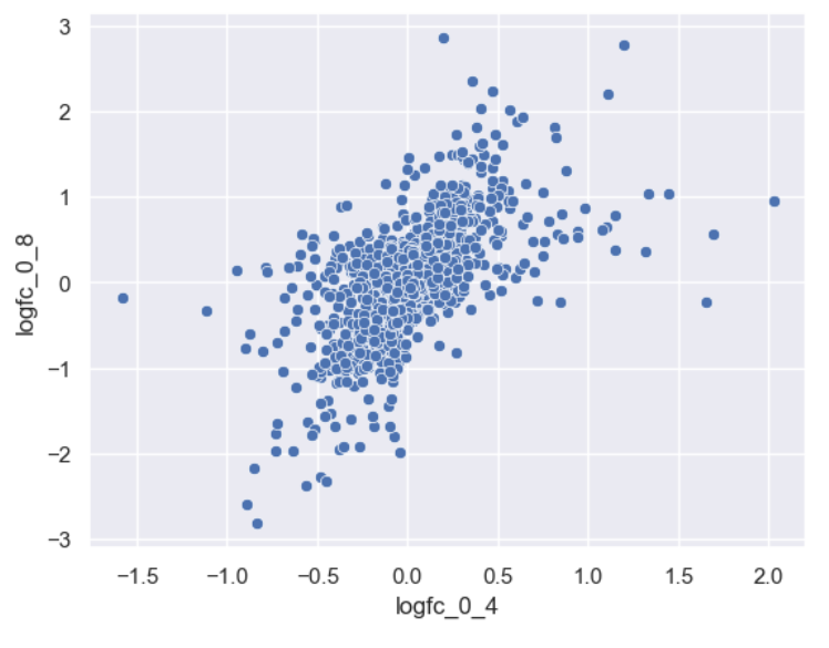
Let’s now improve this plot step-by-step. First we can give the axes more human-readable names than the dataframe’s column names.
PYTHON
sns.scatterplot(data = time_matrix, x = "logfc_0_4", y = "logfc_0_8")
plt.xlabel("0min to 4min (log FC)")
plt.ylabel("0min to 8min (log FC)")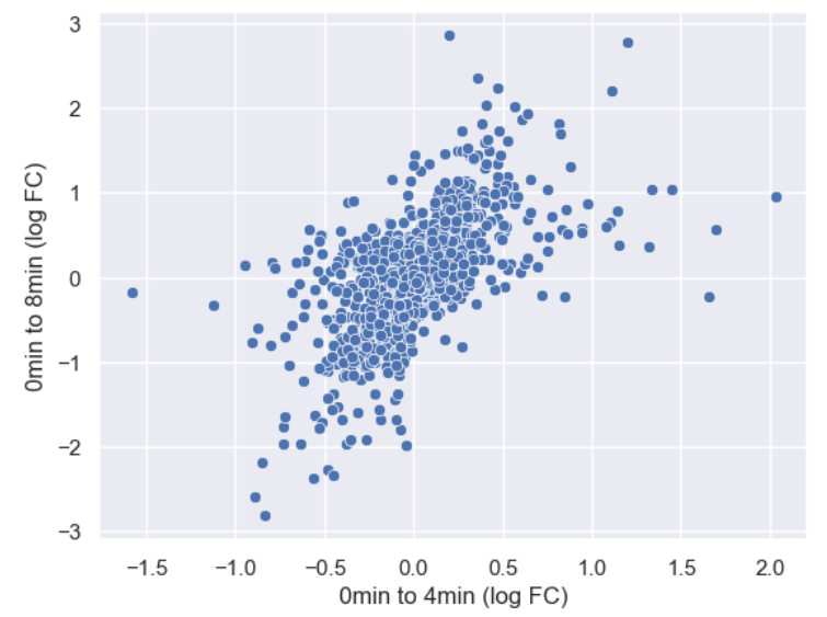
It is difficult to see see the density of genes due to there being so
many points. Lets make the points a little transparent to help with this
by changing their alpha level.
PYTHON
sns.scatterplot(data = time_matrix, x = "logfc_0_4", y = "logfc_0_8", alpha = 0.4)
plt.xlabel("0min to 4min (log FC)")
plt.ylabel("0min to 8min (log FC)")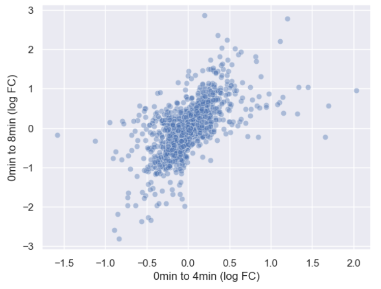
Or we could make the points smaller by adjusting the s
argument.
PYTHON
sns.scatterplot(data = time_matrix, x = "logfc_0_4", y = "logfc_0_8", alpha = 0.6, s=4)
plt.xlabel("0min to 4min (log FC)")
plt.ylabel("0min to 8min (log FC)")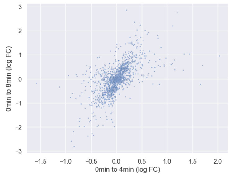
Now let’s incorporate gene_biotype. To do this, we can
set the hue of the scatterplot to the column name. We’re
also going to make some more room for the plot by changing matplotlib’s
rcParams, which are the global plotting settings.
Global plot settings with
rcParams
rcParams is a specialized dictionary used by
matplotlib to store all global plot settings. You can
change rcParams to set things like the
PYTHON
plt.rcParams['figure.figsize'] = [12, 8]
sns.scatterplot(data = time_matrix, x = "logfc_0_4", y = "logfc_0_8", alpha = 0.6, hue="gene_biotype")
plt.xlabel("0min to 4min (log FC)")
plt.ylabel("0min to 8min (log FC)")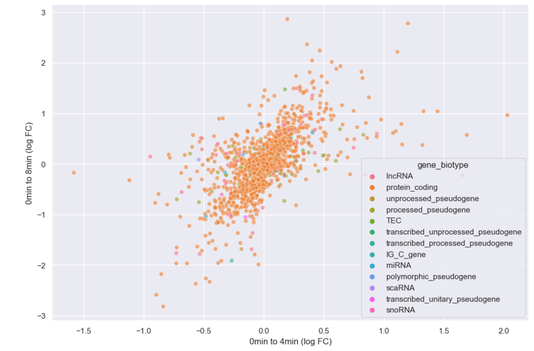
It looks like we overwhelmingly have protein coding genes in the dataset. Instead of plotting every biotype, let’s just plot whether or not the genes are protein coding.
Challenge
Create a new boolean column, is_protein_coding which
specifies whether or not each gene is protein coding.
Make a scatterplot where the style of the points varies
with is_protein_coding.
PYTHON
time_matrix["is_protein_coding"] = time_matrix["gene_biotype"]=="protein_coding"
print(time_matrix)
OUTPUT
time     chromosome_name    gene_biotype          0          4          8  \
gene
AI504432               3          lncRNA  10.010544  10.085962   9.974814
AW046200               8          lncRNA   7.275920   7.226188   6.346325
AW551984               9  protein_coding   7.860330   7.264752   8.194396
Aamp                   1  protein_coding  12.159714  12.235069  12.198784
Abca12                 1  protein_coding   2.509810   2.336441   2.329376
...                  ...             ...        ...        ...        ...
Zkscan3               13  protein_coding  11.031923  10.946440  10.696602
Zranb1                 7  protein_coding  12.546820  12.646836  12.984985
Zranb3                 1  protein_coding   7.582472   7.611006   7.578124
Zscan22                7  protein_coding   9.239555   9.049392   8.689101
Zw10                   9  protein_coding  10.586751  10.598198  10.524456

time      logfc_0_4  logfc_0_8  is_protein_coding
gene
AI504432   0.075419  -0.035730              False
AW046200  -0.049732  -0.929596              False
AW551984  -0.595578   0.334066               True
Aamp       0.075354   0.039070               True
Abca12    -0.173369  -0.180433               True
...             ...        ...                ...
Zkscan3   -0.085483  -0.335321               True
Zranb1     0.100015   0.438165               True
Zranb3     0.028535  -0.004348               True
Zscan22   -0.190164  -0.550454               True
Zw10       0.011447  -0.062295               True

[1474 rows x 8 columns]
PYTHON
sns.scatterplot(data = time_matrix, x = "logfc_0_4", y = "logfc_0_8", alpha = 0.6, style="is_protein_coding")
plt.xlabel("0min to 4min (log FC)")
plt.ylabel("0min to 8min (log FC)")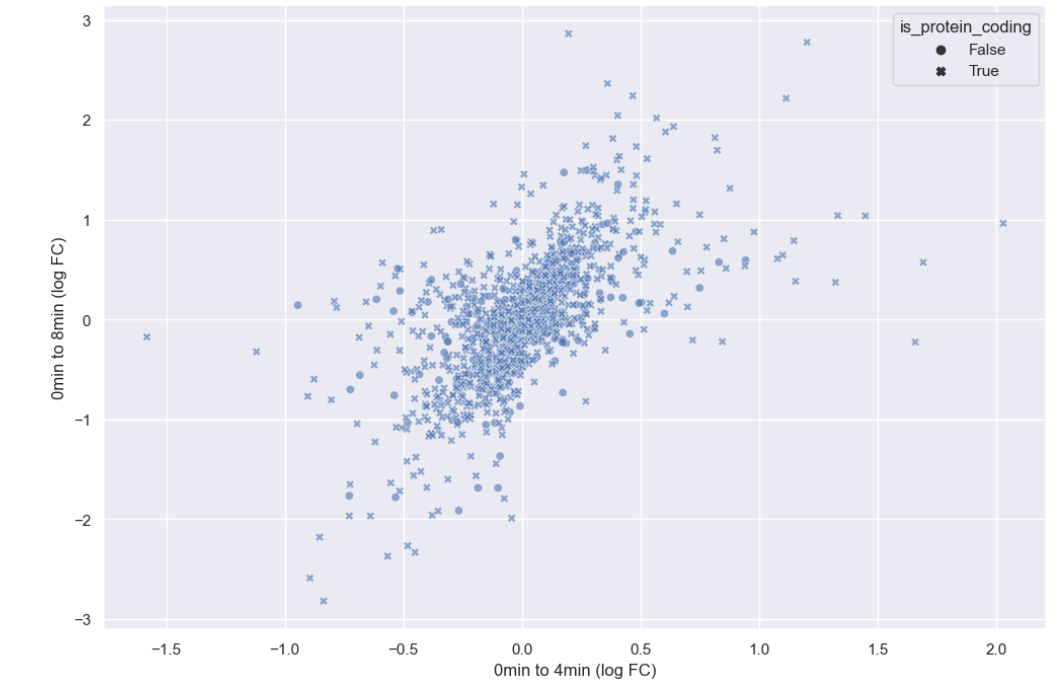
Now that hue is freed up, we can use it to encode for chromosome.
PYTHON
#This hit my personal stylistic limit, so I'm spread the call to multiple lines
sns.scatterplot(data = time_matrix,
                x = "logfc_0_4",
                y = "logfc_0_8",
                alpha = 0.6,
                style = "is_protein_coding",
                hue = "chromosome_name")
plt.xlabel("0min to 4min (log FC)")
plt.ylabel("0min to 8min (log FC)")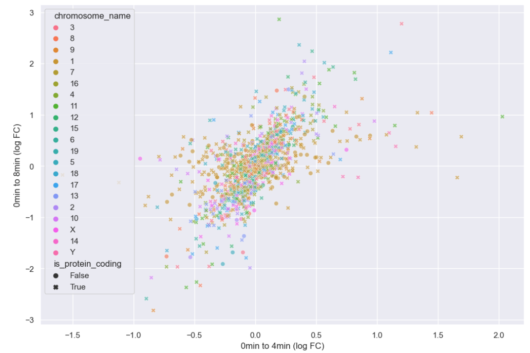
There doesn’t seem to be any interesting pattern. Let’s go back to just plotting whether or not the gene is protein coding, and do a little more to clean up the plot.
PYTHON
# This scales all text in the plot by 150%
sns.set(font_scale = 1.5)

sns.scatterplot(data = time_matrix,
                x = "logfc_0_4",
                y = "logfc_0_8",
                alpha = 0.6,
                hue = "is_protein_coding",
                #Sets the color pallete to map values to
                palette = "mako")
plt.xlabel("0min to 4min (log FC)")
plt.ylabel("0min to 8min (log FC)")

# Set a legend title and give it 2 columns
plt.legend(ncol = 2, title="Is Protein Coding")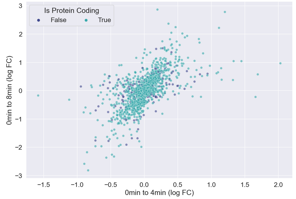
Heatmaps
Seaborn also has great built-in support for heatmaps.
We can make heatmaps using heatmap or
clustermap, depending on if we want our data to be
clustered. Let’s take a look at the correlation matrix for our
samples.
PYTHON
sample_matrix = rnaseq_df.pivot_table(columns = "sample", values = "log_exp", index="gene")
print(sample_matrix.corr())
OUTPUT
sample      GSM2545336  GSM2545337  GSM2545338  GSM2545339  GSM2545340  \
sample
GSM2545336    1.000000    0.972832    0.970700    0.979381    0.957032
GSM2545337    0.972832    1.000000    0.992230    0.983430    0.972068
GSM2545338    0.970700    0.992230    1.000000    0.981653    0.970098
GSM2545339    0.979381    0.983430    0.981653    1.000000    0.961275
GSM2545340    0.957032    0.972068    0.970098    0.961275    1.000000
GSM2545341    0.957018    0.951554    0.950648    0.940430    0.979411
GSM2545342    0.987712    0.980026    0.978246    0.974903    0.968918
GSM2545343    0.948861    0.971826    0.973301    0.959663    0.988114
GSM2545344    0.973664    0.987626    0.985568    0.980757    0.970084
GSM2545345    0.943748    0.963804    0.963715    0.946226    0.984994
GSM2545346    0.967839    0.961595    0.957958    0.955665    0.984706
GSM2545347    0.958351    0.957363    0.955393    0.944399    0.982981
GSM2545348    0.973558    0.992018    0.991673    0.982984    0.971515
GSM2545349    0.948938    0.970211    0.971276    0.955778    0.988263
GSM2545350    0.952803    0.973764    0.971737    0.960796    0.991229
GSM2545351    0.991921    0.977846    0.973363    0.979936    0.962843
GSM2545352    0.980437    0.989274    0.986909    0.983319    0.974796
GSM2545353    0.974628    0.989940    0.989857    0.982648    0.971325
GSM2545354    0.950621    0.972800    0.972051    0.959123    0.987231
GSM2545362    0.986494    0.981655    0.978767    0.988969    0.962088
GSM2545363    0.936577    0.962115    0.962892    0.940839    0.980774
GSM2545380    0.988869    0.977962    0.975382    0.973683    0.965520

sample      GSM2545341  GSM2545342  GSM2545343  GSM2545344  GSM2545345  ...  \
sample                                                                  ...
GSM2545336    0.957018    0.987712    0.948861    0.973664    0.943748  ...
GSM2545337    0.951554    0.980026    0.971826    0.987626    0.963804  ...
GSM2545338    0.950648    0.978246    0.973301    0.985568    0.963715  ...
GSM2545339    0.940430    0.974903    0.959663    0.980757    0.946226  ...
GSM2545340    0.979411    0.968918    0.988114    0.970084    0.984994  ...
GSM2545341    1.000000    0.967231    0.967720    0.958880    0.978091  ...
GSM2545342    0.967231    1.000000    0.959923    0.980462    0.957994  ...
GSM2545343    0.967720    0.959923    1.000000    0.965428    0.983462  ...
GSM2545344    0.958880    0.980462    0.965428    1.000000    0.967708  ...
GSM2545345    0.978091    0.957994    0.983462    0.967708    1.000000  ...
GSM2545346    0.983828    0.973720    0.977478    0.962581    0.976912  ...
GSM2545347    0.986949    0.968972    0.974794    0.962113    0.981518  ...
GSM2545348    0.950961    0.980532    0.974156    0.986710    0.965095  ...
GSM2545349    0.971058    0.960674    0.992085    0.966662    0.986116  ...
GSM2545350    0.973947    0.964523    0.990495    0.970990    0.986146  ...
GSM2545351    0.961638    0.989280    0.953650    0.979976    0.950451  ...
GSM2545352    0.960888    0.985541    0.971954    0.990066    0.968691  ...
GSM2545353    0.952424    0.982904    0.971896    0.989196    0.965436  ...
GSM2545354    0.973524    0.961077    0.988615    0.972600    0.987209  ...
GSM2545362    0.951186    0.982616    0.955145    0.983885    0.946956  ...
GSM2545363    0.970944    0.952557    0.980218    0.965252    0.987553  ...
GSM2545380    0.963521    0.990511    0.957152    0.978371    0.956813  ...

sample      GSM2545348  GSM2545349  GSM2545350  GSM2545351  GSM2545352  \
sample
GSM2545336    0.973558    0.948938    0.952803    0.991921    0.980437
GSM2545337    0.992018    0.970211    0.973764    0.977846    0.989274
GSM2545338    0.991673    0.971276    0.971737    0.973363    0.986909
GSM2545339    0.982984    0.955778    0.960796    0.979936    0.983319
GSM2545340    0.971515    0.988263    0.991229    0.962843    0.974796
GSM2545341    0.950961    0.971058    0.973947    0.961638    0.960888
GSM2545342    0.980532    0.960674    0.964523    0.989280    0.985541
GSM2545343    0.974156    0.992085    0.990495    0.953650    0.971954
GSM2545344    0.986710    0.966662    0.970990    0.979976    0.990066
GSM2545345    0.965095    0.986116    0.986146    0.950451    0.968691
GSM2545346    0.960875    0.978673    0.981337    0.971079    0.970621
GSM2545347    0.958524    0.978974    0.980361    0.964883    0.967565
GSM2545348    1.000000    0.971489    0.973997    0.977225    0.990905
GSM2545349    0.971489    1.000000    0.990858    0.954456    0.971922
GSM2545350    0.973997    0.990858    1.000000    0.959045    0.975085
GSM2545351    0.977225    0.954456    0.959045    1.000000    0.983727
GSM2545352    0.990905    0.971922    0.975085    0.983727    1.000000
GSM2545353    0.992297    0.969924    0.972310    0.979291    0.991556
GSM2545354    0.972151    0.990242    0.989228    0.956395    0.972436
GSM2545362    0.980224    0.955712    0.959541    0.988591    0.984683
GSM2545363    0.963226    0.983872    0.982521    0.943499    0.966163
GSM2545380    0.979398    0.956662    0.961779    0.989683    0.985750

sample      GSM2545353  GSM2545354  GSM2545362  GSM2545363  GSM2545380
sample
GSM2545336    0.974628    0.950621    0.986494    0.936577    0.988869
GSM2545337    0.989940    0.972800    0.981655    0.962115    0.977962
GSM2545338    0.989857    0.972051    0.978767    0.962892    0.975382
GSM2545339    0.982648    0.959123    0.988969    0.940839    0.973683
GSM2545340    0.971325    0.987231    0.962088    0.980774    0.965520
GSM2545341    0.952424    0.973524    0.951186    0.970944    0.963521
GSM2545342    0.982904    0.961077    0.982616    0.952557    0.990511
GSM2545343    0.971896    0.988615    0.955145    0.980218    0.957152
GSM2545344    0.989196    0.972600    0.983885    0.965252    0.978371
GSM2545345    0.965436    0.987209    0.946956    0.987553    0.956813
GSM2545346    0.963956    0.975386    0.961966    0.967480    0.973104
GSM2545347    0.961118    0.977208    0.952988    0.972364    0.967319
GSM2545348    0.992297    0.972151    0.980224    0.963226    0.979398
GSM2545349    0.969924    0.990242    0.955712    0.983872    0.956662
GSM2545350    0.972310    0.989228    0.959541    0.982521    0.961779
GSM2545351    0.979291    0.956395    0.988591    0.943499    0.989683
GSM2545352    0.991556    0.972436    0.984683    0.966163    0.985750
GSM2545353    1.000000    0.971512    0.980850    0.962497    0.981468
GSM2545354    0.971512    1.000000    0.958851    0.983429    0.957011
GSM2545362    0.980850    0.958851    1.000000    0.942461    0.980664
GSM2545363    0.962497    0.983429    0.942461    1.000000    0.951069
GSM2545380    0.981468    0.957011    0.980664    0.951069    1.000000

[22 rows x 22 columns]
We can see the structure of these correlations in a clustered heatmap.
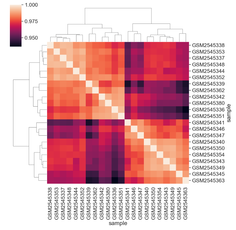
We can change the color mapping.
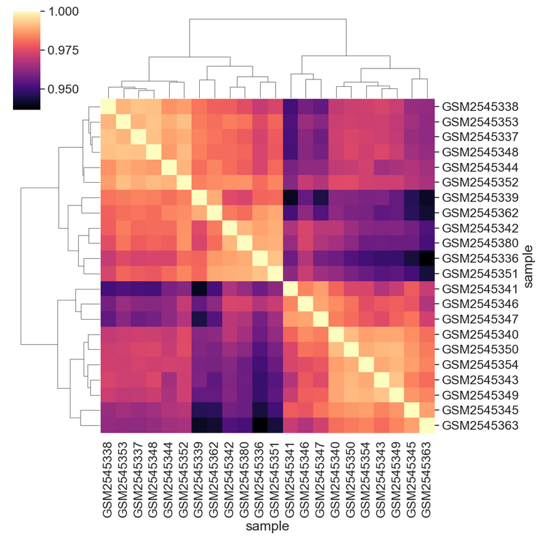
We can add sample information to the plot by changing the index. First we need to get the data.
PYTHON
# We select all of the columns related to the samples we might want to look at, group by sample, then aggregate by the most common value, or mode
sample_data = rnaseq_df[['sample','organism', 'age', 'sex', 'infection',
       'strain', 'time', 'tissue', 'mouse']].groupby('sample').agg(pd.Series.mode)
print(sample_data)
OUTPUT
	organism 	age 	sex 	infection 	strain 	time 	tissue 	mouse
sample
GSM2545336 	Mus musculus 	8 	Female 	InfluenzaA 	C57BL/6 	8 	Cerebellum 	14
GSM2545337 	Mus musculus 	8 	Female 	NonInfected 	C57BL/6 	0 	Cerebellum 	9
GSM2545338 	Mus musculus 	8 	Female 	NonInfected 	C57BL/6 	0 	Cerebellum 	10
GSM2545339 	Mus musculus 	8 	Female 	InfluenzaA 	C57BL/6 	4 	Cerebellum 	15
GSM2545340 	Mus musculus 	8 	Male 	InfluenzaA 	C57BL/6 	4 	Cerebellum 	18
GSM2545341 	Mus musculus 	8 	Male 	InfluenzaA 	C57BL/6 	8 	Cerebellum 	6
GSM2545342 	Mus musculus 	8 	Female 	InfluenzaA 	C57BL/6 	8 	Cerebellum 	5
GSM2545343 	Mus musculus 	8 	Male 	NonInfected 	C57BL/6 	0 	Cerebellum 	11
GSM2545344 	Mus musculus 	8 	Female 	InfluenzaA 	C57BL/6 	4 	Cerebellum 	22
GSM2545345 	Mus musculus 	8 	Male 	InfluenzaA 	C57BL/6 	4 	Cerebellum 	13
GSM2545346 	Mus musculus 	8 	Male 	InfluenzaA 	C57BL/6 	8 	Cerebellum 	23
GSM2545347 	Mus musculus 	8 	Male 	InfluenzaA 	C57BL/6 	8 	Cerebellum 	24
GSM2545348 	Mus musculus 	8 	Female 	NonInfected 	C57BL/6 	0 	Cerebellum 	8
GSM2545349 	Mus musculus 	8 	Male 	NonInfected 	C57BL/6 	0 	Cerebellum 	7
GSM2545350 	Mus musculus 	8 	Male 	InfluenzaA 	C57BL/6 	4 	Cerebellum 	1
GSM2545351 	Mus musculus 	8 	Female 	InfluenzaA 	C57BL/6 	8 	Cerebellum 	16
GSM2545352 	Mus musculus 	8 	Female 	InfluenzaA 	C57BL/6 	4 	Cerebellum 	21
GSM2545353 	Mus musculus 	8 	Female 	NonInfected 	C57BL/6 	0 	Cerebellum 	4
GSM2545354 	Mus musculus 	8 	Male 	NonInfected 	C57BL/6 	0 	Cerebellum 	2
GSM2545362 	Mus musculus 	8 	Female 	InfluenzaA 	C57BL/6 	4 	Cerebellum 	20
GSM2545363 	Mus musculus 	8 	Male 	InfluenzaA 	C57BL/6 	4 	Cerebellum 	12
GSM2545380 	Mus musculus 	8 	Female 	InfluenzaA 	C57BL/6 	8 	Cerebellum 	19
Then we can join, set the index, and plot to see the sample groupings.
PYTHON
corr_df = sample_matrix.corr()
corr_df = corr_df.join(sample_data)
corr_df = corr_df.set_index("infection")
sns.clustermap(corr_df.iloc[:,:-8],
               cmap = "magma")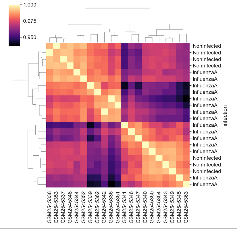
Creating a boxplot
Visualize log mean gene expression by sample and some other variable
of choice in rnaseq_df. Take some time to try to get this
plot close to publication ready for either a poster, presentation, or
paper.
You may need want to rotate the x labels of the plot, which can be
done with plt.xticks(rotation = degrees) where
degrees is the number of degrees you wish to rotate by.
Check out some of the details of sns.set_context() here.
Seaborn has useful size default for different figure types.
Your plot will of course vary, but here are some examples of what we can do:
PYTHON
sns.set_context("talk")
# Things like this will depend on your screen resolution and size
#plt.rcParams['figure.figsize'] = [8, 6]
#plt.rcParams['figure.dpi'] = 300
#sns.set(font_scale=1.25)
sns.set_palette(sns.color_palette("rocket_r", n_colors=3))
sns.boxplot(rnaseq_df,
            x = "sample",
            y = "log_exp",
            hue = "time",
            dodge=False)
plt.xticks(rotation=45, ha='right');
plt.ylabel("Log Expression")
plt.xlabel("")
# See this thread for more discussion of legend positions: https://stackoverflow.com/a/43439132
plt.legend(title='Days Post Infection', loc=(1.04, 0.5), labels=['0 days','4 days','8 days'])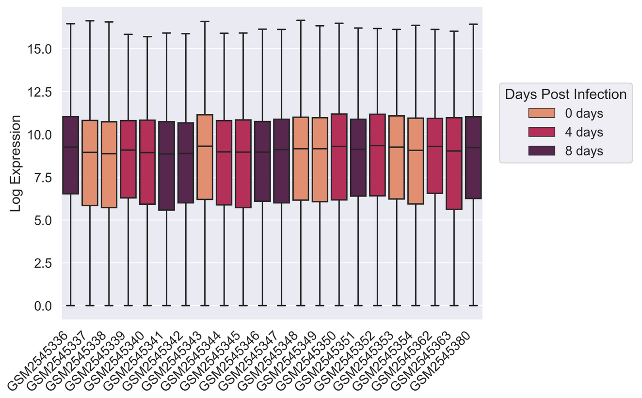
PYTHON
sns.set_palette(["#A51C30","#8996A0"])
sns.violinplot(rnaseq_df,
            x = "sample",
            y = "log_exp",
            hue = "infection",
            dodge=False)
plt.xticks(rotation=45, ha='right');
plt.legend(loc = 'lower right')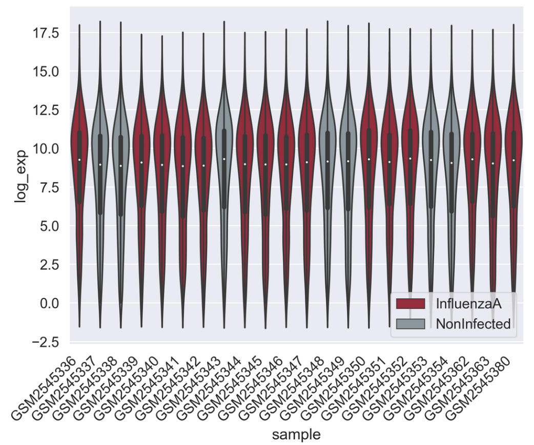
PYTHON
sns.set_context("talk")
pal = sns.color_palette("blend:#A51C30,#FFDB6D", 24)
g = sns.catplot(rnaseq_df,
            kind = "box",
            x = "sample",
            y = "log_exp",
            col = "sex",
            dodge=False,
            hue = "sample",
            palette = pal,
            sharex = False)
for axes in g.axes.flat:
    _ = axes.set_xticklabels(axes.get_xticklabels(), rotation=45, ha='right')
g.set_axis_labels("", "Log Expression")
plt.subplots_adjust(wspace=0.1)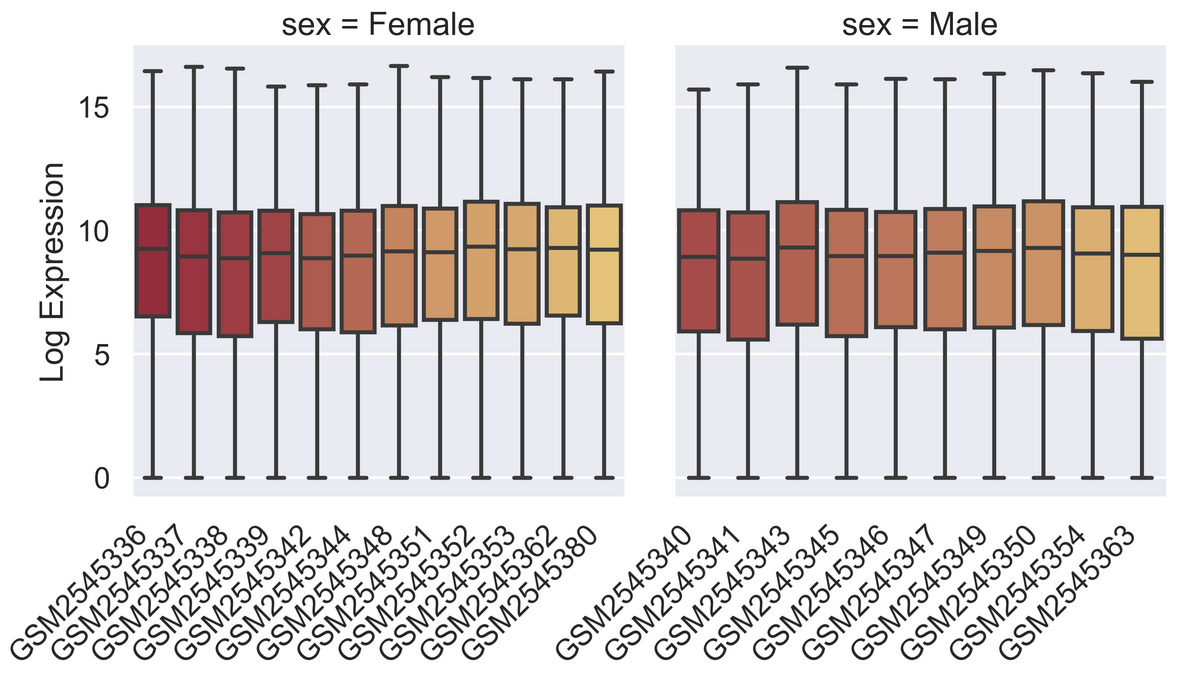
Saving your plot to a file
If you are satisfied with the plot you see you may want to save it to a file, perhaps to include it in a publication. There is a function in the matplotlib.pyplot module that accomplishes this: savefig. Calling this function, e.g. with
will save the current figure to the file my_figure.png.
The file format will automatically be deduced from the file name
extension (other formats are pdf, ps, eps and svg).
Note that functions in plt refer to a global figure
variable and after a figure has been displayed to the screen (e.g. with
plt.show) matplotlib will make this variable refer to a new
empty figure. Therefore, make sure you call plt.savefig
before the plot is displayed to the screen, otherwise you may find a
file with an empty plot.
When using dataframes, data is often generated and plotted to screen
in one line. In addition to using plt.savefig, we can save
a reference to the current figure in a local variable (with
plt.gcf) and call the savefig class method
from that variable to save the figure to file.
This supports most common image formats such as png,
svg, pdf, etc.
Making your plots accessible
Whenever you are generating plots to go into a paper or a
presentation, there are a few things you can do to make sure that
everyone can understand your plots. * Always make sure your text is
large enough to read. Use the fontsize parameter in
xlabel, ylabel, title, and
legend, and tick_params
with labelsize to increase the text size of the numbers
on your axes. * Similarly, you should make your graph elements easy to
see. Use s to increase the size of your scatterplot markers
and linewidth to increase the sizes of your plot lines. *
Using color (and nothing else) to distinguish between different plot
elements will make your plots unreadable to anyone who is colorblind, or
who happens to have a black-and-white office printer. For lines, the
linestyle parameter lets you use different types of lines.
For scatterplots, marker lets you change the shape of your
points. If you’re unsure about your colors, you can use Coblis
or Color Oracle to simulate what
your plots would look like to those with colorblindness.