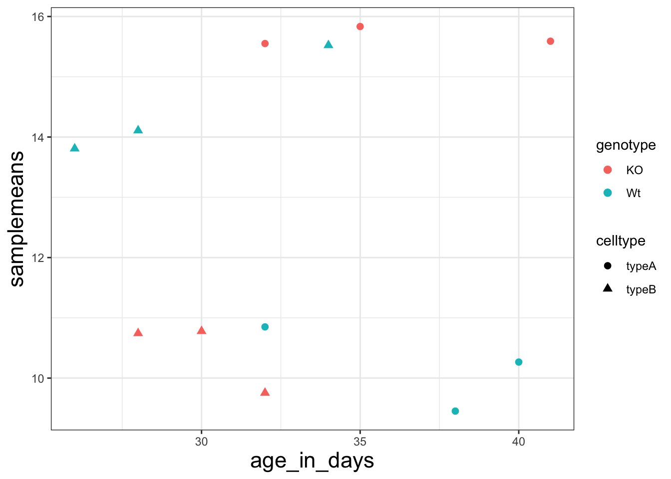
library(ggplot2)
load("data/new_metadata.RData")

ggplot(new_metadata) +
  geom_point(aes(x = age_in_days, y= samplemeans, color = genotype,
            shape=celltype), size=2.25) +
  theme_bw() +
theme(axis.title = element_text(size=rel(1.5))) 
Let’s return to our scatterplot:
library(ggplot2)
load("data/new_metadata.RData")
ggplot(new_metadata) +
geom_point(aes(x = age_in_days, y= samplemeans, color = genotype,
shape=celltype), size=2.25) +
theme_bw() +
theme(axis.title = element_text(size=rel(1.5))) 
1. The current axis label text defaults to what we gave as input to geom_point (i.e the column headers). We can change this by adding additional layers called xlab() and ylab() for the x- and y-axis, respectively. Add these layers to the current plot such that the x-axis is labeled “Age (days)” and the y-axis is labeled “Mean expression”.
2. Use the ggtitle layer to add a plot title of your choice.
3. Add the following new layer to the code chunk `theme(plot.title=element_text(hjust=0.5))`.
- What does it change?
- How many theme() layers can be added to a ggplot code chunk, in your estimation?
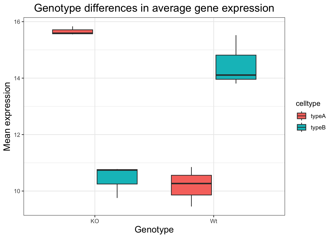
ggplot(new_metadata) +
  geom_boxplot(aes(x = genotype, y = samplemeans, fill = celltype)) +
  ggtitle("Genotype differences in average gene expression") +
  xlab("Genotype") +
  ylab("Mean expression") +
  theme_bw() +
  theme(axis.title = element_text(size = rel(1.25))) +
  theme(plot.title = element_text(hjust = 0.5, size = rel(1.5)))
It centers and increases the size of the plot title. You can add unlimited theme() layers.
When publishing, it is helpful to ensure all plots have similar formatting. To do this we can create a custom function with our preferences for the theme. Create a function called `personal_theme` which takes no arguments and
- calls one of the ggplot2 themes such as theme_bw()
- sets the title text size to size=rel(1.5)
- sets the axis text size (you can use axis.title)
Once you have your function, call it to change your histogram’s theme.
The materials in this lesson have been adapted from work created by the (HBC)\](http://bioinformatics.sph.harvard.edu/) and Data Carpentry (http://datacarpentry.org/). These are open access materials distributed under the terms of the [Creative Commons Attribution license](https://creativecommons.org/licenses/by/4.0/) (CC BY 4.0), which permits unrestricted use, distribution, and reproduction in any medium, provided the original author and source are credited.