## load the new_metadata data frame into your environment from a .RData object
load("data/new_metadata.RData")Session 3: Data Visualization in R
Introduction
In this session, we will explore the ways to create, manipulate, and export variety of plots such as histograms, boxplots, line plots, and scatter plots.
R is one of the most versatile platform for data visualization and it can create almost any type of graph. Although there are several ways to create graphs in R, we will particularly focus on “ggplot2” package which is arguably one of the most used package in R.
For this lesson, you will need the `new_metadata` data frame. Load it into your environment as follows:
Next, let’s check if it was successfully loaded into the environment:
# this data frame should have 12 rows and 5 columns
View(new_metadata)
When we are working with large sets of numbers it can be useful to display that information graphically to gain more insight. In this lesson we will be plotting with the popular Bioconductor package [`ggplot2`](http://docs.ggplot2.org/).
The `ggplot2` syntax takes some getting used to, but once you get it, you will find it’s extremely powerful and flexible. We will start with drawing a simple x-y scatterplot of `samplemeans` versus `age_in_days` from the `new_metadata` data frame. Please note that `ggplot2` expects a dataframe or a tibble (the Tidyverse version of a dataframe) as input.
Let’s start by loading the `ggplot2` library:
library(ggplot2)The `ggplot()` function is used to **initialize the basic graph structure**, then we add to it. The basic idea is that you specify different parts of the plot using additional functions one after the other and combine them into a “code chunk” using the `+` operator; the functions in the resulting code chunk are called layers.
Let’s start:
load("data/new_metadata.RData")
ggplot(new_metadata) # what happens? 
You get an blank plot, because you need to specify additional layers using the + operator.
The geom (geometric) object is the layer that specifies what kind of plot we want to draw. A plot must have at least one geom ; there is no upper limit. Examples include:
- points (geom_point, geom_jitter for scatter plots, dot plots, etc)
- lines (geom_line, for time series, trend lines, etc)
- boxplot (geom_boxplot, for, well, boxplots!)
Let’s add a “geom” layer to our plot using the + operator, and since we want a scatter plot so we will use geom_point().
#ggplot(new_metadata) +
 # geom_point() # note what happens here
Why do we get an error? Is the error message easy to decipher?
We get an error because each type of geom usually has a required set of aesthetics to be set. “Aesthetics” are set with the aes() function and can be set either nested within geom_point() (applies only to that layer) or within ggplot() (applies to the whole plot).
The aes() function has many different arguments, and all of those arguments take columns from the original data frame as input. It can be used to specify many plot elements including the following:
- position (i.e., on the x and y axes)
- color (“outside” color)
- fill (“inside” color)
- shape (of points)
- linetype
- size
To start, we will specify x- and y-axis since geom_point requires the most basic information about a scatterplot, i.e. what you want to plot on the x and y axes. All of the other plot elements mentioned above are optional.
ggplot(new_metadata) +
     geom_point(aes(x = age_in_days, y= samplemeans))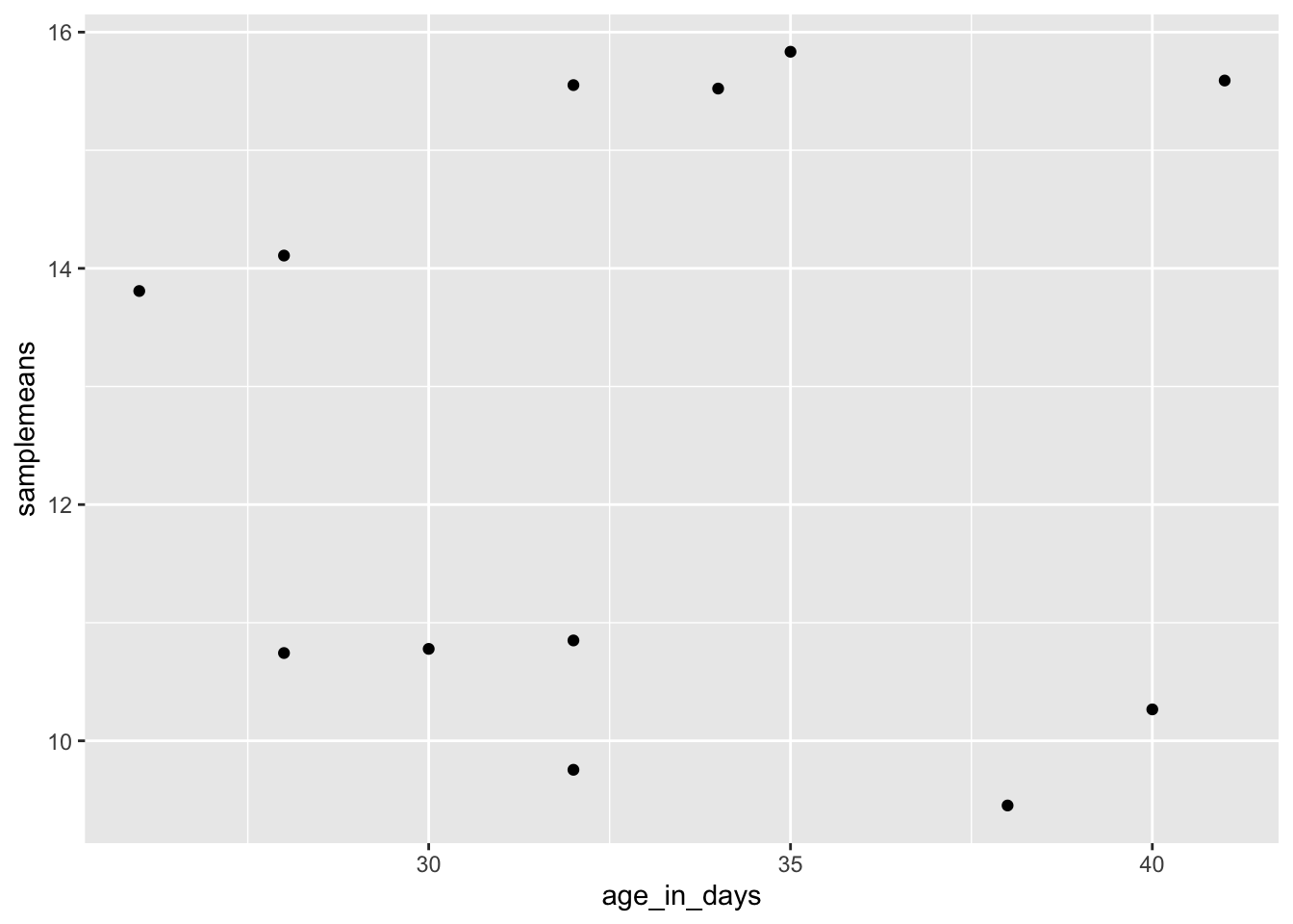
Now that we have the required aesthetics, let’s add some extras like color to the plot. We can color the points on the plot based on the genotype column** within aes(). You will notice that there are a default set of colors that will be used so we do not have to specify. Note that the legend has been conveniently plotted for us.
ggplot(new_metadata) +
geom_point(aes(x = age_in_days, y= samplemeans, color = genotype)) 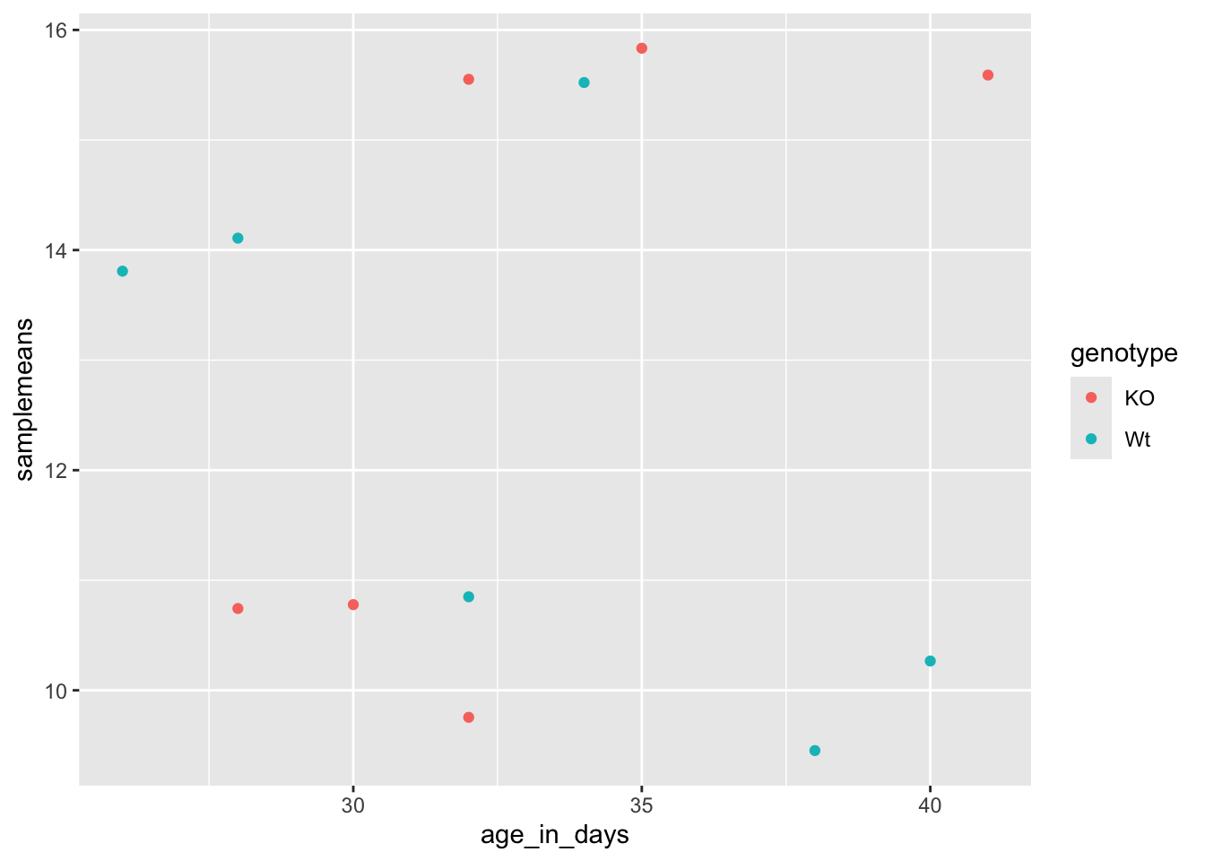
Let’s try to have both celltype and genotype represented on the plot. To do this we can assign the shape argument in aes() the celltype column, so that each celltype is plotted with a different shaped data point.
ggplot(new_metadata) +
  geom_point(aes(x = age_in_days, y= samplemeans, color = genotype,
shape=celltype)) 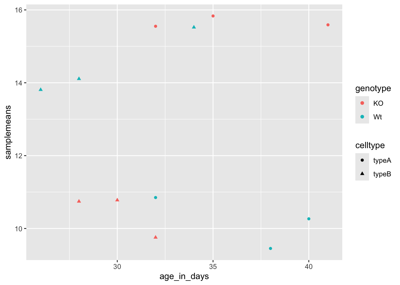
The data points are quite small. We can adjust the size of the data points within the geom_point() layer, but it should not be within aes() since we are not mapping it to a column in the input data frame, instead we are just specifying a number.
ggplot(new_metadata) +
  geom_point(aes(x = age_in_days, y= samplemeans, color = genotype,
shape=celltype), size=2.25) 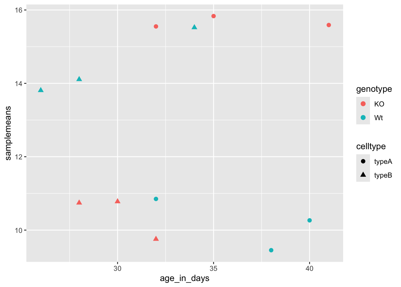
The labels on the x- and y-axis are also quite small and hard to read. To change their size, we need to add an additional theme layer. The ggplot2 theme system handles non-data plot elements such as:
- Axis label aesthetics
- Plot background
- Facet label background
- Legend appearance
There are built-in themes we can use (i.e. theme_bw()) that mostly change the background/foreground colors, by adding it as additional layer. Or we can adjust specific elements of the current default theme by adding the theme() layer and passing in arguments for the things we wish to change. Or we can use both.
Let’s add a layer theme_bw().
ggplot(new_metadata) +
  geom_point(aes(x = age_in_days, y= samplemeans, color = genotype,
            shape=celltype), size=3.0) +
theme_bw() 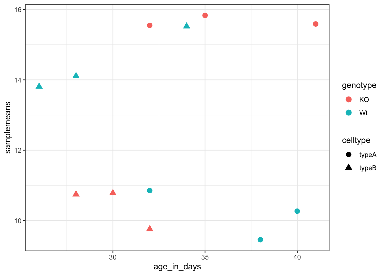
Do the axis labels or the tick labels get any larger by changing themes?
No, they don’t. But, we can add arguments using theme() to change the size of axis labels ourselves. Since we will be adding this layer “on top”, or after theme_bw(), any features we change will override what is set by the theme_bw() layer.
Let’s increase the size of both the axes titles to be 1.5 times the default size. When modifying the size of text the rel() function is commonly used to specify a change relative to the default.
ggplot(new_metadata) +
  geom_point(aes(x = age_in_days, y= samplemeans, color = genotype,
            shape=celltype), size=2.25) +
  theme_bw() +
theme(axis.title = element_text(size=rel(1.5))) 
Histograms
To plot a histogram we require another type of geometric object called geom_histogram, which requires a statistical transformation. Some plot types (such as scatterplots) do not require transformations, each point is plotted at x and y coordinates equal to the original value. Other plots, such as boxplots, histograms, prediction lines etc. need to be transformed. Usually these objects have has a default statistic for the transformation, but that can be changed via the stat_bin argument.
Let’s plot a histogram of sample mean expression in our data:
ggplot(new_metadata) +
  geom_histogram(aes(x = samplemeans))
`stat_bin()` using `bins = 30`. Pick better value with `binwidth`.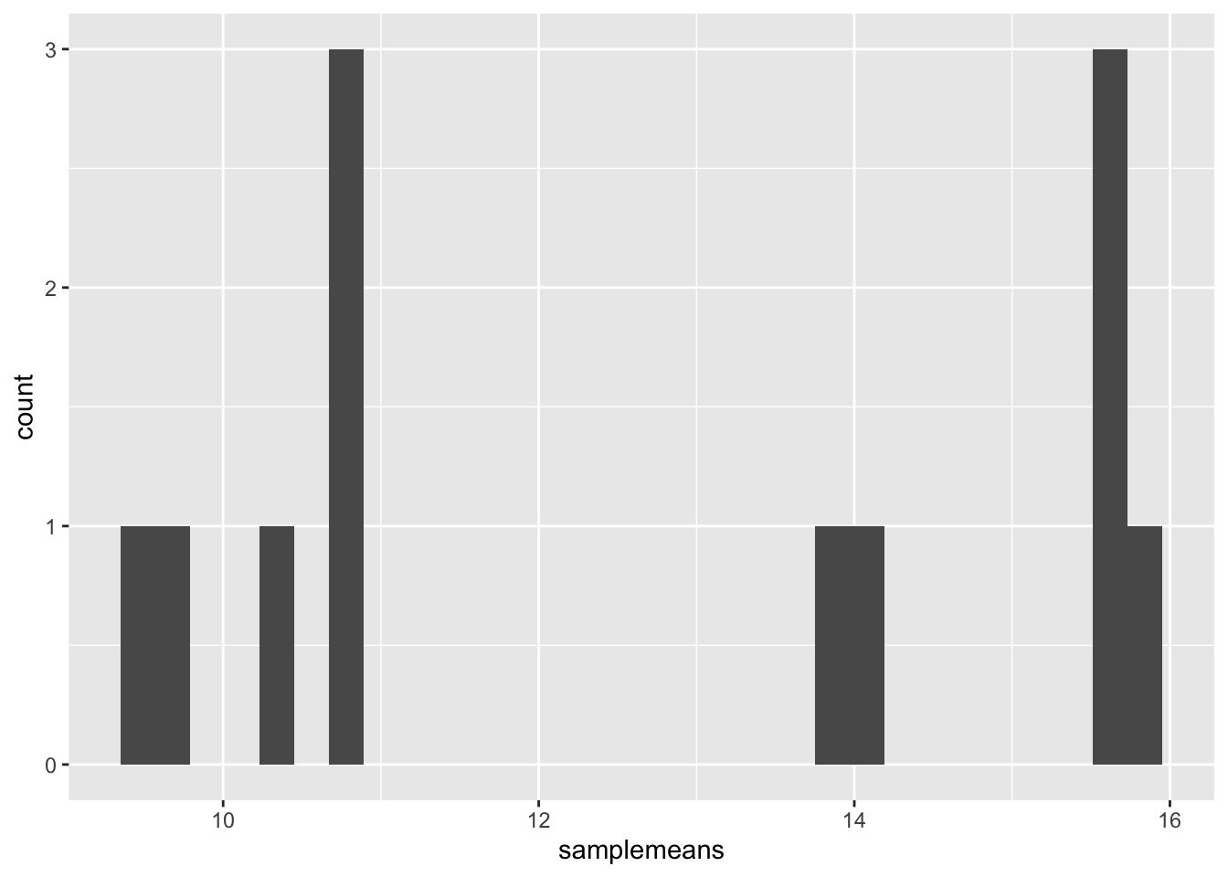
You will notice that even though the histogram is plotted, R gives a warning message stat_bin() using bins = 30. Pick better value with binwidth. These are the transformations we discussed. Apparently the default is not good enough.
Let’s change the binwidth values. How does the plot differ?
ggplot(new_metadata) +
  geom_histogram(aes(x = samplemeans), stat = "bin", binwidth=0.8)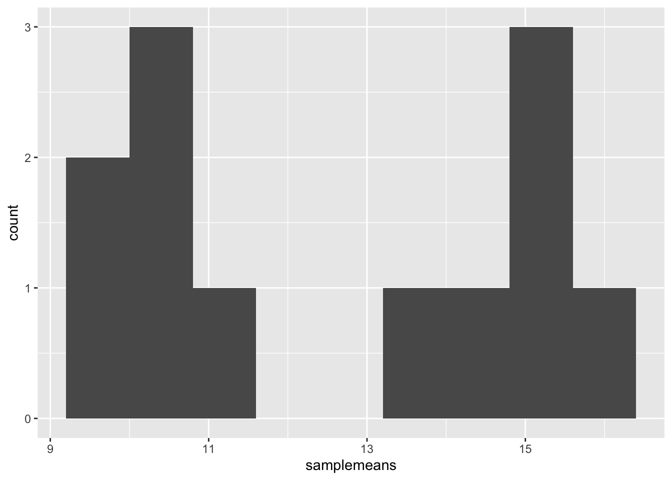
> NOTE: You can use the example("geom_point") function here to explore a multitude of different aesthetics and layers that can be added to your plot. As you scroll through the different plots, take note of how the code is modified. You can use this with any of the different geometric object layers available in ggplot2 to learn how you can easily modify your plots!