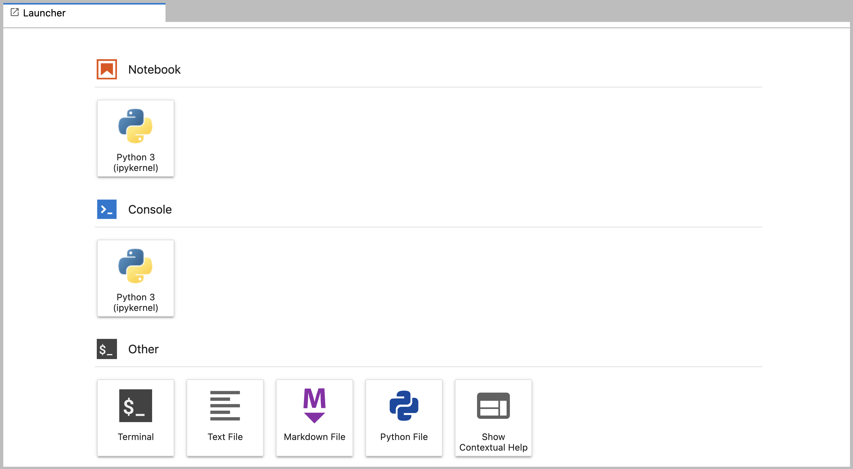
Welcome to PythonA Level-1 Heading
Figure 1
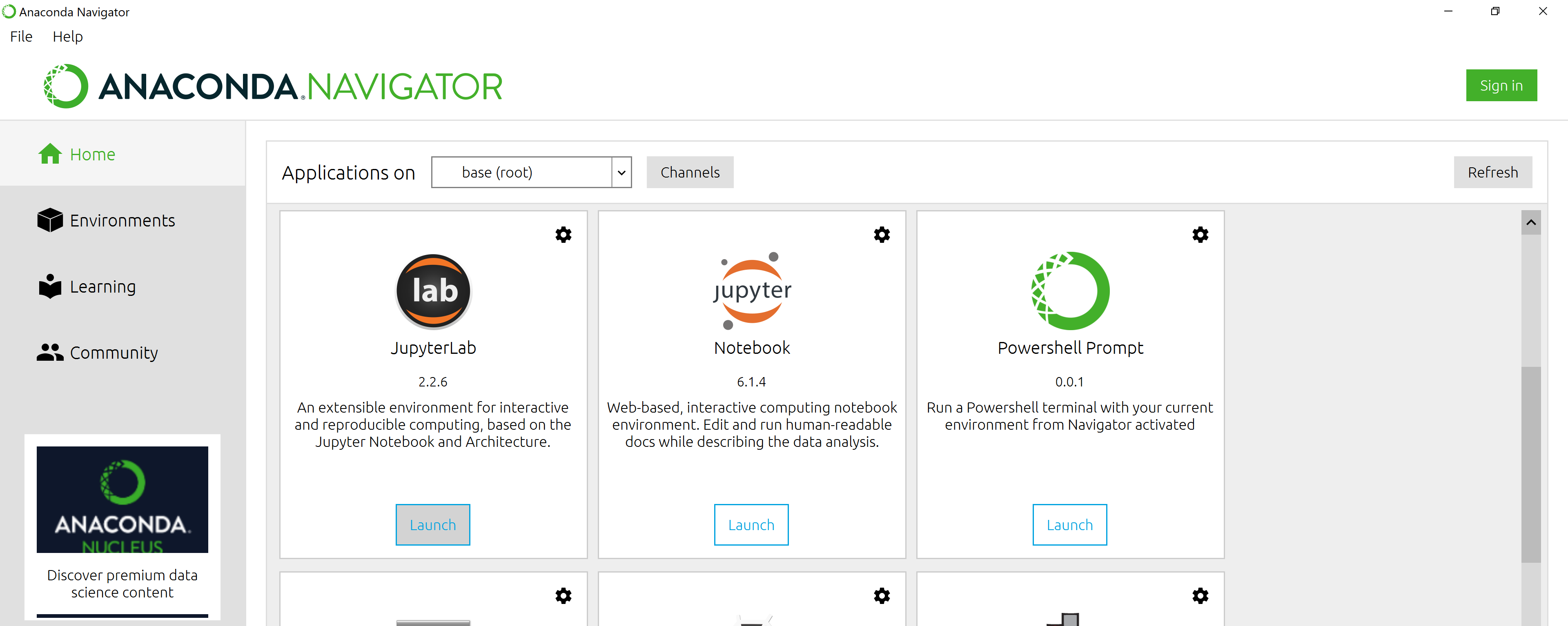
Anaconda Navigator landing page
Figure 2
Anaconda Navigator landing page
Figure 3
JupyterLab Menu Bar
Figure 4
JupyterLab Left Side Bar
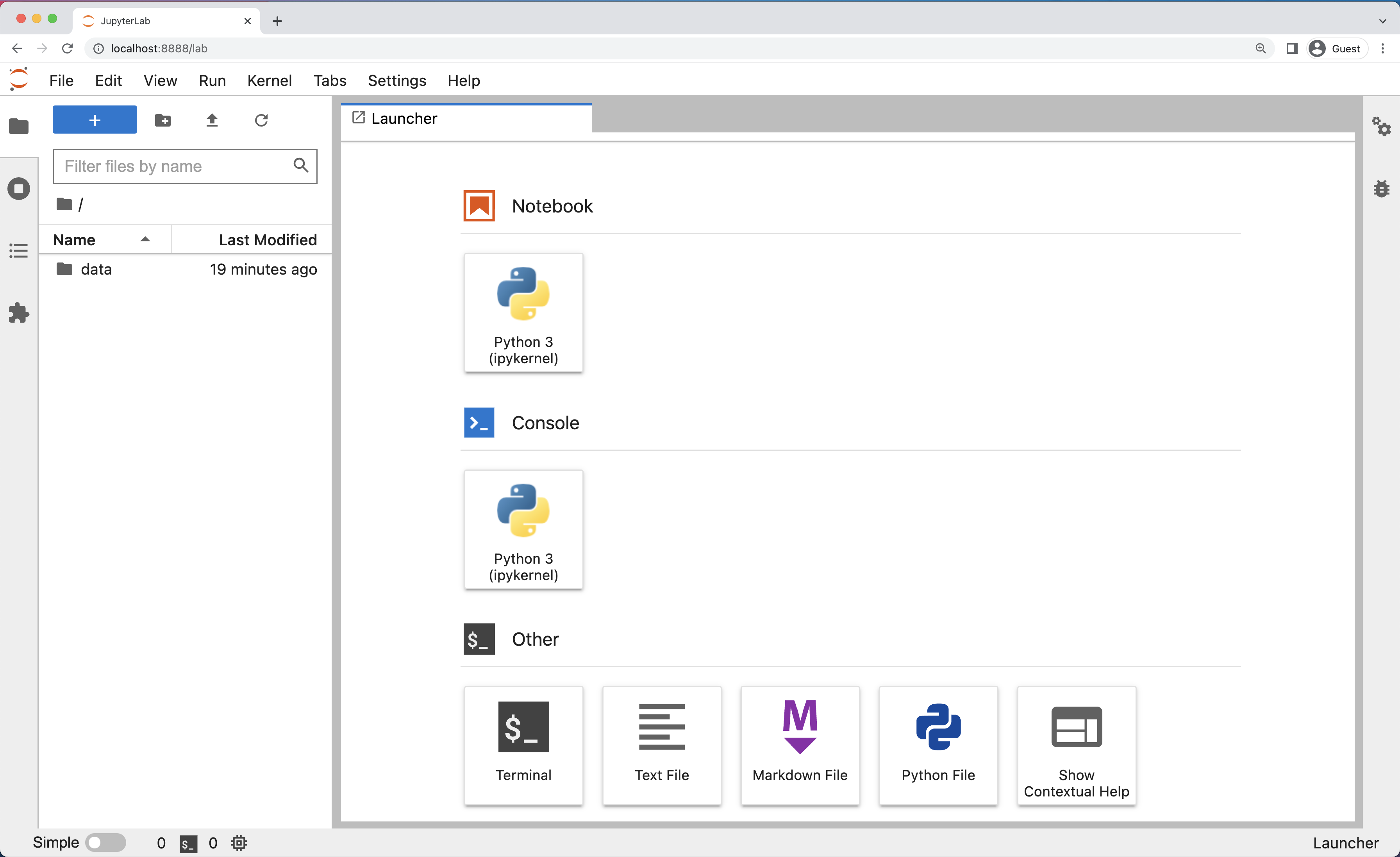
Figure 5
JupyterLab Main Work Area
Figure 6
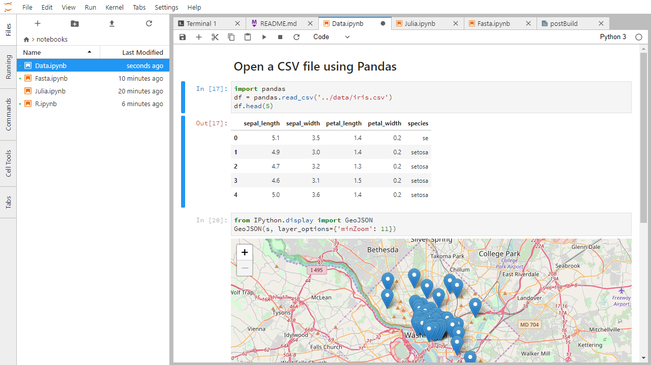
Example Jupyter Notebook
Figure 7
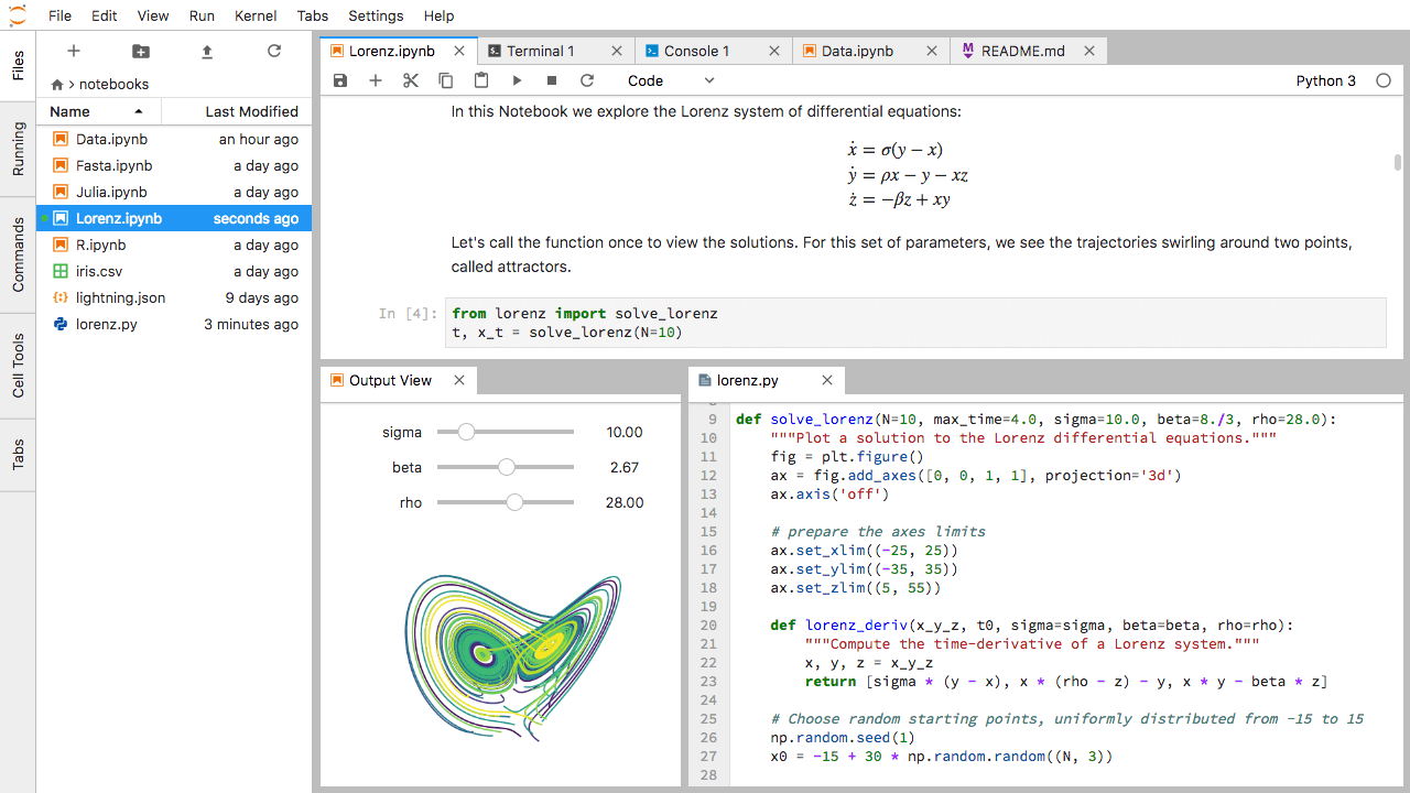
Multi-panel JupyterLab
Variables in Python
Basic Types
Figure 1
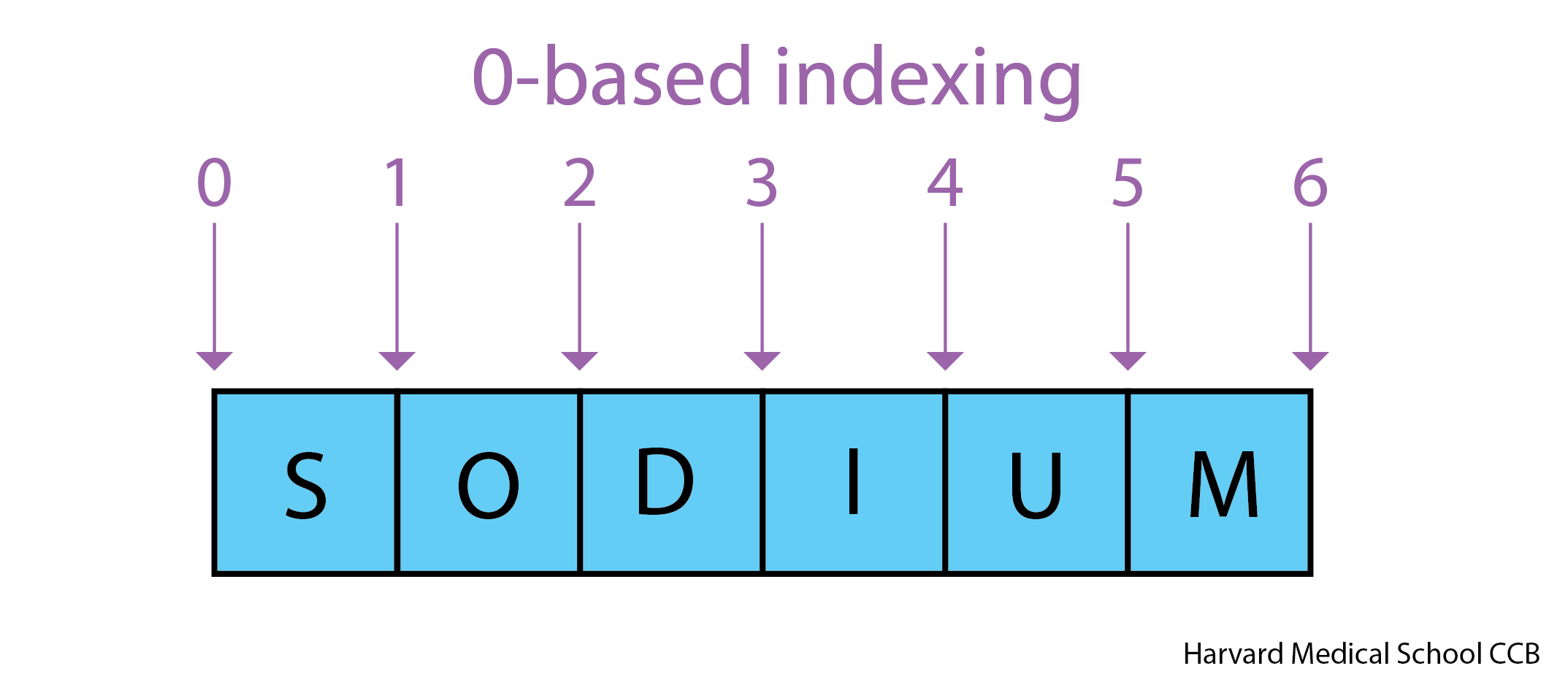
Python uses 0-based indexing.
Built-in Functions and Help
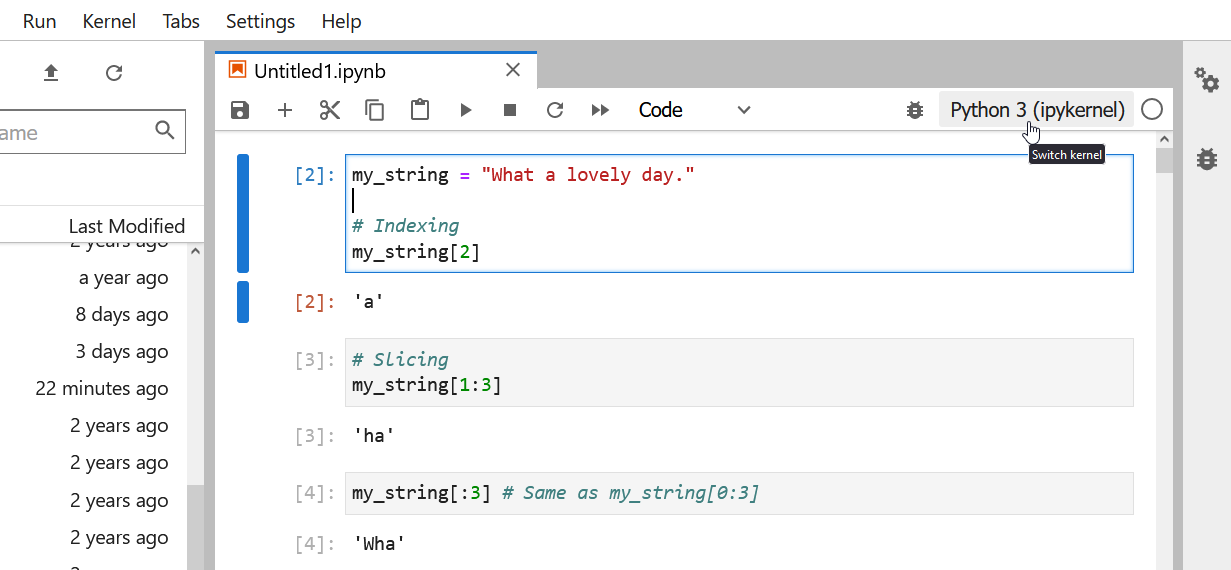
String Manipulation
Using Objects
Lists
Figure 1
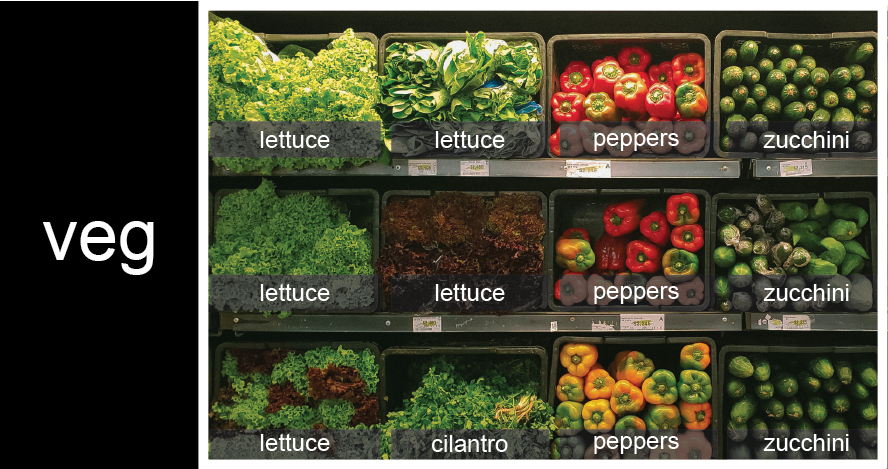
veg is represented as a shelf full
of produce. There are three rows of vegetables on the shelf, and each
row contains three baskets of vegetables. We can label each basket
according to the type of vegetable it contains, so the top row contains
(from left to right) lettuce, lettuce, and peppers.Figure 2
![veg is now shown as a list of three rows, with veg[0] representing the top row of three baskets, veg[1] representing the second row, and veg[2] representing the bottom row.](fig/05_groceries_veg0.png)
veg is now shown as a list of three
rows, with veg[0] representing the top row of three
baskets, veg[1] representing the second row, and
veg[2] representing the bottom row.Figure 3
To reference a specific basket on a specific shelf, you use two
indexes. The first index represents the row (from top to bottom) and the
second index represents the specific basket (from left to right). ![veg is now shown as a two-dimensional grid, with each basket labeled according to its index in the nested list. The first index is the row number and the second index is the basket number, so veg[1][3] represents the basket on the far right side of the second row (basket 4 on row 2): zucchini](fig/05_groceries_veg00.png)
For Loops
Libraries
Reading tabular data
Managing Python Environments
Figure 1
Changing the kernel
Figure 2
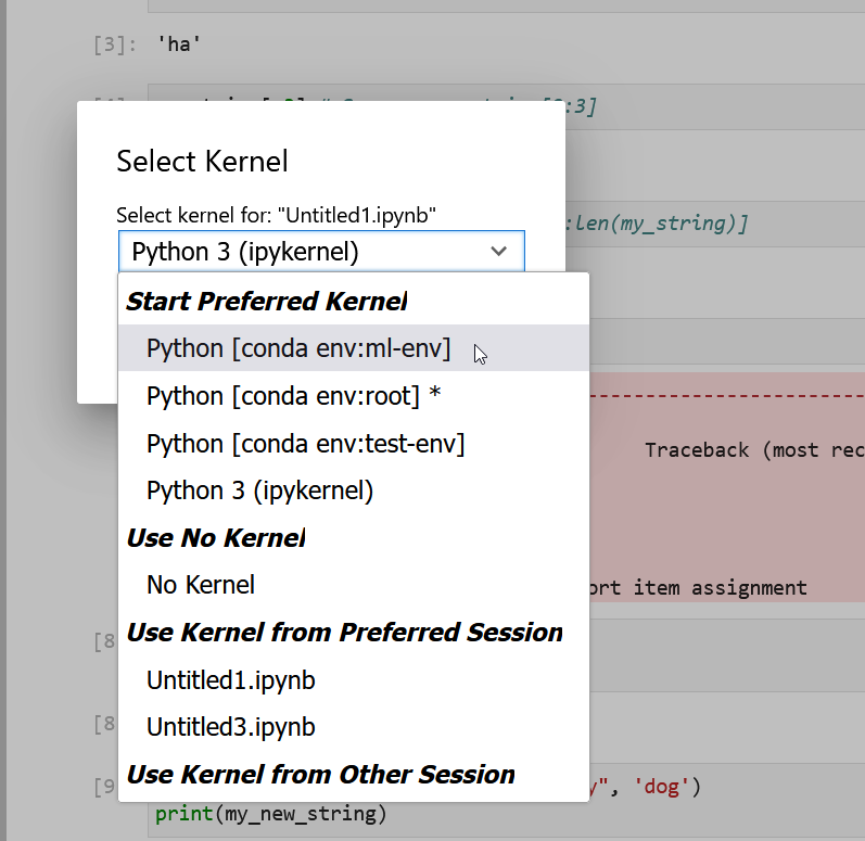
Selecting conda kernels in Jupyer Lab
Dictionaries
Figure 1
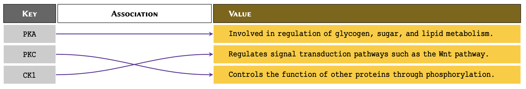
Illustrative diagram of associative arrays,
showing the sets of keys and their association with some of the
values.
Conditionals
Pandas DataFrames
Writing Functions
Perform Statistical Tests with Scipy
Reshaping Data
Figure 1
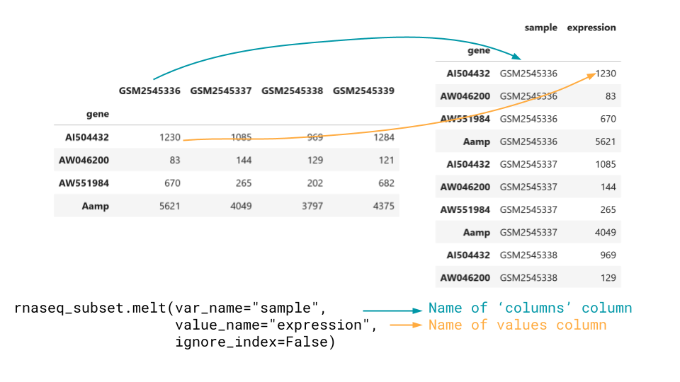
Melt goes from wide to long data
Figure 2
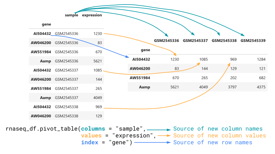
Pivot_table goes from long to wide
Combining Data
Figure 1
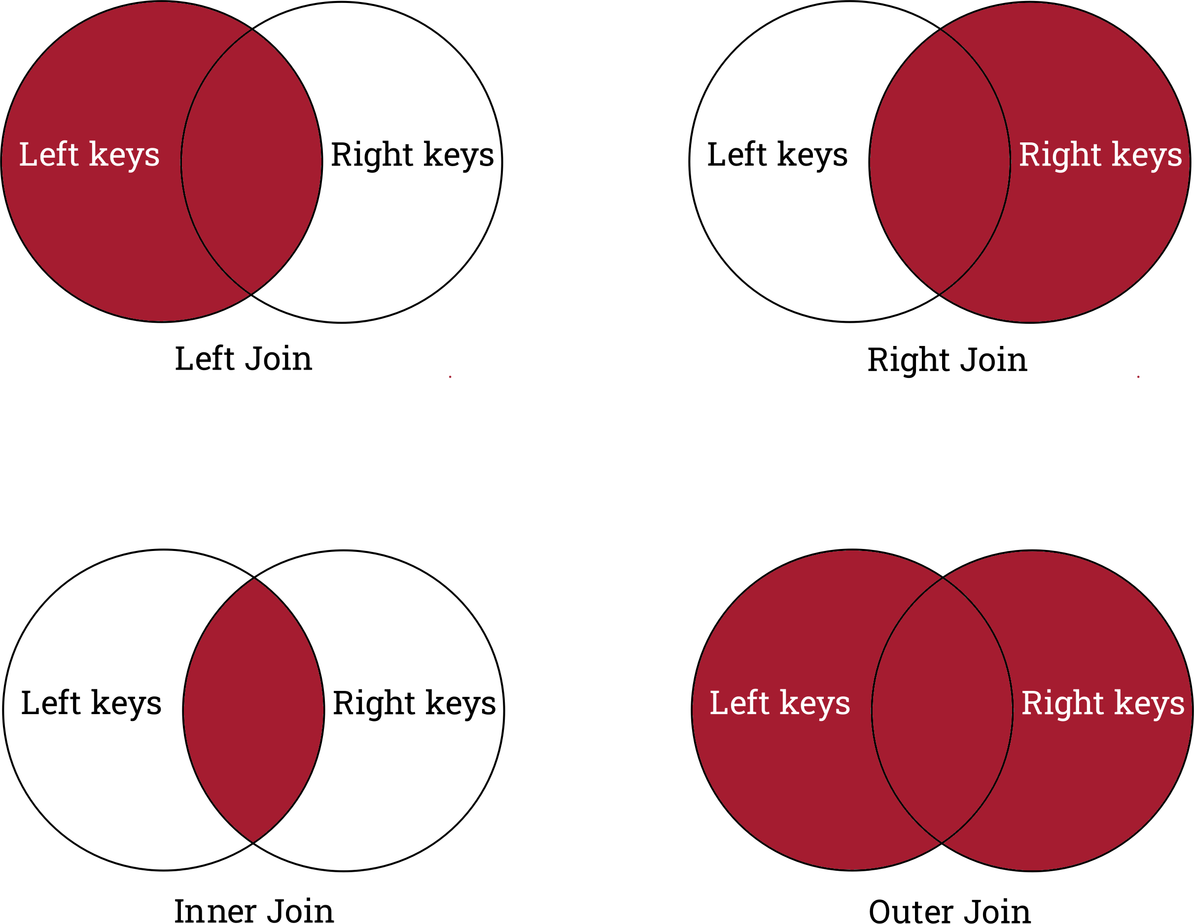
A summary of the types of joins and what they
keep and drop.
Visualizing data with matplotlib and seaborn
Figure 1
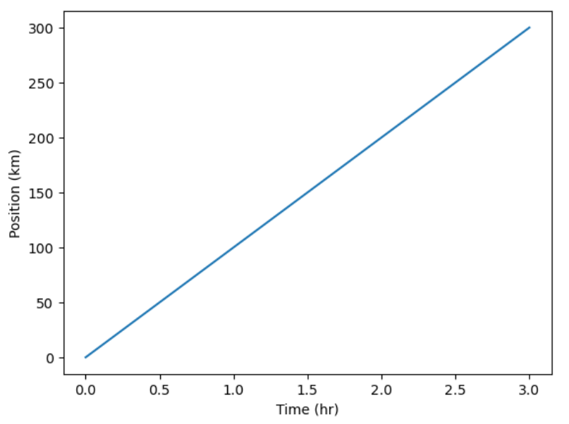
Simple Position-Time Plot
Figure 2
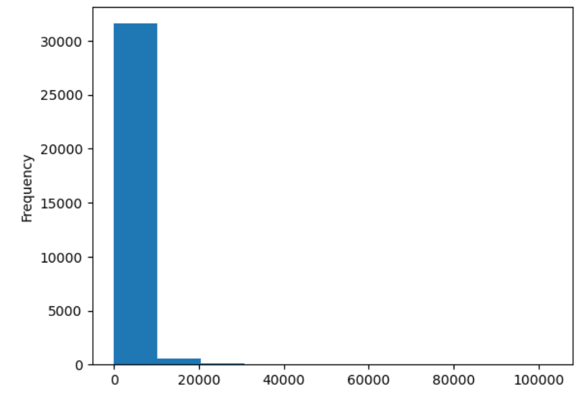
Expression histogram
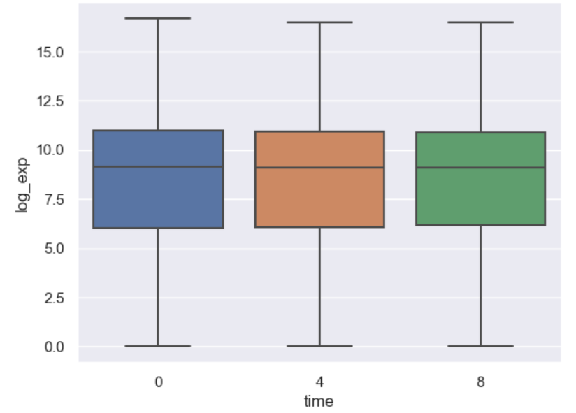
Figure 3
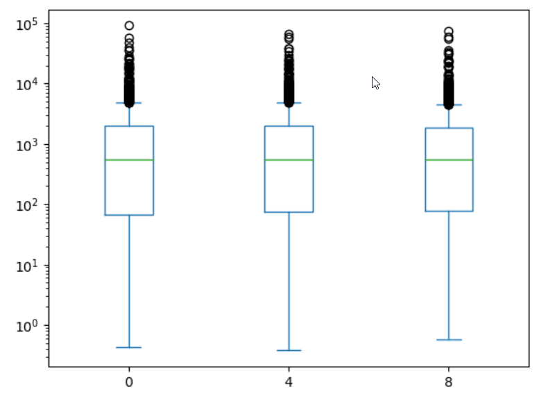
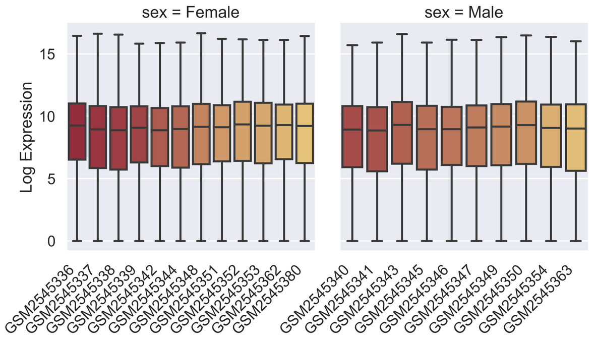
Boxplot by timepoint
Figure 4
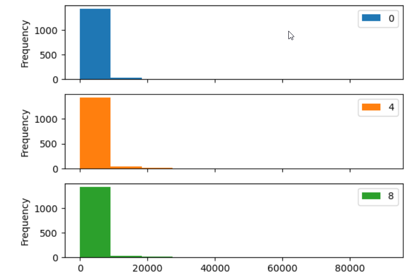
Histogram by timpoint as subplots.
Figure 5
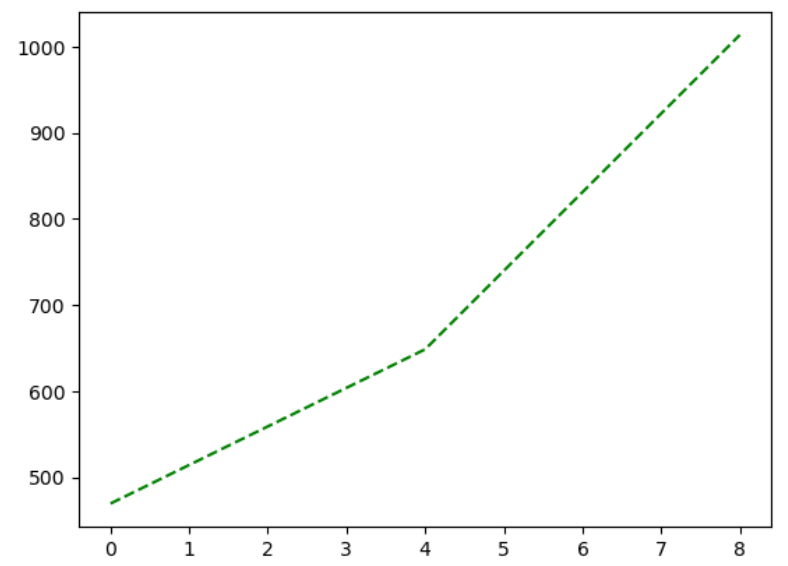
Asl expression over time
Figure 6
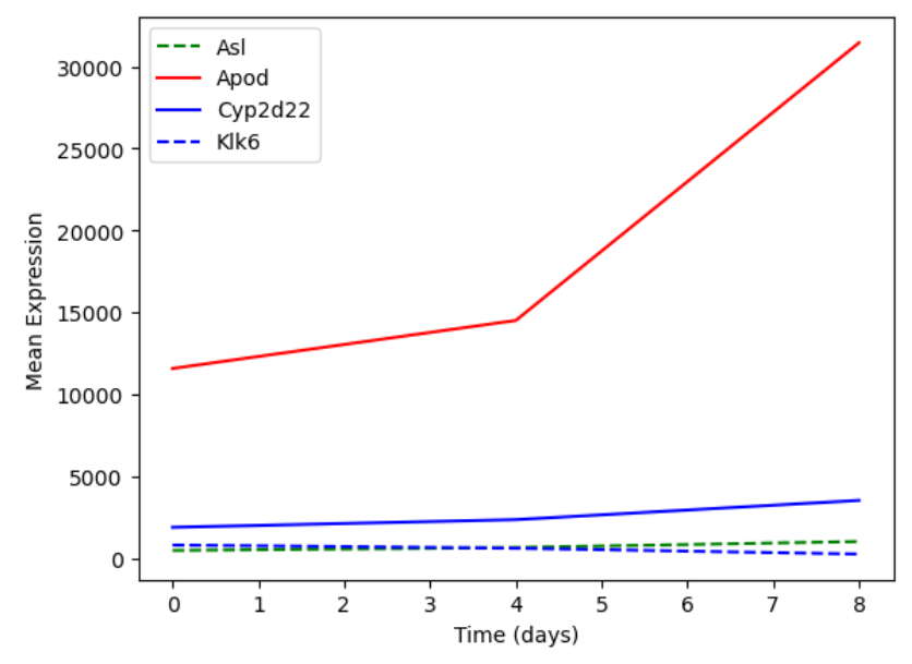
Multiple lines on the same plot with a
legend
Figure 7
A simple boxplot using seaborn
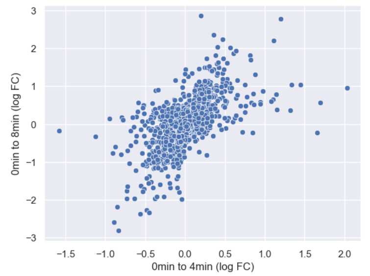
Figure 8
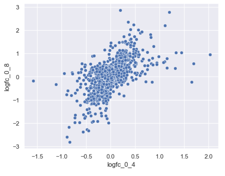
Basic foldchange scatterplot.
Figure 9
Axis labels changed
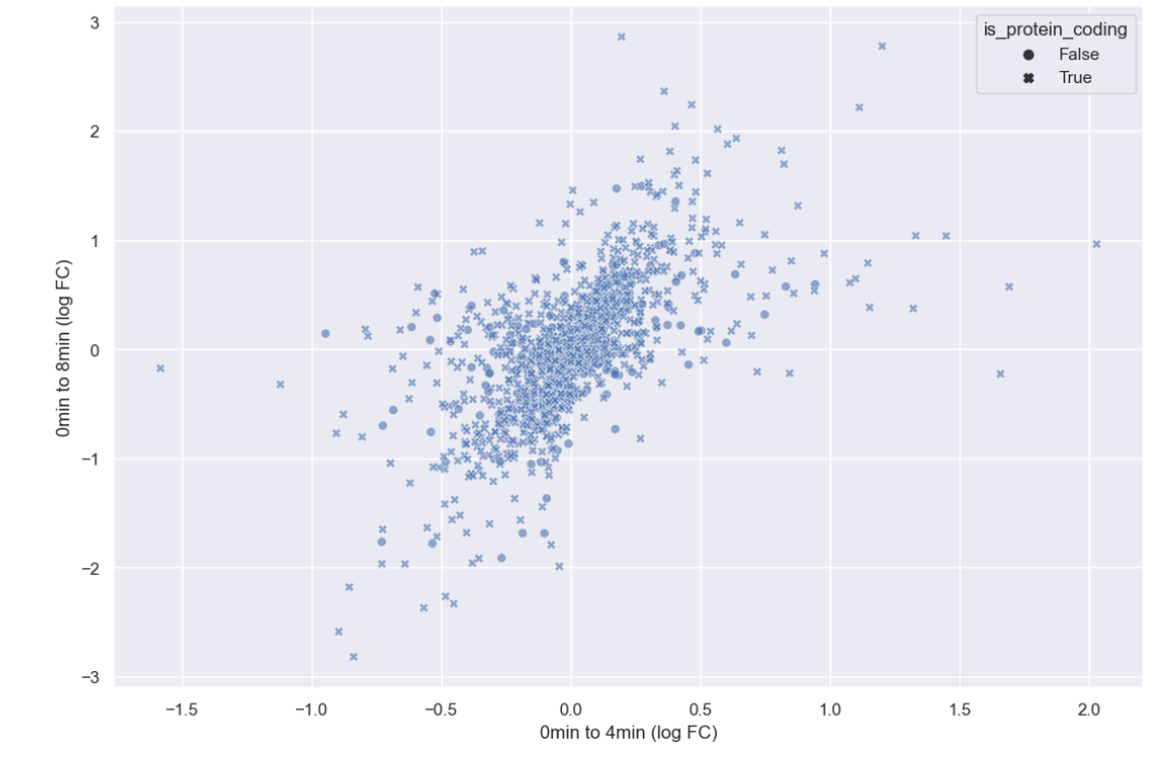
Figure 10
Adjusted alpha level
Figure 11
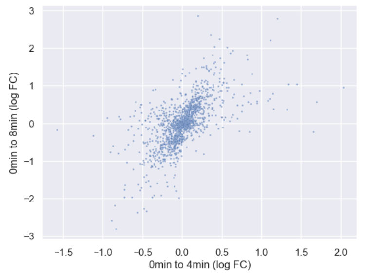
Adjusted point size
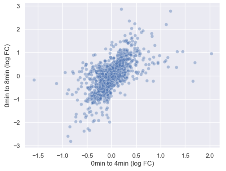
Figure 12
Added gene_biotype as hue
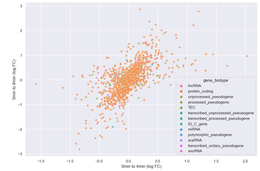
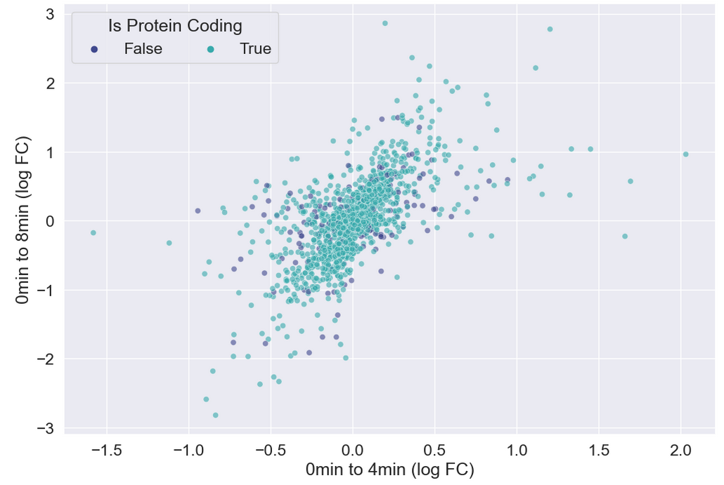
Figure 13
Style set to is_protein_coding
Figure 14
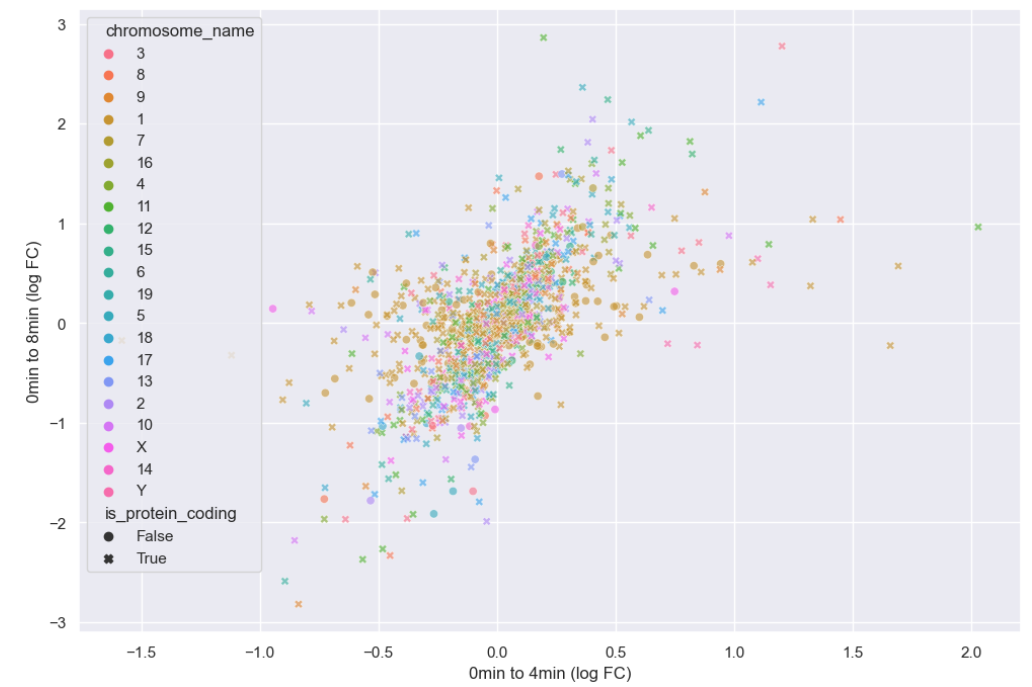
Adding chromosome
Figure 15
Cleaning up the plot
Figure 16
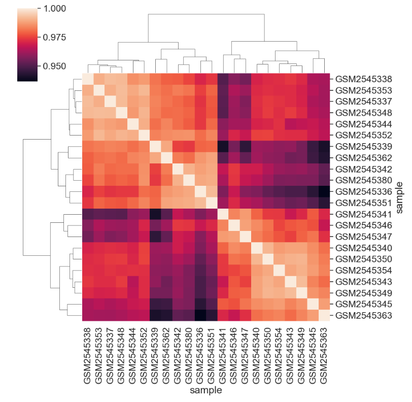
Default clustered heatmap
Figure 17
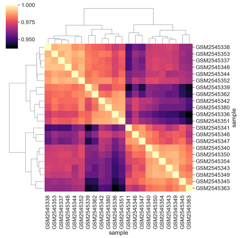
Using magma colormap
Figure 18
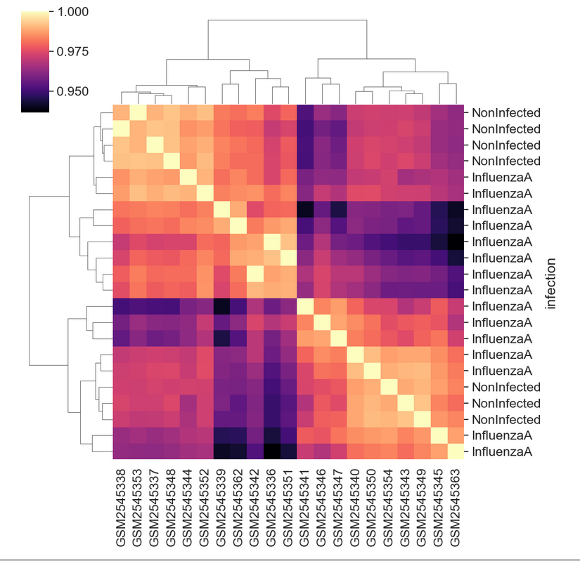
Heatmap with infection information
Figure 19
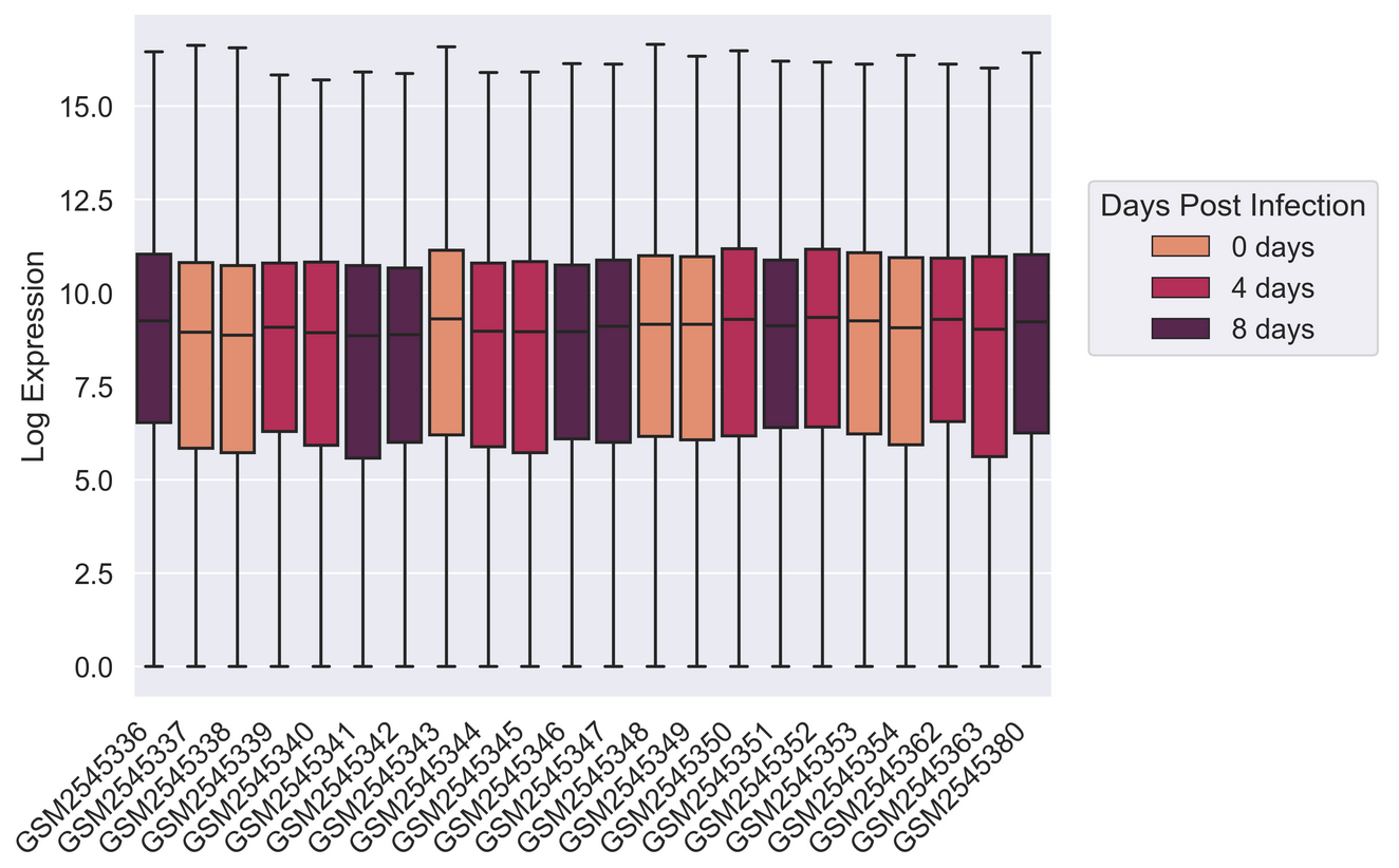
Figure 20
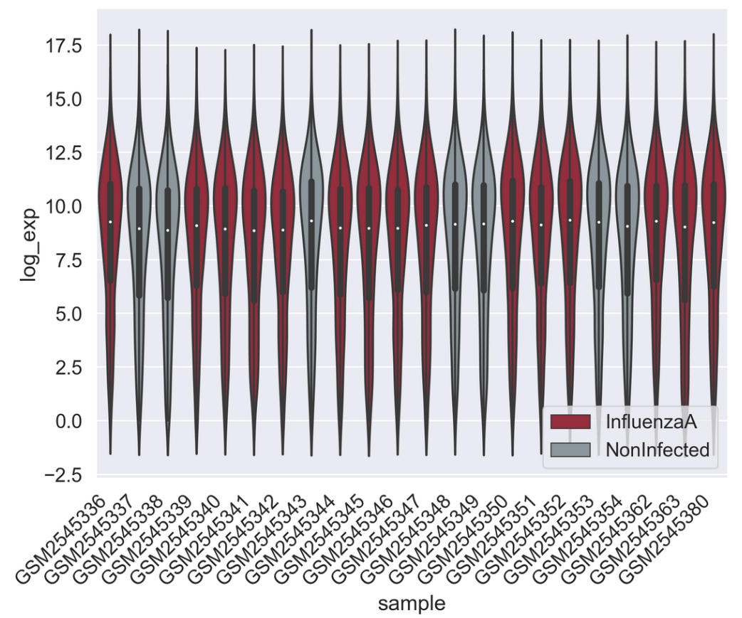
Figure 21
Perform machine learning with Scikit-learn
Figure 1
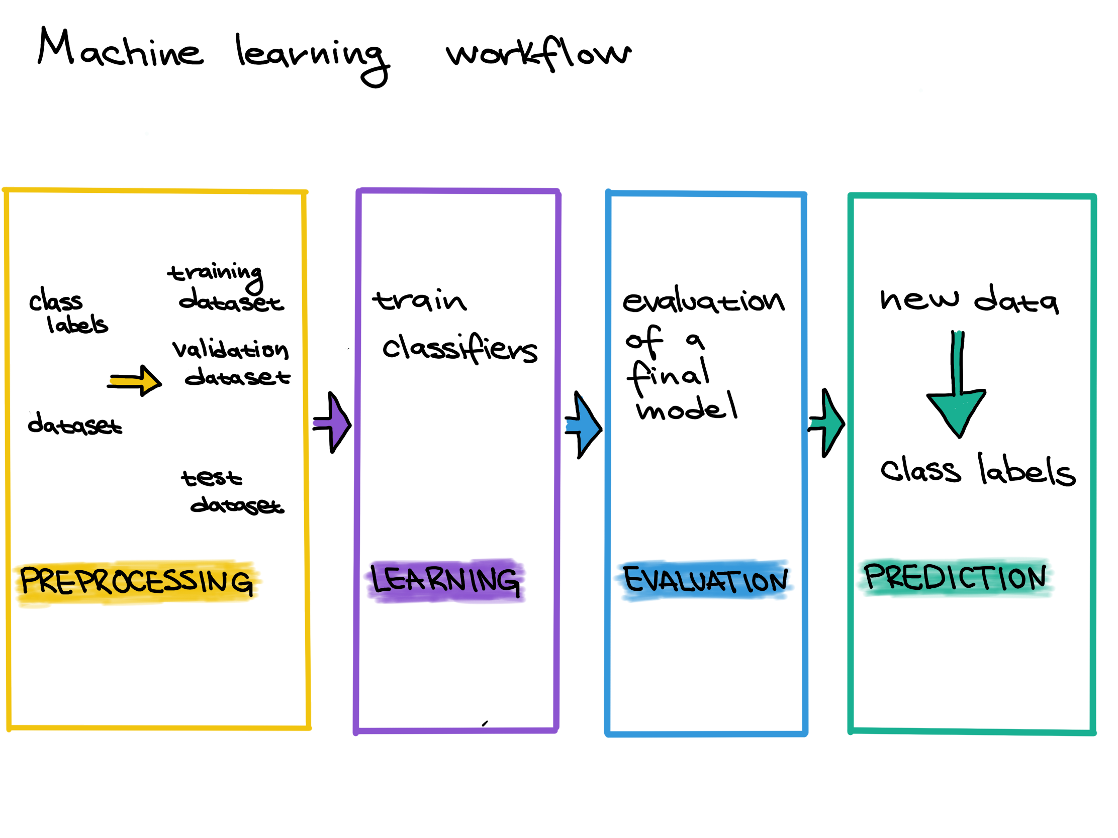
Supervised Machine Learning Workflow
Figure 2
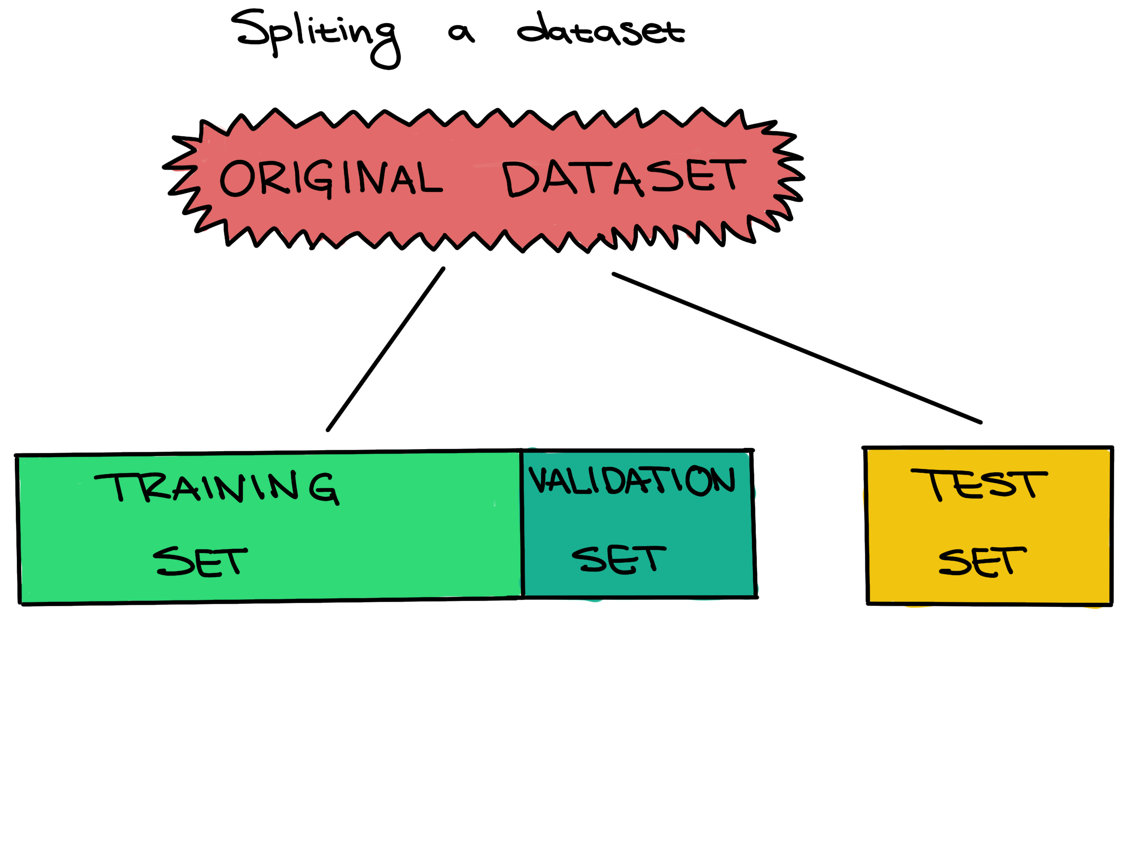 .
.
Figure 3
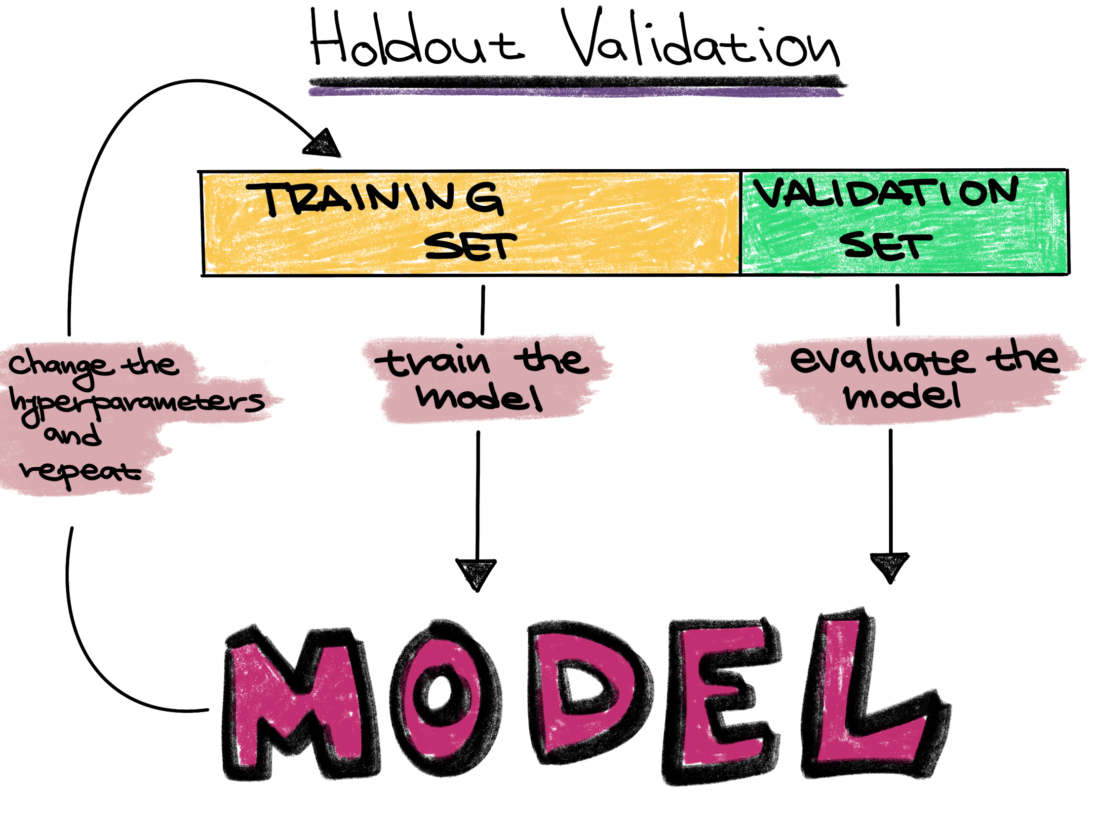
Holdout validation strategy
Figure 4
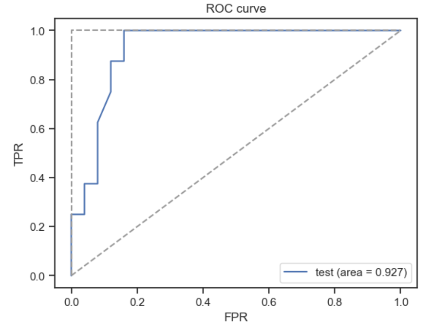
ROC curve
Figure 5
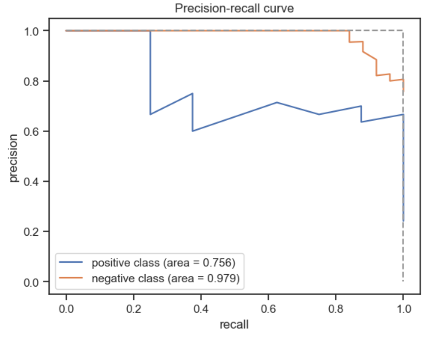
PR curve
Figure 6
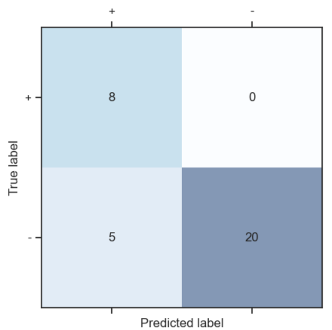
Confusion Matrix