
Pivoting data
You can find the original, extended version of this chapter here.
When managing data, pivoting can be understood to refer to one of two processes:
- The creation of pivot tables, which are tables of statistics that summarise the data of a more extensive table
- The conversion of a table from long to wide format, or vice versa.
In this page, we will focus on the latter definition. This page discusses the formats of data. It is useful to be aware of the idea of “tidy data”, in which each variable has it’s own column, each observation has it’s own row, and each value has it’s own cell. More about this topic can be found at this online chapter in R for Data Science.
Wide-to-long
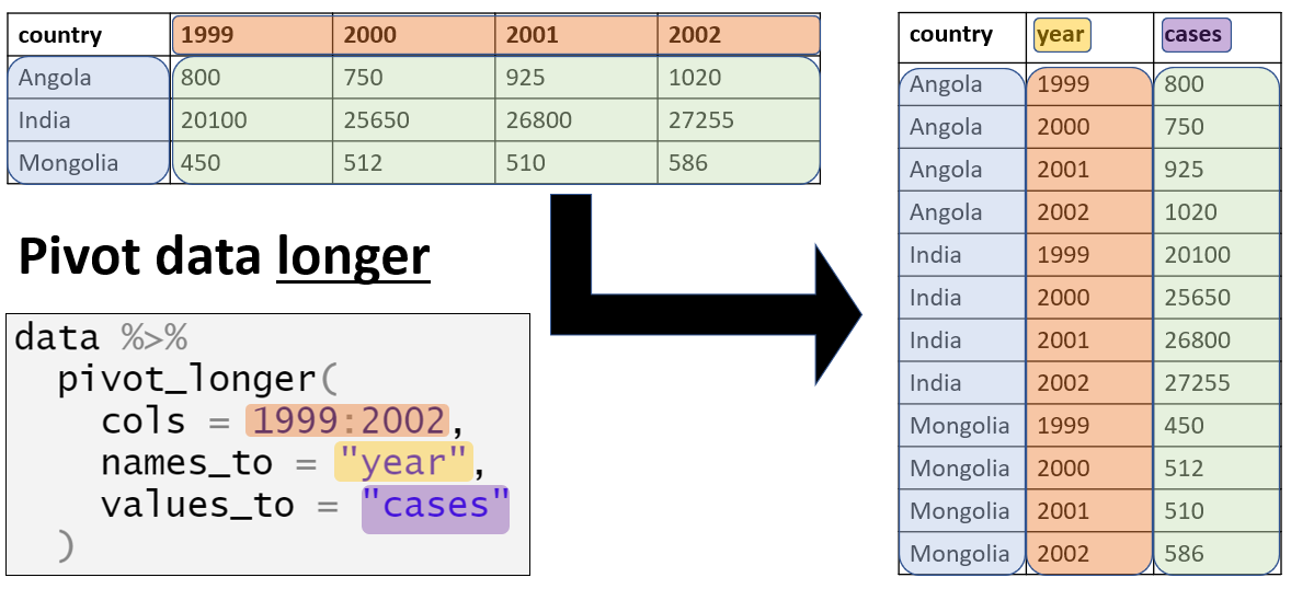
“Wide” format
Data are often entered and stored in a “wide” format - where a subject’s characteristics or responses are stored in a single row. While this may be useful for presentation, it is not ideal for some types of analysis.
Let us take the count_data dataset imported in the Preparation section above as an example. You can see that each row represents a “facility-day”. The actual case counts (the right-most columns) are stored in a “wide” format such that the information for every age group on a given facility-day is stored in a single row.
Each observation in this dataset refers to the malaria counts at one of 65 facilities on a given date, ranging from count_data$data_date %>% min() to count_data$data_date %>% max(). These facilities are located in one Province (North) and four Districts (Spring, Bolo, Dingo, and Barnard). The dataset provides the overall counts of malaria, as well as age-specific counts in each of three age groups - <4 years, 5-14 years, and 15 years and older.
“Wide” data like this are not adhering to “tidy data” standards, because the column headers do not actually represent “variables” - they represent values of a hypothetical “age group” variable.
This format can be useful for presenting the information in a table, or for entering data (e.g. in Excel) from case report forms. However, in the analysis stage, these data typically should be transformed to a “longer” format more aligned with “tidy data” standards. The plotting R package ggplot2 in particular works best when data are in a “long” format.
Visualising the total malaria counts over time poses no difficulty with the data in it’s current format:
ggplot(count_data) +
  geom_col(aes(x = data_date, y = malaria_tot), width = 1)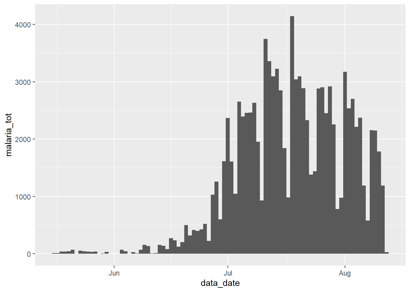
However, what if we wanted to display the relative contributions of each age group to this total count? In this case, we need to ensure that the variable of interest (age group), appears in the dataset in a single column that can be passed to {ggplot2}’s “mapping aesthetics” aes() argument.
pivot_longer()
The tidyr function pivot_longer() makes data “longer”. tidyr is part of the tidyverse of R packages.
It accepts a range of columns to transform (specified to cols =). Therefore, it can operate on only a part of a dataset. This is useful for the malaria data, as we only want to pivot the case count columns.
In this process, you will end up with two “new” columns - one with the categories (the former column names), and one with the corresponding values (e.g. case counts). You can accept the default names for these new columns, or you can specify your own to names_to = and values_to = respectively.
Let’s see pivot_longer() in action…
Standard pivoting
We want to use tidyr’s pivot_longer() function to convert the “wide” data to a “long” format. Specifically, to convert the four numeric columns with data on malaria counts to two new columns: one which holds the age groups and one which holds the corresponding values.
df_long <- count_data %>%
  pivot_longer(
    cols = c(`malaria_rdt_0-4`, `malaria_rdt_5-14`, `malaria_rdt_15`, `malaria_tot`)
  )

df_long
Notice that the newly created data frame (df_long) has more rows (12,152 vs 3,038); it has become longer. In fact, it is precisely four times as long, because each row in the original dataset now represents four rows in df_long, one for each of the malaria count observations (<4y, 5-14y, 15y+, and total).
In addition to becoming longer, the new dataset has fewer columns (8 vs 10), as the data previously stored in four columns (those beginning with the prefix malaria_) is now stored in two.
Since the names of these four columns all begin with the prefix malaria_, we could have made use of the handy “tidyselect” function starts_with() to achieve the same result.
# provide column with a tidyselect helper function
count_data %>%
  pivot_longer(
    cols = starts_with("malaria_")
  )
# A tibble: 12,152 × 8
location_name data_date submitted_date Province District newid name value
<chr> <date> <date> <chr> <chr> <int> <chr> <int>
1 Facility 1 2020-08-11 2020-08-12 North Spring 1 malari… 11
2 Facility 1 2020-08-11 2020-08-12 North Spring 1 malari… 12
3 Facility 1 2020-08-11 2020-08-12 North Spring 1 malari… 23
4 Facility 1 2020-08-11 2020-08-12 North Spring 1 malari… 46
5 Facility 2 2020-08-11 2020-08-12 North Bolo 2 malari… 11
6 Facility 2 2020-08-11 2020-08-12 North Bolo 2 malari… 10
7 Facility 2 2020-08-11 2020-08-12 North Bolo 2 malari… 5
8 Facility 2 2020-08-11 2020-08-12 North Bolo 2 malari… 26
9 Facility 3 2020-08-11 2020-08-12 North Dingo 3 malari… 8
10 Facility 3 2020-08-11 2020-08-12 North Dingo 3 malari… 5
# ℹ 12,142 more rowsor by position:
# provide columns by position
count_data %>%
  pivot_longer(
    cols = 6:9
  )
or by named range:
# provide range of consecutive columns
count_data %>%
  pivot_longer(
    cols = `malaria_rdt_0-4`:malaria_tot
  )
These two new columns are given the default names of name and value, but we can override these defaults to provide more meaningful names, which can help remember what is stored within, using the names_to and values_to arguments. Let’s use the names age_group and counts:
df_long <-
  count_data %>%
  pivot_longer(
    cols = starts_with("malaria_"),
    names_to = "age_group",
    values_to = "counts"
  )

df_long
# A tibble: 12,152 × 8
location_name data_date submitted_date Province District newid age_group
<chr> <date> <date> <chr> <chr> <int> <chr>
1 Facility 1 2020-08-11 2020-08-12 North Spring 1 malaria_rdt_…
2 Facility 1 2020-08-11 2020-08-12 North Spring 1 malaria_rdt_…
3 Facility 1 2020-08-11 2020-08-12 North Spring 1 malaria_rdt_…
4 Facility 1 2020-08-11 2020-08-12 North Spring 1 malaria_tot
5 Facility 2 2020-08-11 2020-08-12 North Bolo 2 malaria_rdt_…
6 Facility 2 2020-08-11 2020-08-12 North Bolo 2 malaria_rdt_…
7 Facility 2 2020-08-11 2020-08-12 North Bolo 2 malaria_rdt_…
8 Facility 2 2020-08-11 2020-08-12 North Bolo 2 malaria_tot
9 Facility 3 2020-08-11 2020-08-12 North Dingo 3 malaria_rdt_…
10 Facility 3 2020-08-11 2020-08-12 North Dingo 3 malaria_rdt_…
# ℹ 12,142 more rows
# ℹ 1 more variable: counts <int>We can now pass this new dataset to {ggplot2}, and map the new column count to the y-axis and new column age_group to the fill = argument (the column internal color). This will display the malaria counts in a stacked bar chart, by age group:
ggplot(data = df_long) +
  geom_col(
    mapping = aes(x = data_date, y = counts, fill = age_group),
    width = 1
  )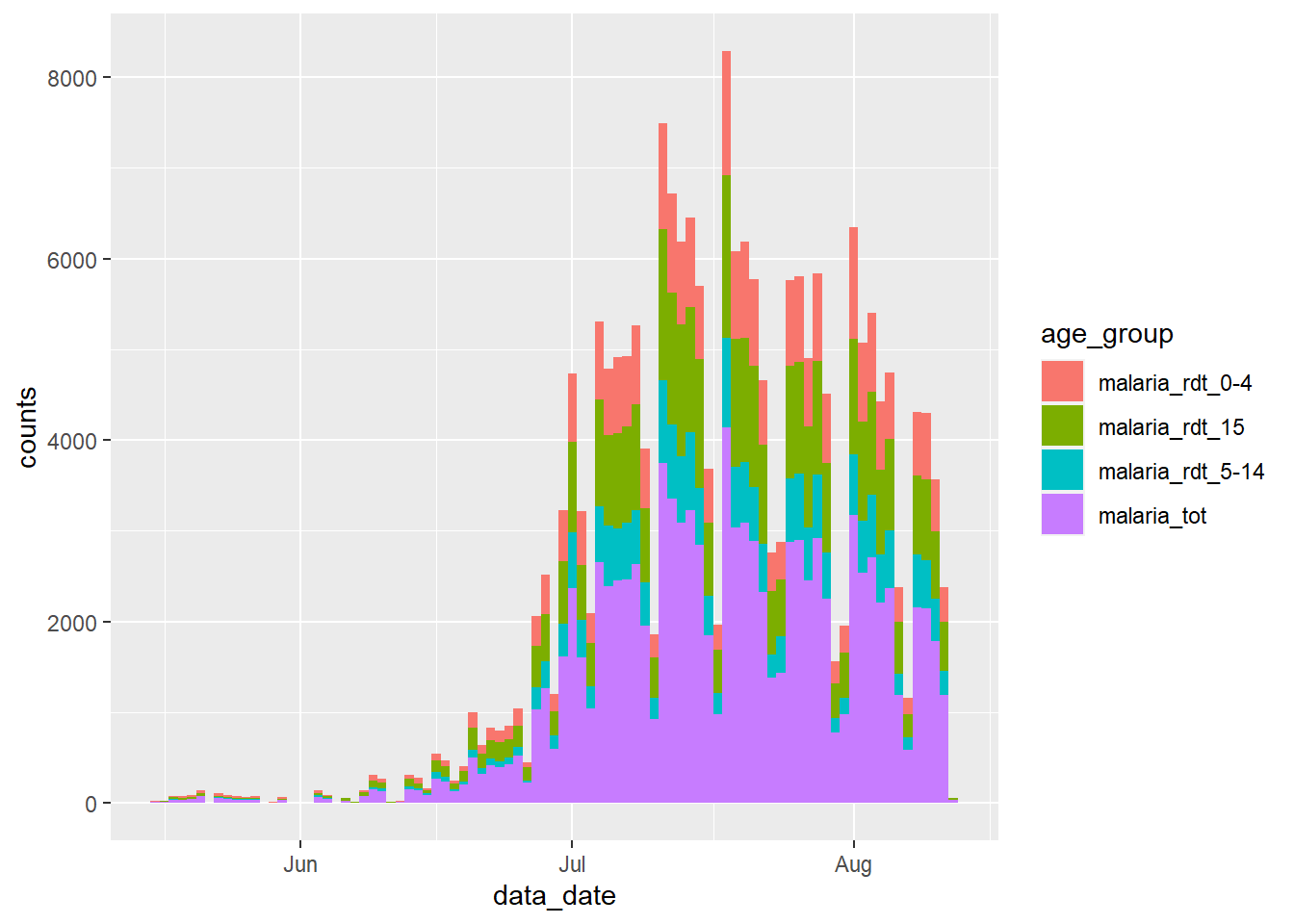
Examine this new plot, and compare it with the plot we created earlier - what has gone wrong?
We have encountered a common problem when wrangling surveillance data - we have also included the total counts from the malaria_tot column, so the magnitude of each bar in the plot is twice as high as it should be.
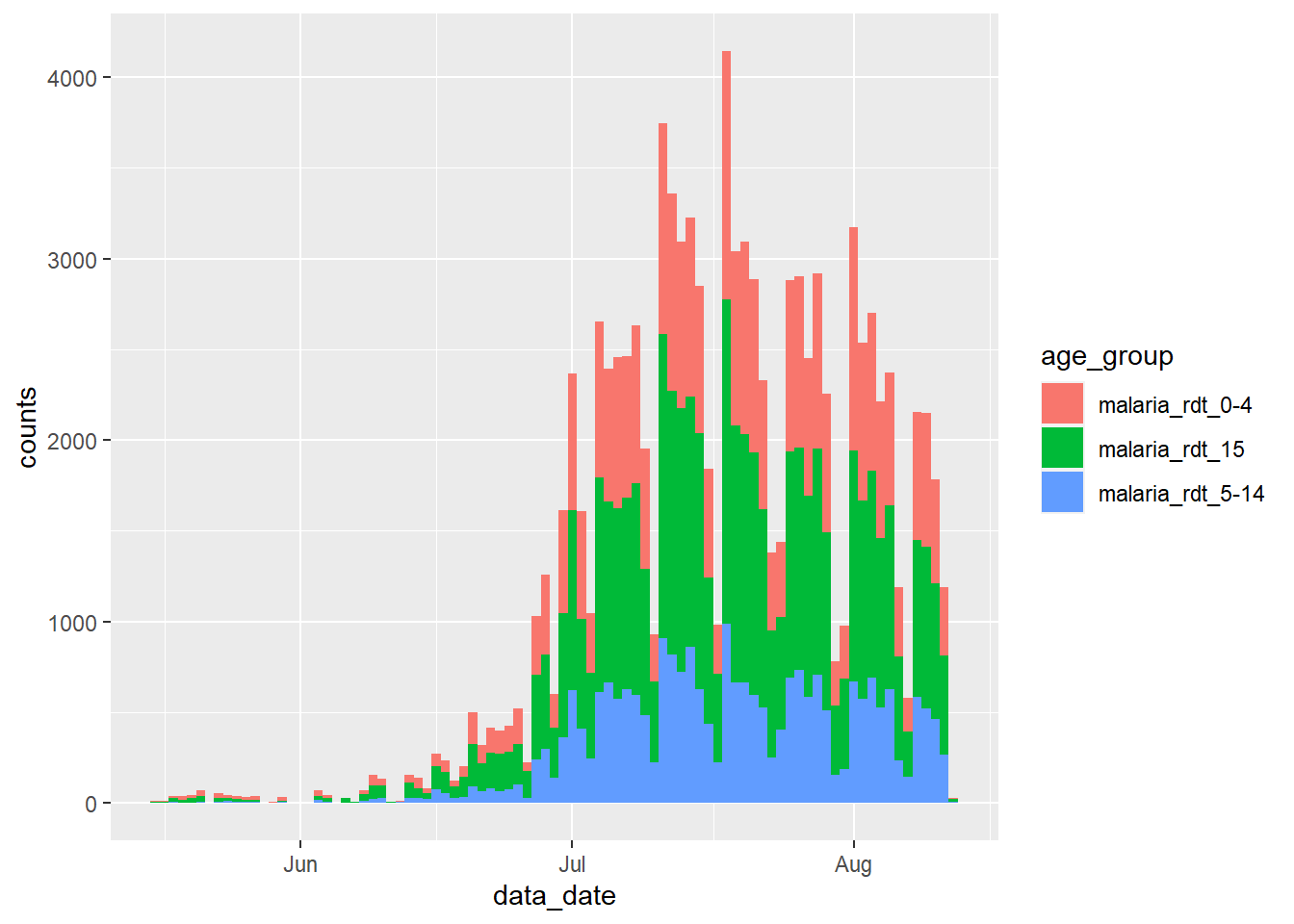
We can handle this in a number of ways. We could simply filter these totals from the dataset before we pass it to ggplot():
df_long %>%
  filter(age_group != "malaria_tot") %>%
  ggplot() +
  geom_col(
    aes(x = data_date, y = counts, fill = age_group),
    width = 1
  )
Alternatively, we could have excluded this variable when we ran pivot_longer(), thereby maintaining it in the dataset as a separate variable. See how its values “expand” to fill the new rows.
count_data %>%
  pivot_longer(
    cols = `malaria_rdt_0-4`:malaria_rdt_15,   # does not include the totals column
    names_to = "age_group",
    values_to = "counts"
  )
# A tibble: 9,114 × 9
location_name data_date submitted_date Province District malaria_tot newid
<chr> <date> <date> <chr> <chr> <int> <int>
1 Facility 1 2020-08-11 2020-08-12 North Spring 46 1
2 Facility 1 2020-08-11 2020-08-12 North Spring 46 1
3 Facility 1 2020-08-11 2020-08-12 North Spring 46 1
4 Facility 2 2020-08-11 2020-08-12 North Bolo 26 2
5 Facility 2 2020-08-11 2020-08-12 North Bolo 26 2
6 Facility 2 2020-08-11 2020-08-12 North Bolo 26 2
7 Facility 3 2020-08-11 2020-08-12 North Dingo 18 3
8 Facility 3 2020-08-11 2020-08-12 North Dingo 18 3
9 Facility 3 2020-08-11 2020-08-12 North Dingo 18 3
10 Facility 4 2020-08-11 2020-08-12 North Bolo 49 4
# ℹ 9,104 more rows
# ℹ 2 more variables: age_group <chr>, counts <int>Pivoting data of multiple classes
The above example works well in situations in which all the columns you want to “pivot longer” are of the same class (character, numeric, logical…).
However, there will be many cases when, as a field epidemiologist, you will be working with data that was prepared by non-specialists and which follow their own non-standard logic - as Hadley Wickham noted (referencing Tolstoy) in his seminal article on Tidy Data principles: “Like families, tidy datasets are all alike but every messy dataset is messy in its own way.”
One particularly common problem you will encounter will be the need to pivot columns that contain different classes of data. This pivot will result in storing these different data types in a single column, which is not a good situation. There are various approaches one can take to separate out the mess this creates, but there is an important step you can take using pivot_longer() to avoid creating such a situation yourself.
Take a situation in which there have been a series of observations at different time steps for each of three items A, B and C. Examples of such items could be individuals (e.g. contacts of an Ebola case being traced each day for 21 days) or remote village health posts being monitored once per year to ensure they are still functional. Let’s use the contact tracing example. Imagine that the data are stored as follows:
As can be seen, the data are a bit complicated. Each row stores information about one item, but with the time series running further and further away to the right as time progresses. Moreover, the column classes alternate between date and character values.
One particularly bad example of this encountered by this author involved cholera surveillance data, in which 8 new columns of observations were added each day over the course of 4 years. Simply opening the Excel file in which these data were stored took >10 minuntes on my laptop!
In order to work with these data, we need to transform the data frame to long format, but keeping the separation between a date column and a character (status) column, for each observation for each item. If we don’t, we might end up with a mixture of variable types in a single column (a very big “no-no” when it comes to data management and tidy data):
df %>%
  pivot_longer(
    cols = -id,
    names_to = c("observation")
  )
# A tibble: 18 × 3
id observation value
<chr> <chr> <chr>
1 A obs1_date 2021-04-23
2 A obs1_status Healthy
3 A obs2_date 2021-04-24
4 A obs2_status Healthy
5 A obs3_date 2021-04-25
6 A obs3_status Unwell
7 B obs1_date 2021-04-23
8 B obs1_status Healthy
9 B obs2_date 2021-04-24
10 B obs2_status Healthy
11 B obs3_date 2021-04-25
12 B obs3_status Healthy
13 C obs1_date 2021-04-23
14 C obs1_status Missing
15 C obs2_date 2021-04-24
16 C obs2_status Healthy
17 C obs3_date 2021-04-25
18 C obs3_status Healthy Above, our pivot has merged dates and characters into a single value column. R will react by converting the entire column to class character, and the utility of the dates is lost.
To prevent this situation, we can take advantage of the syntax structure of the original column names. There is a common naming structure, with the observation number, an underscore, and then either “status” or “date”. We can leverage this syntax to keep these two data types in separate columns after the pivot.
We do this by:
- Providing a character vector to the
names_to =argument, with the second item being (".value"). This special term indicates that the pivoted columns will be split based on a character in their name…
- You must also provide the “splitting” character to the
names_sep =argument. In this case, it is the underscore “_“.
Thus, the naming and split of new columns is based around the underscore in the existing variable names.
df_long <-
  df %>%
  pivot_longer(
    cols = -id,
    names_to = c("observation", ".value"),
    names_sep = "_"
  )

df_long
# A tibble: 9 × 4
id observation date status
<chr> <chr> <chr> <chr>
1 A obs1 2021-04-23 Healthy
2 A obs2 2021-04-24 Healthy
3 A obs3 2021-04-25 Unwell
4 B obs1 2021-04-23 Healthy
5 B obs2 2021-04-24 Healthy
6 B obs3 2021-04-25 Healthy
7 C obs1 2021-04-23 Missing
8 C obs2 2021-04-24 Healthy
9 C obs3 2021-04-25 HealthyFinishing touches:
Note that the date column is currently in character class - we can easily convert this into it’s proper date class using the mutate() and as_date() functions.
We may also want to convert the observation column to a numeric format by dropping the “obs” prefix and converting to numeric. We cando this with str_remove_all() from the stringr package.
df_long <-
  df_long %>%
  mutate(
    date = date %>% lubridate::as_date(),
    observation =
      observation %>%
      str_remove_all("obs") %>%
      as.numeric()
  )

df_long
# A tibble: 9 × 4
id observation date status
<chr> <dbl> <date> <chr>
1 A 1 2021-04-23 Healthy
2 A 2 2021-04-24 Healthy
3 A 3 2021-04-25 Unwell
4 B 1 2021-04-23 Healthy
5 B 2 2021-04-24 Healthy
6 B 3 2021-04-25 Healthy
7 C 1 2021-04-23 Missing
8 C 2 2021-04-24 Healthy
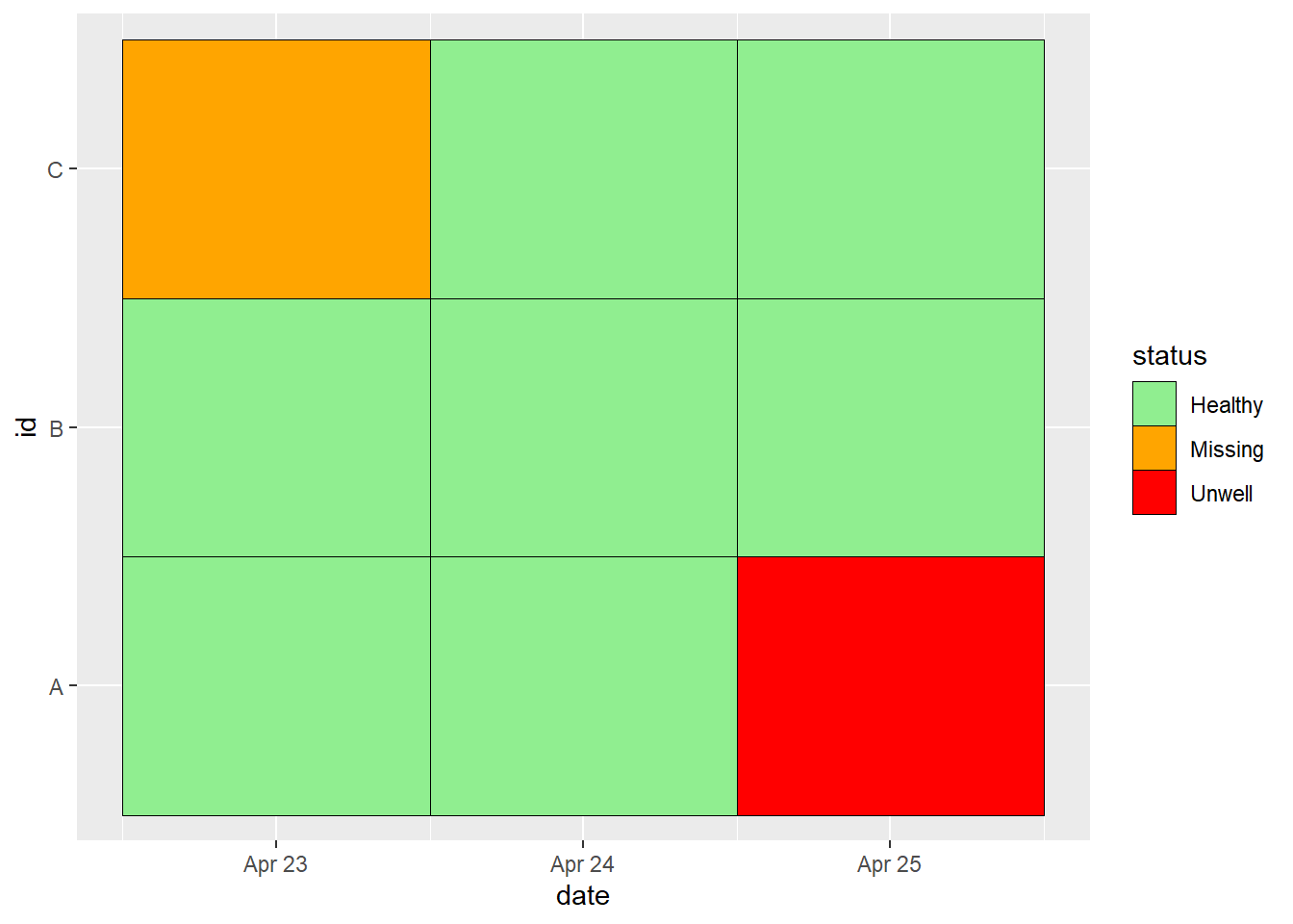
9 C 3 2021-04-25 HealthyAnd now, we can start to work with the data in this format, e.g. by plotting a descriptive heat tile:
ggplot(data = df_long, mapping = aes(x = date, y = id, fill = status)) +
  geom_tile(colour = "black") +
  scale_fill_manual(
    values =
      c("Healthy" = "lightgreen",
        "Unwell" = "red",
        "Missing" = "orange")
  )
Long-to-wide
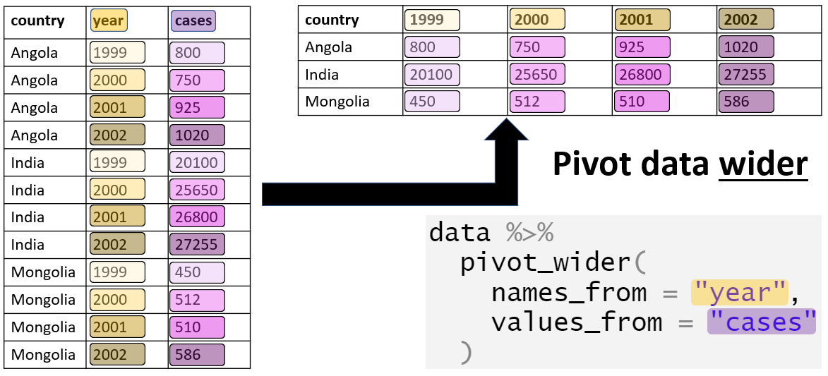
In some instances, we may wish to convert a dataset to a wider format. For this, we can use the pivot_wider() function.
A typical use-case is when we want to transform the results of an analysis into a format which is more digestible for the reader (such as a [Table for presentation][Tables for presentation]). Usually, this involves transforming a dataset in which information for one subject is are spread over multiple rows into a format in which that information is stored in a single row.
Data
For this section of the page, we will use the case linelist (see the Preparation section), which contains one row per case.
Here are the first 50 rows:
Suppose that we want to know the counts of individuals in the different age groups, by gender:
df_wide <-
  linelist %>%
  count(age_cat, gender)

df_wide
age_cat gender n
1 0-4 f 640
2 0-4 m 416
3 0-4 <NA> 39
4 5-9 f 641
5 5-9 m 412
6 5-9 <NA> 42
7 10-14 f 518
8 10-14 m 383
9 10-14 <NA> 40
10 15-19 f 359
11 15-19 m 364
12 15-19 <NA> 20
13 20-29 f 468
14 20-29 m 575
15 20-29 <NA> 30
16 30-49 f 179
17 30-49 m 557
18 30-49 <NA> 18
19 50-69 f 2
20 50-69 m 91
21 50-69 <NA> 2
22 70+ m 5
23 70+ <NA> 1
24 <NA> <NA> 86This gives us a long dataset that is great for producing visualisations in ggplot2, but not ideal for presentation in a table:
ggplot(df_wide) +
  geom_col(aes(x = age_cat, y = n, fill = gender))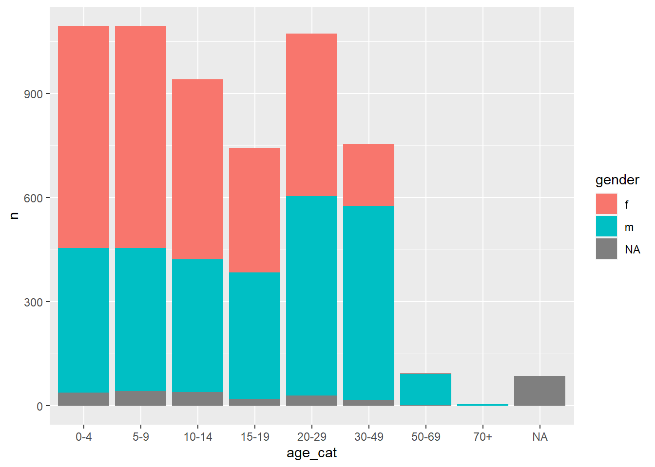
Pivot wider
Therefore, we can use pivot_wider() to transform the data into a better format for inclusion as tables in our reports.
The argument names_from specifies the column from which to generate the new column names, while the argument values_from specifies the column from which to take the values to populate the cells. The argument id_cols = is optional, but can be provided a vector of column names that should not be pivoted, and will thus identify each row.
table_wide <-
  df_wide %>%
  pivot_wider(
    id_cols = age_cat,
    names_from = gender,
    values_from = n
  )

table_wide
# A tibble: 9 × 4
age_cat f m `NA`
<fct> <int> <int> <int>
1 0-4 640 416 39
2 5-9 641 412 42
3 10-14 518 383 40
4 15-19 359 364 20
5 20-29 468 575 30
6 30-49 179 557 18
7 50-69 2 91 2
8 70+ NA 5 1
9 <NA> NA NA 86This table is much more reader-friendly, and therefore better for inclusion in our reports. You can convert into a pretty table with several packages including flextable and knitr.
table_wide %>%
  janitor::adorn_totals(c("row", "col")) %>% # adds row and column totals
  knitr::kable() %>%
  kableExtra::row_spec(row = 10, bold = TRUE) %>%
kableExtra::column_spec(column = 5, bold = TRUE) | age_cat | f | m | NA | Total |
|---|---|---|---|---|
| 0-4 | 640 | 416 | 39 | 1095 |
| 5-9 | 641 | 412 | 42 | 1095 |
| 10-14 | 518 | 383 | 40 | 941 |
| 15-19 | 359 | 364 | 20 | 743 |
| 20-29 | 468 | 575 | 30 | 1073 |
| 30-49 | 179 | 557 | 18 | 754 |
| 50-69 | 2 | 91 | 2 | 95 |
| 70+ | NA | 5 | 1 | 6 |
| NA | NA | NA | 86 | 86 |
| Total | 2807 | 2803 | 278 | 5888 |
Fill
In some situations after a pivot, and more commonly after a bind, we are left with gaps in some cells that we would like to fill.
Data
For example, take two datasets, each with observations for the measurement number, the name of the facility, and the case count at that time. However, the second dataset also has a variable Year.
df1 <-
  tibble::tribble(
       ~Measurement, ~Facility, ~Cases,
                  1,  "Hosp 1",     66,
                  2,  "Hosp 1",     26,
                  3,  "Hosp 1",      8,
                  1,  "Hosp 2",     71,
                  2,  "Hosp 2",     62,
                  3,  "Hosp 2",     70,
                  1,  "Hosp 3",     47,
                  2,  "Hosp 3",     70,
                  3,  "Hosp 3",     38,
       )

df1
# A tibble: 9 × 3
Measurement Facility Cases
<dbl> <chr> <dbl>
1 1 Hosp 1 66
2 2 Hosp 1 26
3 3 Hosp 1 8
4 1 Hosp 2 71
5 2 Hosp 2 62
6 3 Hosp 2 70
7 1 Hosp 3 47
8 2 Hosp 3 70
9 3 Hosp 3 38df2 <-
tibble::tribble(
~Year, ~Measurement, ~Facility, ~Cases,
2000, 1, "Hosp 4", 82,
2001, 2, "Hosp 4", 87,
2002, 3, "Hosp 4", 46
)
df2# A tibble: 3 × 4
Year Measurement Facility Cases
<dbl> <dbl> <chr> <dbl>
1 2000 1 Hosp 4 82
2 2001 2 Hosp 4 87
3 2002 3 Hosp 4 46When we perform a bind_rows() to join the two datasets together, the Year variable is filled with NA for those rows where there was no prior information (i.e. the first dataset):
df_combined <-
  bind_rows(df1, df2) %>%
  arrange(Measurement, Facility)

df_combined
# A tibble: 12 × 4
Measurement Facility Cases Year
<dbl> <chr> <dbl> <dbl>
1 1 Hosp 1 66 NA
2 1 Hosp 2 71 NA
3 1 Hosp 3 47 NA
4 1 Hosp 4 82 2000
5 2 Hosp 1 26 NA
6 2 Hosp 2 62 NA
7 2 Hosp 3 70 NA
8 2 Hosp 4 87 2001
9 3 Hosp 1 8 NA
10 3 Hosp 2 70 NA
11 3 Hosp 3 38 NA
12 3 Hosp 4 46 2002fill()
In this case, Year is a useful variable to include, particularly if we want to explore trends over time. Therefore, we use fill() to fill in those empty cells, by specifying the column to fill and the direction (in this case up):
df_combined %>%
  fill(Year, .direction = "up")
# A tibble: 12 × 4
Measurement Facility Cases Year
<dbl> <chr> <dbl> <dbl>
1 1 Hosp 1 66 2000
2 1 Hosp 2 71 2000
3 1 Hosp 3 47 2000
4 1 Hosp 4 82 2000
5 2 Hosp 1 26 2001
6 2 Hosp 2 62 2001
7 2 Hosp 3 70 2001
8 2 Hosp 4 87 2001
9 3 Hosp 1 8 2002
10 3 Hosp 2 70 2002
11 3 Hosp 3 38 2002
12 3 Hosp 4 46 2002Alternatively, we can rearrange the data so that we would need to fill in a downward direction:
df_combined <-
  df_combined %>%
  arrange(Measurement, desc(Facility))

df_combined
# A tibble: 12 × 4
Measurement Facility Cases Year
<dbl> <chr> <dbl> <dbl>
1 1 Hosp 4 82 2000
2 1 Hosp 3 47 NA
3 1 Hosp 2 71 NA
4 1 Hosp 1 66 NA
5 2 Hosp 4 87 2001
6 2 Hosp 3 70 NA
7 2 Hosp 2 62 NA
8 2 Hosp 1 26 NA
9 3 Hosp 4 46 2002
10 3 Hosp 3 38 NA
11 3 Hosp 2 70 NA
12 3 Hosp 1 8 NAdf_combined <-
df_combined %>%
fill(Year, .direction = "down")
df_combined# A tibble: 12 × 4
Measurement Facility Cases Year
<dbl> <chr> <dbl> <dbl>
1 1 Hosp 4 82 2000
2 1 Hosp 3 47 2000
3 1 Hosp 2 71 2000
4 1 Hosp 1 66 2000
5 2 Hosp 4 87 2001
6 2 Hosp 3 70 2001
7 2 Hosp 2 62 2001
8 2 Hosp 1 26 2001
9 3 Hosp 4 46 2002
10 3 Hosp 3 38 2002
11 3 Hosp 2 70 2002
12 3 Hosp 1 8 2002We now have a useful dataset for plotting:
ggplot(df_combined) +
  aes(Year, Cases, fill = Facility) +
  geom_col()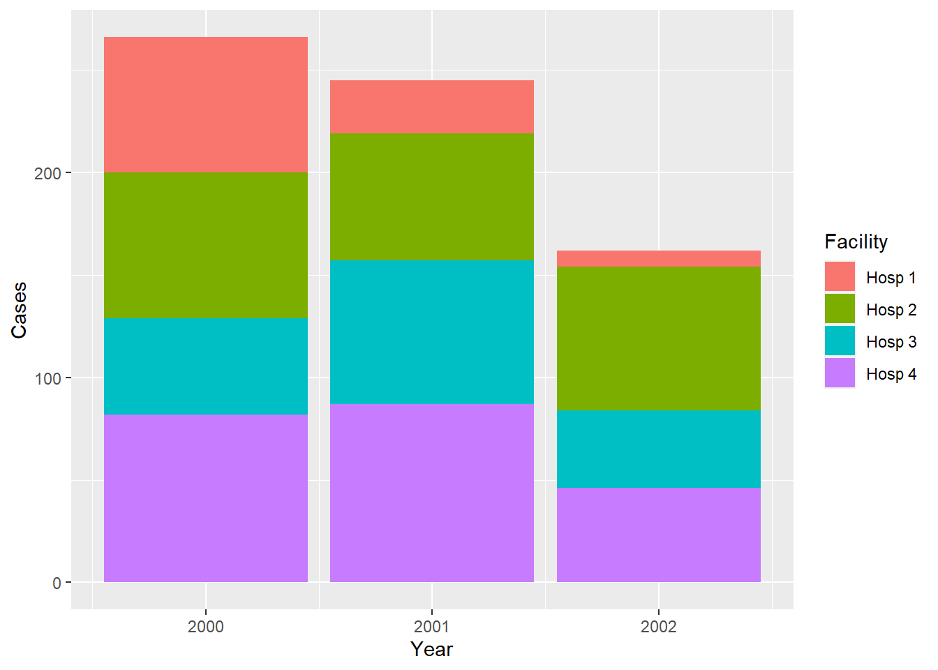
But less useful for presenting in a table, so let’s practice converting this long, untidy dataframe into a wider, tidy dataframe:
df_combined %>%
  pivot_wider(
    id_cols = c(Measurement, Facility),
    names_from = "Year",
    values_from = "Cases"
  ) %>%
  arrange(Facility) %>%
  janitor::adorn_totals(c("row", "col")) %>%
  knitr::kable() %>%
  kableExtra::row_spec(row = 5, bold = TRUE) %>%
kableExtra::column_spec(column = 5, bold = TRUE) | Measurement | Facility | 2000 | 2001 | 2002 | Total |
|---|---|---|---|---|---|
| 1 | Hosp 1 | 66 | NA | NA | 66 |
| 2 | Hosp 1 | NA | 26 | NA | 26 |
| 3 | Hosp 1 | NA | NA | 8 | 8 |
| 1 | Hosp 2 | 71 | NA | NA | 71 |
| 2 | Hosp 2 | NA | 62 | NA | 62 |
| 3 | Hosp 2 | NA | NA | 70 | 70 |
| 1 | Hosp 3 | 47 | NA | NA | 47 |
| 2 | Hosp 3 | NA | 70 | NA | 70 |
| 3 | Hosp 3 | NA | NA | 38 | 38 |
| 1 | Hosp 4 | 82 | NA | NA | 82 |
| 2 | Hosp 4 | NA | 87 | NA | 87 |
| 3 | Hosp 4 | NA | NA | 46 | 46 |
| Total | - | 266 | 245 | 162 | 673 |
N.B. In this case, we had to specify to only include the three variables Facility, Year, and Cases as the additional variable Measurement would interfere with the creation of the table:
df_combined %>%
  pivot_wider(
    names_from = "Year",
    values_from = "Cases"
  ) %>%
knitr::kable()| Measurement | Facility | 2000 | 2001 | 2002 |
|---|---|---|---|---|
| 1 | Hosp 4 | 82 | NA | NA |
| 1 | Hosp 3 | 47 | NA | NA |
| 1 | Hosp 2 | 71 | NA | NA |
| 1 | Hosp 1 | 66 | NA | NA |
| 2 | Hosp 4 | NA | 87 | NA |
| 2 | Hosp 3 | NA | 70 | NA |
| 2 | Hosp 2 | NA | 62 | NA |
| 2 | Hosp 1 | NA | 26 | NA |
| 3 | Hosp 4 | NA | NA | 46 |
| 3 | Hosp 3 | NA | NA | 38 |
| 3 | Hosp 2 | NA | NA | 70 |
| 3 | Hosp 1 | NA | NA | 8 |